

Comics News
Ten More Comic Creators Tell Tripwire What Makes A Truly Eye-Catching Comic Cover Part Five


Judge A Book By Its Cover?
Tripwire’s contributing writer Paul N Neal is proud to present Part Five of his ongoing series of articles that ask ten more comic book creators what makes a truly eye-catching comic book cover.
As ever this is the specific question each creator was asked:
“As a comic book professional, you have been in the position to help create or influence the creation of numerous covers for a variety of comics, would you be able to pick a favourite comic cover you have helped create? AND, also in a few words perhaps would you be kind enough to explain your choice, and what you think goes into making a successful and eye-catching cover”
Links to previous instalments of this series of articles are provided at the end of this article.
The first comic creator to contribute to Part Five was the new Marvel Comics superstar artist Netho Diaz…
Netho Diaz
Cover Image: X-Men 30. Volume 7
Publication Date: May 2026

I’ve done some covers I’m proud of! And some I’m really not happy with. Sometimes the concept itself isn’t something that I’m enthusiastic about, and sometimes I have so many ideas that it’s hard to shrink it down to three layouts for my editor to pick out his favourite.
I’d say X-Men #30 is my favourite. I think it really captures the essence of X-Men in their prime. I didn’t intentionally want to homage Jim Lee, but it turned out to be similar to his compositions. Which is great, i think!
I think Book Of Revelation #1 also is a good one. Instant classic shot. Very symmetric and the body language looks very powerful. For a villain cover, that’s very important.

I think for a good cover, sometimes we need to think outside the box and come up with something creative. But sometimes you just need to go with classic compositions. strong characters, body language, dynamism and contrast must be there.
There are so many beautiful covers out there. From Alex Ross’s Justice League ones all the way to Scott Campbell’s Spider-man ones. But maybe one that stands out is Spider-man #1, by Todd McFarlane. Till these days it remains a classic and a big influence on everyone who draws the character.

Everything is there and is perfectly done. Instant classic. I do believe that the fact that this cover has been displayed so many times at this point, that it helps us to create this feeling that it’s a classic. Whatever it is, it’s gorgeous!
***
Mike Hawthorne
Cover Image: Deadpool Issue 2. Vol 5. (Hip Hop Variant)
Publication Date: January 2016

My personal favourite is likely my Hip Hop variant for Deadpool #2.
It allowed me to play within my two loves, comics and Hip Hop (though I do not love Vanilla Ice!) I believe it was my first time colouring my own cover at Marvel too, so I got to create precisely the image I wanted from start to finish. The end result was funny but still had the flair needed for a superhero comic.
A good cover should read clearly from across the room and hint at the fun inside the comic without giving up too much. Design is just as much a part of the process as drawing. A “cool” image is just not enough. We must work on designing all aspects of the cover for it to work well.
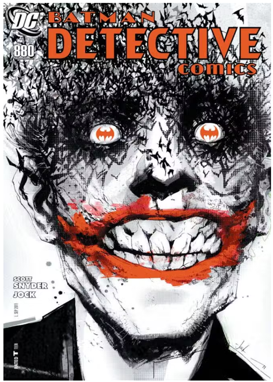
Some of my favourite covers? The Jock Joker cover for Detective Comics and Mazzuchelli’s Daredevil on a rooftop cover.

***
Robert Atkins
Cover Image: Transformers #100 / GI Joe #200
Publication Date: March 2014
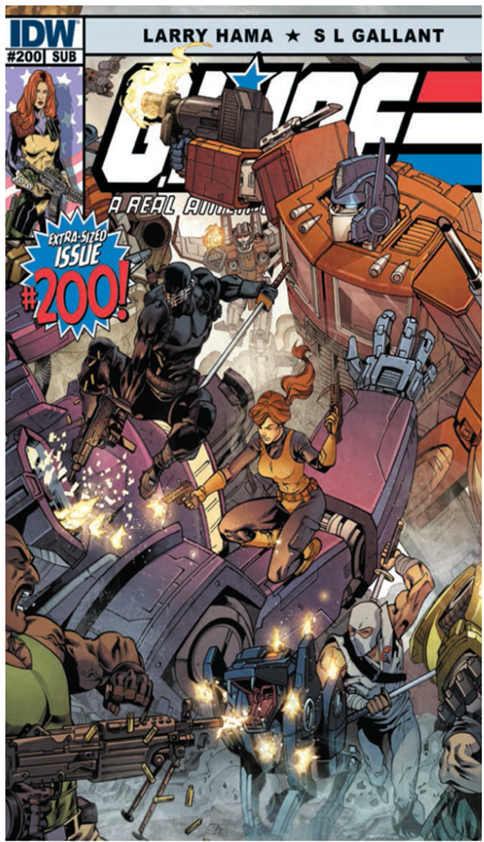
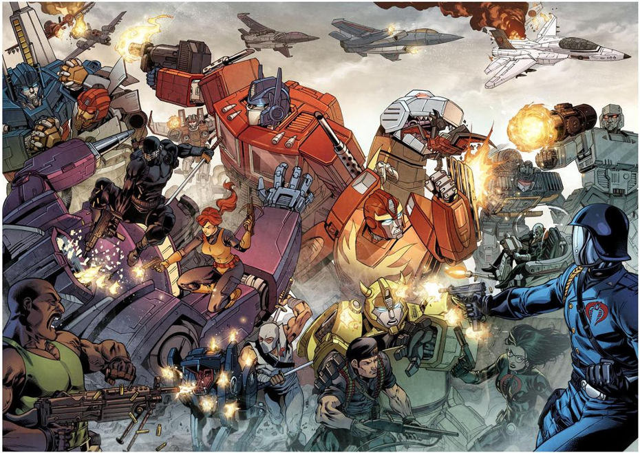
I’ve created over 140 covers for the GI Joe property and related titles, among other properties as well.
I categorise covers into 3 types (and each type can cross over into another)
1- Iconic Cover: This cover should show your character(s) doing what they are known for in their “iconic” role. So, Batman stands on a gargoyle looking over Gotham, Spider-Man swings through New York and Judge Dredd looks gruff and you wouldn’t want to be the one breaking the law. Etc. These are great for an issue #1 or a new launch of a story arc. It’s a great entry point cover
2 – Symbolic Covers: These covers don’t have to show a full character, but must indicate, through symbolism and iconography something that a character is going through, or a potential interaction/story in the book. For example, Uncanny X-Men #379 shows Cyclops’s visor cracked and broken on the ground in a spotlight. This doesn’t occur in the book but symbolizes Cyclops’ perceived death in the story. Or a classic Amazing Spider-Man #50 with his back turned in the background and Peter Parker walking toward the camera on the cover. In the issue we see the great image of Peter Parker walking away down the alley from the Spider-Man suit in the trash. The cover symbolised the character and his conflicting alter-ego.
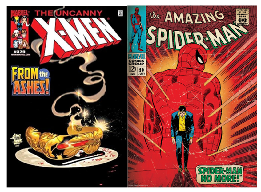

3 – Story covers: This cover type is straightforward; we want to show an element of the interior story to make the reader ask, “What is going on here?”. If the reader is asking “What, When, How, Why,” they want to pick up that issue to find the answer in the story.
I’ll add a 4th cover type that is becoming more predominant: a “Montage” or “Movie-Poster” cover, where artists emulate the great Drew Struzan and his iconic movie posters from the 80s to the 2000s. These are the most difficult to compose and keep interesting. They are also becoming a bit cliche but can be effective if executed well.
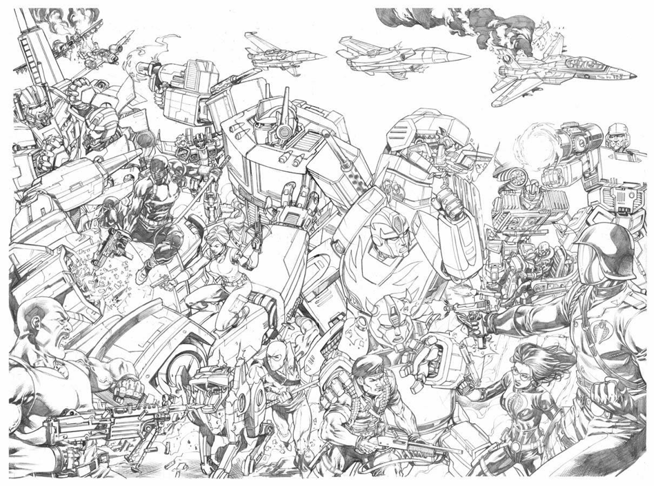
My Transformers versus GI Joe cover was an opportunity to showcase this Hasbro shared universe. Good vs Evil, Man vs Man, Man vs Machine, Machine vs Machine. This single iconic shot covers all the bases in storytelling.
Inside the book, this is not a crossover. So, it’s not a story cover. It’s symbolic in the Good vs Evil trope and story type. I would put it in the “Iconic” category because you see these characters doing what they do best in a visually interesting way that keeps you looking throughout the composition to see the matchups.
I love Snake-Eyes shooting out Shockwave’s one good eye, seeing Bumblebee protect Flint from Cobra Commander’s shots, and watching Ravage shield Storm Shadow from Roadblock’s heavy machine gun. Shockwave releases Lazerbeak only for him to be caught in Grimlock’s maw!
Although difficult to compose due to the number of characters, this was one of my favourite covers. I enjoyed thinking about these match ups and how to lead the reader’s eye from one engagement point to the next across the whole piece.
I have enjoyed illustrating other covers. For me, this was one of my most iconic!
***
Ian Stropforth
Cover Image: Lawless Convention Cover 2026, with Mike Perkins
Publication Date: Spring 2026

The Lawless cover was very exciting for me. I’m a big fan of Mike Perkins. He provided such an amazing image with inks. Mike didn’t have time to colour this image and I was very flattered to discover he’d reached out to The ‘77 to ask if I could provide colours for him.
The objective for me was to try to highlight and showcase Mike’s work and not cause a stylistic clash. My initial efforts were quite tight and conventional and not satisfactory from my perspective, so I adopted to let go a little, to heighten the colour here and there and apply paint directly over the image. I used watercolour to ensure that Mike’s work was always visible, but I always wanted my work to be subservient to Mike Perkins’ great image and not distract from his great ink work.
I think with regards to effective covers the images that first come to mind for me personally are the painted covers of the late 80s and early 90s, specifically Stray Toasters and Black Orchid as they seemed somehow more mature and evocative which contradicts my current drive for pure visual impact.

What I loved about these covers tends to contradict myself slightly, it is the ambiguity, the ambience and texture aspects to picture making. For me this led to an interest in paint and fine art.
However, not through sheer Lawless politics, I have to say that covers by Bolland, Gibson and McMahon also really captured my imagination as a child.
***
David Cousens
Cover Image: The Terminator issue 5 (variant cover.)
Publication Date: March 2025

For me, a great cover has to succeed in a number of areas. Obviously it has to be eye catching, but that’s only the first part of the job! Then the game is to try to come up with something that looks unique, and intriguing, making the reader want to pick up the book and open it to see what’s inside. Ideally, it needs to sell the tone of the story that takes place, and also, as if that wasn’t enough, work as an image by itself, so that it has ‘poster’ appeal. What would make a great panel within a comic doesn’t necessarily make for a good cover, and vice versa.
My favourite cover that I’ve made (so far) is for The Terminator issue 5.
I was lucky enough to know what was going to happen in the story (a luxury cover artists don’t always have!), a Terminator infiltrates a space station!
My first suggestion to the editor, Nate Cosby, was to have a Terminator skull orbiting the Earth, but unfortunately for me, someone else had already drawn something very similar for the issue.
I was determined to still use this concept, as it was too good to pass up. I mean, it’s a Terminator in space! How cool is that?!? Then the idea hit me we could have an astronaut cowering in terror from something and you’d see the terminator’s menacing face in the reflection of the helmet! It gives the reader a hint of what’s in the issue, but with a load of questions. Who is the astronaut? How did a terminator get into space? And why?
The rest of the elements of the cover then fell into place very quickly. I made sure to research some actual astronaut’s uniforms costumes from the time period of the issue, rather than fake something generic. The colour scheme presented itself immediately: the reflective gold visor of the astronauts have would be an easy way to pull focus to the terminator’s face, and then instantly the complementary colour of purple suggest the dread and potential death of the astronaut. Sometimes I can take a while struggling with colour schemes, but in this case there really was only one choice in my mind.
I was quite pleased with how I digitally painted Earth. I resisted the urge to use an actual photo background and went through a number of custom brushes to give a suggestion of clouds without it being too detailed and stealing attention from the terminator’s face. I drew the Endoskeleton’s face a little distorted to match the curve of the visor, which actually led to the Terminator, at first glance, appearing to have a malicious grin, which only added to the suspense.
When I received my comp copies and read the issue, I was surprised to see that a scene remarkably similar to what I’d drawn actually appears in the issue itself! When I discussed this coincidence with the series writer Declan Shalvey, it turned out that when they saw my cover, the team at Dynamite decided that it was such a cool visual that they had to squeeze in a panel that used my idea, which was very flattering! It’s not often that a variant cover ends up affecting the pages inside!
One of my favourite covers of all time is one I don’t hear called out very often: Generation X number #18 Illustrated by the inspirational Chris Bachalo.
The cover’s colour scheme is bright pink and blue, which was a pretty unusual combination for comics at this time, therefore instantly eye-catching. The image itself is a lot of fun, and surreal, so you have the intrigue where you can’t guess what’s going on in the story, but you can see it looks like fun. The particularly clever part of this cover’s design is that, at first glance it all looks surreal. It represents what each character is doing in the story.

In the story, Emma Frost is taking the Generation X kids on her private jet, but not to where she’s told them. Jubilee is bored, so blowing bubbles (which was a choice invented by Bachalo to make multiple pages of characters sitting in a plane more visually interesting), Paige effectively narrated the story by writing a message on her laptop, Everett ends up almost falling out of the plane, and we see him here precariously trying not to fall from the bubble and Monet is in a trance, hyper focusing on peeling the label off of a bottle, unaware of the peril her friends are in, so she is literally isolated from them in her own bubble on the cover. Bachalo is such a thoughtful artist and a huge inspiration to me.
A lot of imagery gets recycled on comic covers; we’ve all seen numerous instances of Spider-Man swinging above cities, Superman flying heroically and Wolverine looking menacing at an opponent, however I think this is the only time I’ve ever seen a bunch of main characters floating on gigantic pink bubbles with a suitcase and a tortoise in a rucksack!
***
Warwick Fraser-Coombe
Cover Image: Pop Star Assassin 3
Publication Date: December 2021
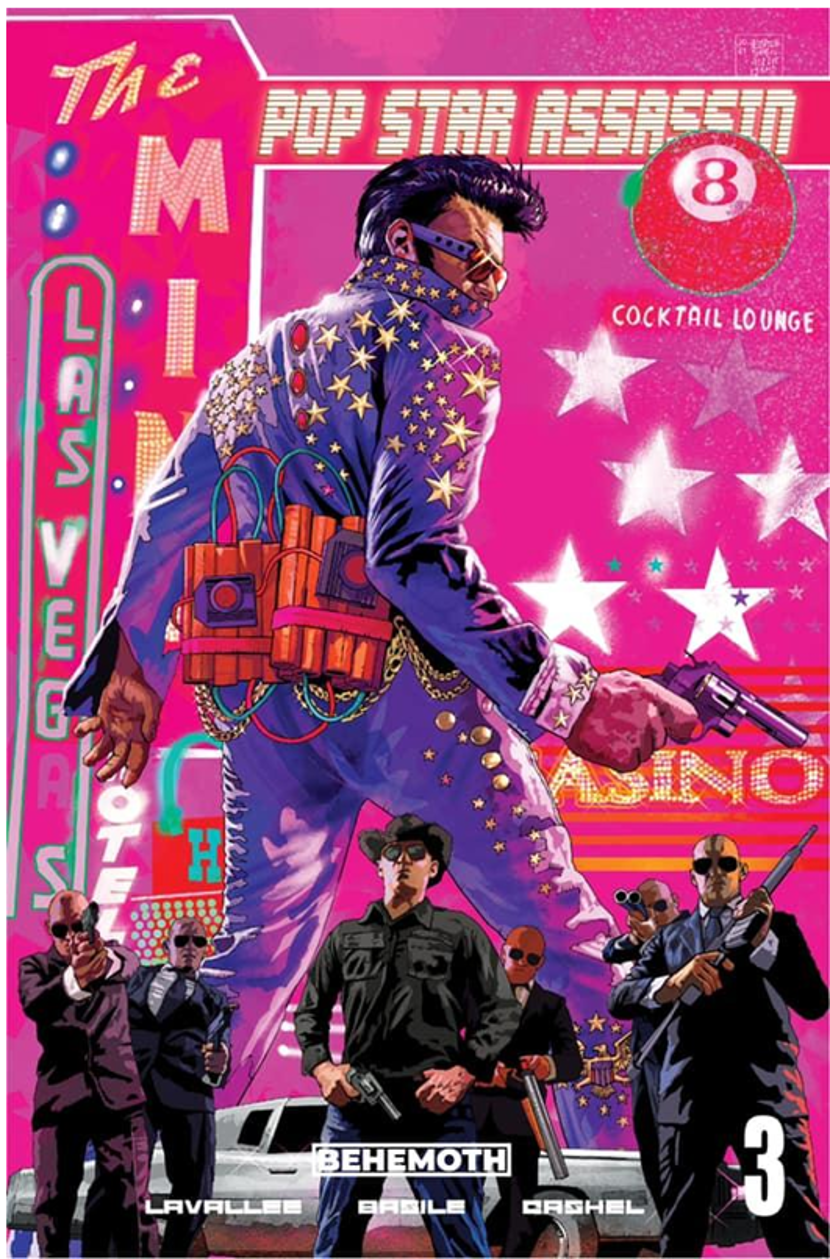
When it comes to cover work in general (comics, books and other projects), I was extremely lucky out of the gate. The first professional cover I did was for a British science fiction anthology magazine called Interzone, issue 218 which was nominated for an artwork of the year award.
A few years later, I was commissioned to do all the covers for the entire year for that magazine, and I decided that the six separate covers would combine to form a single poster image. A task I’ve decided to repeat with the six covers of my own Skullf***er horror comic series, which again, when finished and combined, will form a large poster image.

All covers require a balance of elements. Composition is vital. Visual clarity, a must. You want something that pops out and catches your eye from a news stand or a bookshelf fifty metres away. A powerful composition and bold colour scheme can help with this.
My biggest influences for cover art are probably from the era in which I grew up in, which formed the way I look at art.

Look at early 90s Simon Bisley, for dynamic and powerful poses and compositions and beautifully painted artwork. Glenn Fabry for his beautifully rendered painted covers on Preacher.
For action pieces, I’d recommend looking at the raw energy, the brutal angles and kinetic visuals of Geoff Senior and Kevin O’Neill, whose work in that period seems to explode off the page.
I’m also a huge fan of the mixed media art of artists like Dave McKean (especially his run of Hellblazer covers), Bill Sienkiewicz and the experimental paintings of artists like Jorge Zaffino. These artists have been a massive influence on my own multi-media style and the pin ups I’ve been doing recently for 2000ad.
Other important influences outside of comics you’d be wise to check out movie poster artist masters like Drew Struzan, whose technical prowess is second to none. Bob Peak is also very good.
The favourite of my own covers is probably my Vegas/Elvis suicide bomber variant cover for Pop Star Assassin, for Behemoth, which was the first US cover I ever did. Probably because as the title’s writer, informed me excitedly at 3am one morning, or thereabouts, that the cover was up in the lights on Broadway as part of a visual display for New York Comic Con.
I doubt I’ll ever get the chance to top that.
***
Michael Higgins
Cover Image: Fantastic Four 282
Publication Date: June 1985

My favourite comic book covers back when I was a fan were by Jack Kirby, Barry Smith and Neal Adams. By the time I was working in comics there weren’t too many of those anymore. I’m a pretty firm believer in the concept that what makes a good cover is a stark, dramatic image with large dynamic figures. The more powerful, the better. On the other hand, I also like comic covers that are beautiful, tame pin-up shots. Either way, the goal is to create an image that really grabs a reader’s attention with something enticing.
When I was an editor, my turn-to guy for well-designed pin-up covers was Sandy Plunkett. He did some beautiful work, and we teamed him with inkers like Alan Weiss, Kevin Nowlan and Craig Russell. That’s my idea of some good covers.
I’ve rarely drawn a cover myself. Notably, I was the one who re-pencilled the X-Factor #1 cover. Walter Simonson pencilled and inked the original, but Jim Shooter rejected it because Cyclops’ waist wasn’t thin enough, and over 20 years earlier in the first few issues of X-Men he was nicknamed “Slim.” Obsessive attention to insignificant, outdated details is not what someone who is looking to make a good cover should be concerned with. It really doesn’t matter at all. Do we really care how many times a Kirby costume was slightly different on a cover than the interior? I certainly don’t!
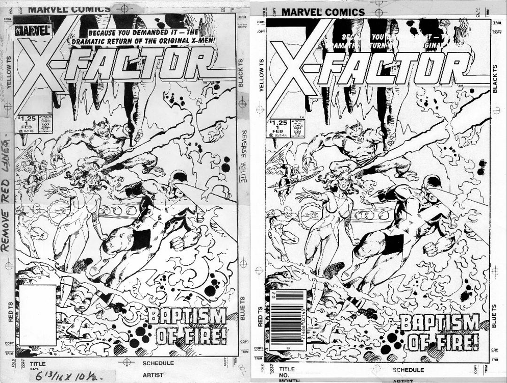

Joe Rubinstein inked the version of the X-Factor cover I did which was the one that was printed. If you ask me, Walter’s original is the better piece. In my opinion, Walter Simonson is one of the best comic book cover artists of all time. Fantastic sense of design, large, exciting elements and characters, all rendered with impeccable line work. He’s amazing, he hits the mark every time… and he’s been doing it regularly for decades!
One cover that really meant a lot to me was a Starbrand cover I did the pencils on (#9), blatantly swiping Jack Kirby, which I wanted to be obvious. It was a New Universe book intentionally filled with Marvel cliches, completely violating all of the New Universe rules. One of Jim Shooter’s obsessions was showing feet on covers.

He’d literally say things like, “If I don’t see their feet how do I know they’re standing on the ground?”
I don’t know. In the real world how do you do it? Anyway, I found the Thor cover by Jack Kirby with the two biggest full figures fighting with their feet showing and made a new cover out of it.
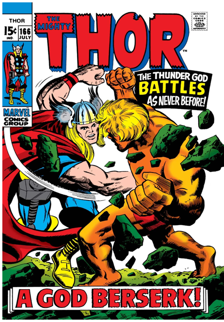
It was my impression of Shooter battling himself, Shooter as his own worst enemy, New Universe versus Marvel Comics. That one was very personal, although I was never totally satisfied with it.
I also once pencilled a Conan cover that was inked by Jim Lee. They reprint that cover every so often on Conan collections, so I guess it turned out okay.

But if I have to pick the cover I had the biggest impact on, I think it would be John Byrne’s cover to Fantastic Four #282. This might seem a little odd, especially given the fact that one of the very first things I ever did for Marvel was background inking on George Perez’s FF #194 cover… but even at that, I think I had more of a visual impact on the John Byrne cover.
In some ways, it may seem like this is not at all the type of cover I would like. Basically, it is four figures standing there doing nothing. At least that’s the way it started out. I can’t take credit for the idea, but when John Byrne handed in the “bare bones” inked image for that cover, he also explained that he wanted everything on the cover—the figures, the logo, the corner box and the copy—getting progressively smaller and smaller, receding into the distance.
I was the assistant editor on FF. I no longer worked in the Bullpen… but I think John Byrne and Editor Mike Carlin always knew I would be the one doing all the production work on this one. It may sound immodest, but I don’t think there was anyone at Marvel who could have done it as well as I did, let alone better. I was good at this. And, as John pointed out on his webpage, it “should be noted that in those days before computers and Photoshop, assistant editor Mike Higgins created the effects on that cover manually, with stats and literal cut and paste!” All true, and I guess I should mention that I also did the cover logo that was appearing on the FF at that time, and it looks like I lettered the copy on this cover as well. I’m all over it!
People have sometimes wondered how this effect was achieved, thinking there was some trick to it. There wasn’t. Using a proportion wheel, I had to figure out the percentage of reduction for every part of that cover—figures, logo, copy— at each and every stage as the image got smaller. The tricky part was to make sure that everything would fade back in straight lines, so it wasn’t just a case of shooting regular increments like 100%, 90%, 80%. That wouldn’t work. Each successive size had to be determined individually, and photostats had to be shot for each percentage of reduction.

Then I had to paste down every individual piece using two coats of rubber cement, cutting around every figure, every outline, every letter using a single edge razor blade with, well, razor precision! It was sort of like inking with a very thin blade. Then, on acetate over the guide coloured with Dr. Martin’s watercolours, I placed a sheet of acetate and using paint, I had to trace over all the black lines of the figures and lettering showing the different colours I wanted every section to become. Then, each colour had to be marked with the appropriate code for the separators to follow.
Normally, when we tried something out of the ordinary like this, the separators would find some way to really blow it. This was one of those rare times I worked on something so complex and in the end achieved the results I was hoping for.
I don’t think this was a stark, dramatic image at the onset, but I think in the end it qualifies. The receding, fading images themselves become dramatic elements! Instead of clashing figures, these colourful elements become the action.
One last thing that can’t be overstated is that the more unique an image is, the more likely it is to stand out and be remembered, and I think that’s true of the cover to Fantastic Four #282. I actually can’t think of any other cover like it.
***
Simon Jacob
Cover Image: 2000AD Prog 897
Publication Date: 22nd July 1994

Way back in the mists of time (i.e. the 90s) I illustrated a series for 2000AD featuring Armoured Gideon, a giant, rather clunky, interdimensional demon-busting robot, created with John Tomlinson, for which I supplied several covers. Of these my favourite is easily the cover for Prog 897 where I think the inside art was drawn by Mike White as part of a retro-flashback piece of storytelling. Most of the Gideon covers from this time became pretty much close-ups of what passed for the robots face, a deliberate move on my part in an effort to make the cover stand out on a newsagent’s shelf – a relatively simple, hopefully intriguing, image that can be easily grasped by someone browsing the magazine racks and maybe tweak their curiosity.
In the case of Prog 897 it’s a fairly restricted colour pallet, two colours essentially, with a big old lightning strike in the background in a homage to/rip-off of Miller’s Dark Knight Returns. The POV is looking up at Gideon in an effort to suggest scale. Caption – “He’s mad, he’s bad and he’s bigger than you!”
Drawing a giant robot like this is not a coincidence. I’ve always been drawn to what you might call ‘high-impact’ covers in a similar vein; Frank Miller’s Wolverine #1, Simon Bisley’s Lobo #1, Carlos Ezquerra’s Mean Machine cover for 2000AD Prog 284, Brian Bolland and Killing Joke – the list goes on – bold, impactful images which act as a gateway to the story being told.


Of course, there’s really no hard and fast rule to creating the lasting ‘classic’ comic book cover. If there were we’d all be doing it! I’ve been a fan for longer than I care to remember and there are too many standouts to name. A few favourites for me would be Jim Steranko, Berni Wrightson, John Byrne on the X-Men, Michael Golden, Alex Toth, Will Eisner, all on multiple covers – the list goes on.
As I sit and think about it, more names bubble up alongside images I haven’t thought about in years but that is the power of a great image that I can still recall them through decades of reading and collecting.
I still have the cover artwork for Prog 897 – it turned up in a studio clean out a few years back. I still like it!
***
Paul Williams
Cover Image: 2000AD Prog 2199
Publication Date: 16th September 2020
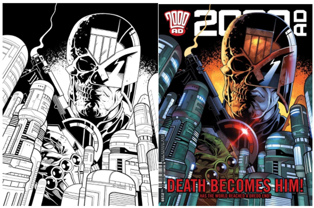
The temptation is always to go with your first because nothing is quite as sweet as seeing your art on the cover of a comic you love for the first time, but I think, truthfully, my favourite cover would be the one that adorned prog 2199 of 2000 AD. The image features Judge Dredd as the personification of death watching over Mega-City One, Lawgiver raised.
Having your work coloured by another artist – in this case, the talented Chris Blythe – can be a complicated thing to experience (especially if you’re a control freak, like me!) because someone else may take your art in an entirely different direction than you envisaged and that can be a tough thing to see. I must admit to having a few disappointing experiences with colourists, which comes purely down to having seen something different in my mind to the final result, but this cover is an example of them not only hitting it out of the park but exceeding what I could have imagined. Chris’s colours really pop and I think that what he brings to the piece really made it stand out on the shelf.
I should note that, although this cover fits thematically extremely well with the Judge Dredd story that was running at the time (‘End of Days’ by Rob Williams, Colin MacNeil and Henry Flint), I was not briefed to draw it for that story by editor Matt Smith (aka Tharg). As has been the case with every cover I’ve drawn for the Rebellion-owned comics so far, this was a result of me sketching an idea down and sending it off in hope. I timed this one well enough that it was commissioned and attached to this epic and it even served as the cover when the whole thing was collected for the Hatchette Partworks hardback edition, which was very cool to see.
As for what makes a successful and eye-catching cover…. I wish I knew! To be honest I’ve never considered one of my strengths to be the ‘pin-up’ style of illustration and so I am very surprised to currently find myself with 5 covers and 4 pin-ups under my belt.
I know what I like to see in a cover, personally, which is a scene from a story that 1) makes the character look as cool as hell and 2) makes you think “I wonder what on earth is going on here, I MUST buy this comic to find out…!”. But there’s also a more artistic side to some comic covers that I appreciate and would love to do someday, where it’s as much graphic design – leaning into negative space, a more art nouveau aesthetic etc – as illustration. This is what I was reaching for, in a small way, with my cover for prog 2407 in which I left a lot of the page white, but I’d love to really push the envelope sometime.

In terms of my favourite covers, I tend to keep an eye out more for specific artists. So, in the world of 2000AD, Cliff Robinson in particular always produces just mind-boggling works of genius and Dylan Teague really compliments his stunning line-work with the palettes he uses. Simon Davis is another, though he’s such a respected portrait painter in the fine art world that it would be surprising if he produced anything other than a masterpiece. I’m also a big fan of JH Williams III whose eye for design and layout is just beyond inspiring.
But, if you held a gun to my head, for a favourite cover I’d probably pick the one that stuck in my mind most from childhood which was the first time I glimpsed the character Armoured Gideon, lit by a strike of lightning, on the cover of 2000AD prog 897. I remember very distinctly looking at this giant, grimacing robot and thinking “WHAT is THAT…?!!”.”

***
Stewart Kenneth Moore
Cover Image: 2000AD Prog 2155
Publication Date: 30th October 2019
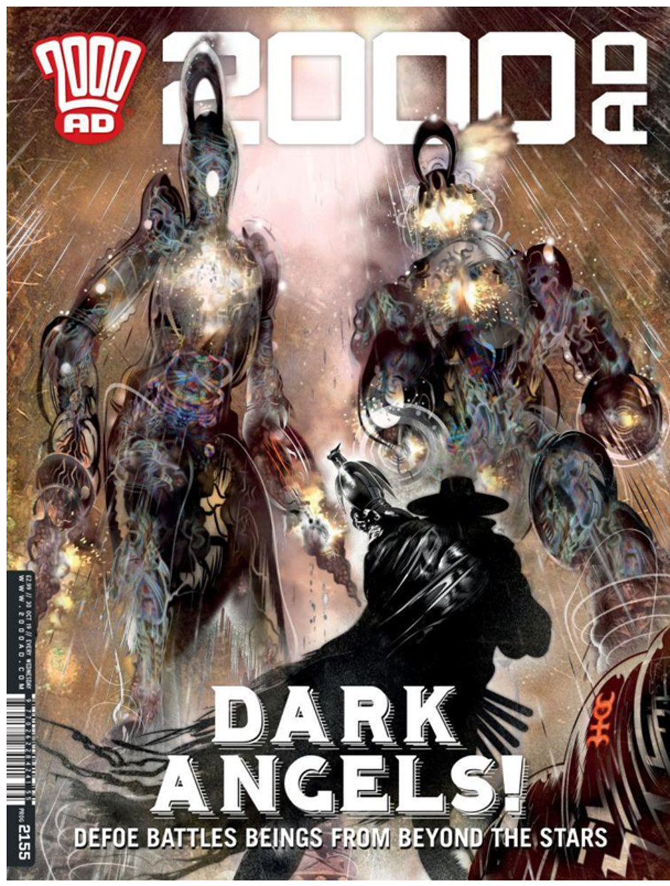
As a young artist I wanted to draw for 2000AD more than any other publication. I’m pretty hard on myself but I was surprised with how well I thought my second Defoe cover worked. Defoe is a big fella, but when he faces the ‘Angels’ in ‘The Divisor’ he is dwarfed by them. I deliberately drew the scene from the PoV of a solitary child looking up at bullies. If you’ve read any of Pat Mills posts on his childhood experiences of brutal priests in his school days, then you’ll understand part of what drives his writing on Defoe. I felt I got that composition right for that reason. It’s also a strange and alien image, which suits 2000AD. And finally, Defoe looks in the weaker position, and yet, he looks strong, perhaps even equally as terrifying.
I was pleased with my ‘Lockdown’ cover, it had just the right tone, I think. I pitched the visual and it so happens that while ‘the big two’ shuttered and sent their staff home, 2000AD kept publishing and getting delivered to fans during lockdown. So, the superheroes failed, but Judge Dredd was unstoppable. The Nerve Centre team should have been commended for that. I think Tharg and the Droids should have won an Eisner for their incredible efforts alone. My pitch just happened to be timely. I only learned later how well TMO did with getting the prog to fans.

Being asked to do the 2000AD Encyclopaedia cover was a total honour for this former 2000AD fanatic {I guess I still am!}. To see it as the backdrop of NYCC was awesome.

Getting a chance to do an oil painting on a Don Lawrence series was another honour. I cracked out my old oil paints in this case, as digital colouring just didn’t seem right in this case.

But I don’t think I’ll top my ‘Roadkill’ cover. I worked around the clock on that and think it caught the Dredd / 2000AD energy just right. 2000AD now use it on their site as a banner, which means I see it more than others I’ve done. It’s just the right shape for a banner.

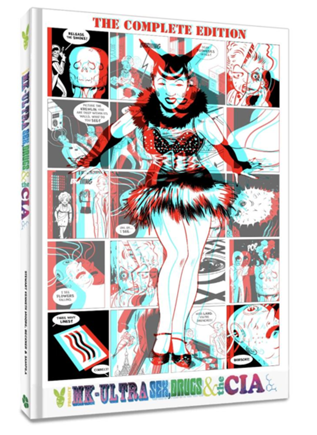
Finally, there is the cover I created for my graphic novel, The Complete Project MKUltra (Clover Press 2024). This was a real challenge. I had to learn how to create 3D art. In this case, for the cover, I managed to create 6 levels of depth. I’ve only ever seen 3 levels of depth in anaglyph 3D visuals. It’s not a boast though, this was total trial and error…and mostly error. Hank Kanalz and Robbie did a smashing job with that book, they even suggested I delve into the optical FX and designed an envelope inside the book to hold my 3D glasses. They also sent me a template for the glasses so I could illustrate them. So, the book has specially designed glasses – how cool is that?
***
As mentioned previously here are the appropriate links to the previous instalments in this series of articles. Each one features another suitably eclectic mix of ten incredibly talented creators from the comic industry.
Part Four.
Part Three.
Part Two.
Part One.
Plus, The Special Simon Bisley Covers Article.
https://tripwiremagazine.co.uk/headlines/simon-bisley-talks-about-his-favourite-comic-covers/











You must be logged in to post a comment.