

Comics News
Tripwire Asks Ten More Comic Creators What Makes An Eye-catching Cover Part Two

The Shop Window To A Comic
As promised after of a well-received part one, Tripwire’s contributing writer Paul Neal continues to ask ten more of our friends in the comic industry a deceivingly simple question.
“As a comic book professional, you have been in the position to help create or influence the creation of numerous covers for a variety of comics, would you be able to pick a favourite comic cover you have helped create? Also, in a few words perhaps would you be kind enough to explain your choice, and what you think goes into making a successful and eye-catching cover”
He began by sharing Bill Morrison’s thoughts on the subject…
Tripwire Note: For a full and in-depth interview with Bill Morrison about so much more the latest issue of Tripwire magazine has you covered.
Bill Morrison
Cover image: Simpsons Comics Issue 1
Publication Date: November 1993
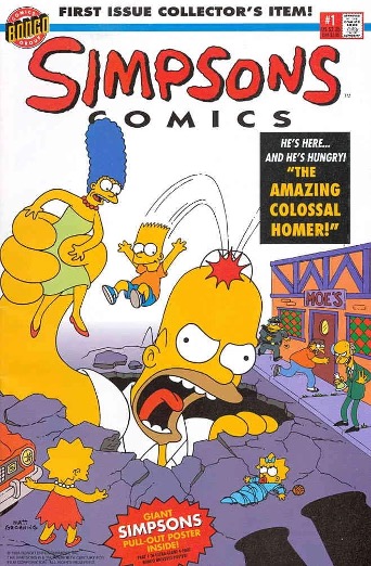
I tend to think of comic covers as I do movie posters. They should get the potential customer excited about what waits for them inside. So, the cover is the poster for the “movie on paper.” Also, like posters, they should be visible and clear from a distance. When a customer enters a shop, you want your cover to yell at them and say, “Come over here and check me out!” So, my favourite covers are the ones that have beautiful art that is intriguing and makes you want to read the contents of the book, with a clear and dynamic design that pops out from all the others surrounding it.
When Matt Groening, Steve Vance, Cindy Vance and I were planning our launch for a new comic book company called Bongo in the early months of 1993, I was tasked with coming up with some promotional ideas to let the public know that an entire line of Simpsons comic books was headed their way. Steve suggested that we try some classic comic-book cover parodies, so I started making Simpsons-centric sketches based on some of the most iconic comics images of the past.
When I presented these sketches to Steve, he instantly zeroed in on one of them, a Fantastic Four #1 homage. Steve loved the idea of launching the company with a parody of Kirby’s classic Fantastic Four #1 cover, so he asked me to draw it up and ink it for the cover of the first issue of Simpsons Comics! In fact, Steve was so inspired by the idea of Homer as a giant, rampaging monster, he decided to write the main story of Simpsons Comics #1 based upon the cover!
Steve’s instincts couldn’t have been more acute, because not only did the issue sell like crazy, our story, The Amazing Colossal Homer, was nominated that year for the Eisner Award™ for Best Short Story! And in July of 1994, Steve, Cindy, and I found ourselves at San Diego Comic-Con on the Eisner Awards™ stage, accepting the trophy from Will Eisner himself!
Winning that award for our very first effort was a wonderful way to make our entrance into the world of comic book publishing. Sadly, Jack Kirby passed away just a few months before, and I’ve always felt that the only thing that would have made the honour sweeter was if we’d been able to publicly thank him for the inspiration that led to it.
Joseph Michael Linsner
Cover image: Crypt of Dawn Issue 5
Publication Date: 1998
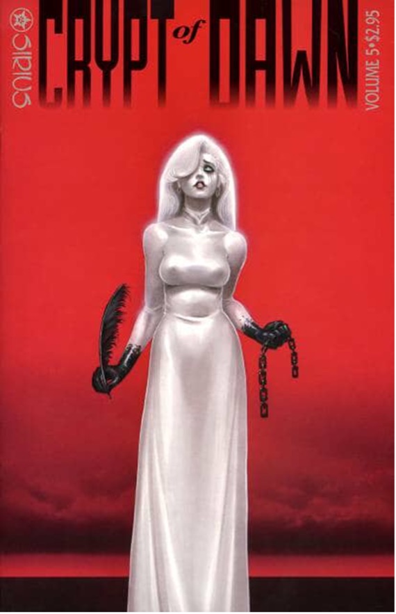
One of my favourite covers was to Crypt Of Dawn #5. I love its streamlined simplicity. Every element comes together exactly as I pictured it. Some covers start out as vague images which you have to hammer into shape, others pop into your mind’s eye fully formed like a Polaroid. This one was like that. I also love it because it’s my personal reaction to realising that I had signed a bad contract — hence the chains and the plume.
As far as covers go, I’m always drawn to bold, striking images which grab the viewer instantly. My hero, Frank Frazetta, was a true master of this. He often used a triangular composition which drew your focus to the most important part. That is enhanced by theatrical “spotlight” lighting. Reality is gladly tampered with-it all-in service of a striking image.
Frazetta became such an icon because his work reproduced well at any size. High contrast images with clear and solid compositions — they still looked great printed in b&w or the size of postage stamps. That’s a tough one to pull off!
Almost every cover employs some type, so I always work that into the initial composition. Nothing drives me crazy like bad production design. Logos or type over a characters head makes me want to kill! Whenever possible I will indicate exactly where and how I want the type.
It’s all a work in progress. Some things always work better than others, but I always push myself to try out new things. The best is yet to come…
Dan Brereton
Cover image: Nocturnals Halloween Noir
Publication Date: 2025
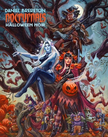
When I’m concepting a cover illustration, there are three ways to go that pop up right off the bat: montage, setting and portrait (partial figure). I try to imbue the image with the most important things the viewer needs to know. I want to lead the eye around the composition in a pleasing way. I want the colours to be striking and work well with the contrast and an effective light pattern. To draw your eye to the book and keep you engaged.
One very important aspect is the relationships of shapes in the composition – they should all work together, never against each other. The eye should keep moving around the picture. Bad “tangents” that confuse or flatten the picture should be carefully avoided. The same goes for placement of the masthead or title logo.
It’s often not my job to place the masthead. I’m not even told where the title is going to be, half the time. I try and make sure there’s enough room. When I’m designing my own books this is all up to me. When an editor or art director is open to it, I’ll provide input into the colours and placement. I think being a good illustrator means that you are at the very least a competent designer. Design is so important to the success of a cover image. Design is the least artistic part of the process, because there is very little grey area to the principles of good design. A thing either works or it doesn’t.
One thing that a lot of cover artists will tell you is when you send in a group of roughs to be chosen by the client – quite a lot of the time they will pick your least favourite. A fellow illustrator once put it simply, “Don’t show them anything you don’t want to do!”
Jimmy Broxton
Cover Image: DRACULINA #1 W 1:15 VIRGIN VARIANT BROXTON RISQUE RETAILER INCENTIVE
Publication Date: January 2022
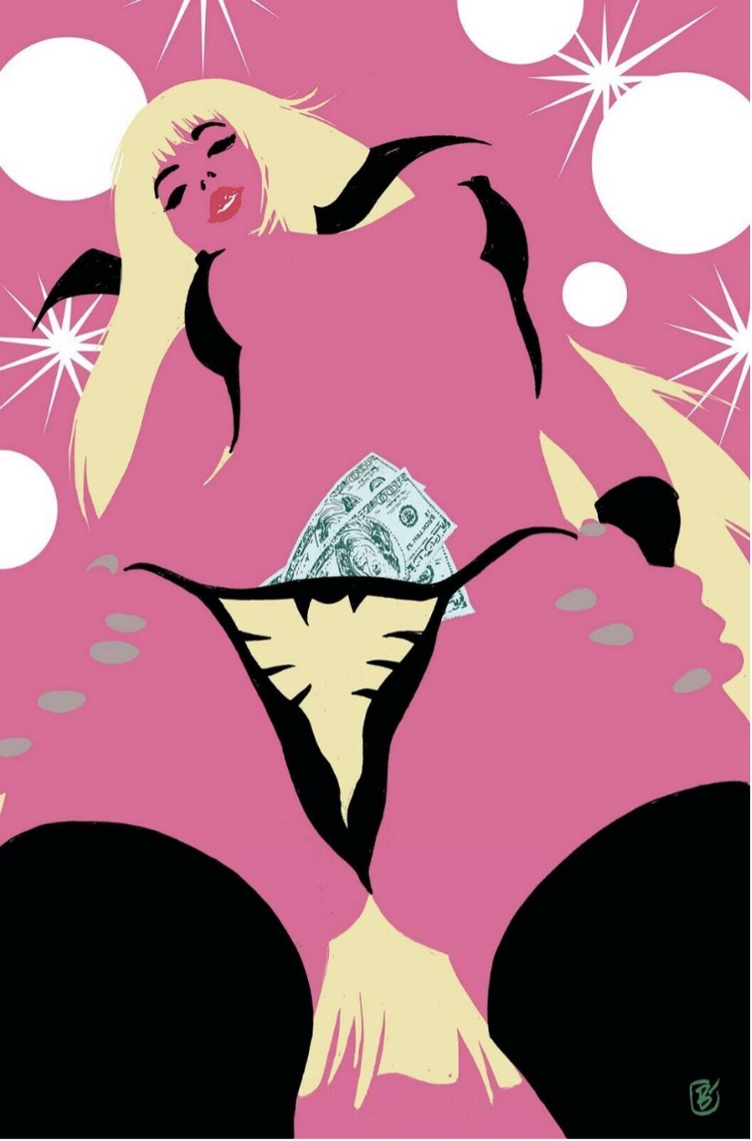
What makes a great cover? There are generally two types of cover, one that depicts a scene from the story that acts as a teaser to entice the reader (these covers are less common nowadays), and the other is a pin-up or generic shot of the lead character, that tells us nothing about the story but just looks cool and eye-catching.
There is a third, one that almost breaks the “4th wall” and actively makes the viewer part of the story or scene depicted. Tricky to pull off, so hardly ever done. I attempted one with this Draculina cover from Dynamite comics.
I was commissioned to do a suite of covers, various characters, with a decidedly risqué feel. Here, we have the titular character, looking down at us, in a strip club setting. We, the viewer are the customer, and that’s our hard-earned cash we’ve just stuffed into her fetching G-string.
Not well known, but most comic artists spend nearly all of their free time in strip clubs and titty-bars. It’s our natural habitat, we get to study anatomy, booze like sailors on shore leave and, best of all, offload some of that undeclared tax-free cash accumulated from convention appearances. I’m not saying this is a great cover, but I had a great time getting the inspiration for it.
In short; a great idea. Of course, the execution is important, as is the design and typographic elements (which must all work together and combine to produce a whole, that, if you’re lucky is greater than the sum of its parts).
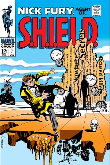
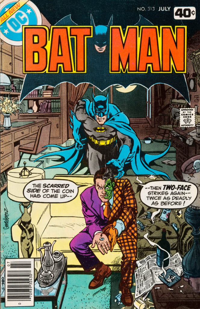
Perfect examples of this would be Nick Fury Agent Of SHIELD #7 by Steranko, Batman #313 by Jose Garcia Lopez, Alien The Illustrated Story by Walt Simonson (with Archie Goodwin), Rocketeer Adventure Magazine #1 by Dave Stevens, and GI JOE #1 (Extreme) by Frank Miller.

Val Semeiks
Tripwire Cover Pick Image: Conan The Barbarian 207. Marvel Comics
Publication Date: Feb 1988
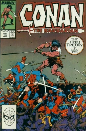
For me it starts with a great drawing. I like comics because I like illustration, and I appreciate the talents of those who can do it well. A lot of covers are exercises in typography and graphic design with very little art. While I can appreciate that too, it’ll never make a favourite comic book cover for me. A great drawing needs content. I want action and visual dynamics. I like monsters and dinosaurs, fantasy and science fiction, pretty girls and big muscles – all the stuff that’s the fabric of my favourite comics. I like funny too. A little outrageous humour can make a cover special. Put it all together and you end up with my favourite covers.
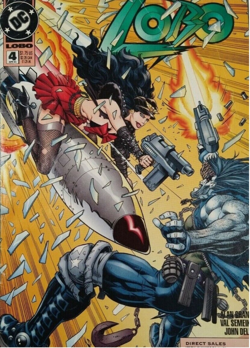
Now I’ve drawn a lot of comic covers and I have a lot of favourites, so I can’t pick just one. But here are a few that I really like.
Conan #207. This is a great action shot. Geof Isherwood did a fine job inking my pencils. I’m a huge Conan fan and this is the kind of fight scene that breathes life (and takes it away) into heroic fantasy. Fans liked this one too. The original art for this cover sold at auction for over $11,000.
Lobo #4. Sometimes I wonder how this one got by editorial censors. Super-hot, psycho biker babe faces down the ultra-machoman, Lobo. And the rocket between her legs is bigger than his. Beyond that, the image just about jumps off the page. Terrific inking by John Dell and colouring by Gloria Vasquez.
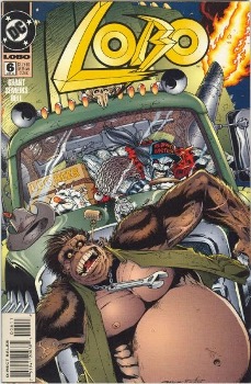
Lobo #6. Let’s see, it’s got an ape. An ape with a corncob pipe and a crescent wrench around his neck. Dawg is smoking Lobo’s cigar. The Mack truck style bulldog hood ornament on the nose of the space truck is a little statue of Dawg. This drawing is an outrageous mashup of genres and is full of fascinating detail. I find it hysterical. It’s the only original art cover from the Lobo series that I still have. I’m glad that John Dell put up with all that’s crammed into this image.
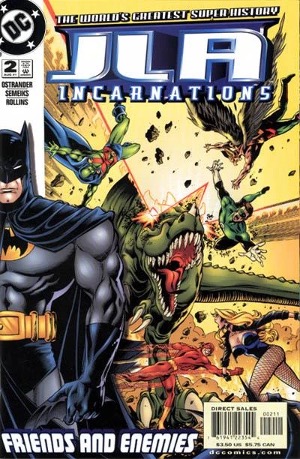
JLA Incarnations #2… Batman. A dinosaur shooting energy beams from its eyes. I don’t know what you like in a comic book, but this does it for me. The seven issues in this series shared a cover design layout. Big superhero to the left with an action scene to the right. I thought it worked well. Nice job inking by Prentis Rollins.
There have been so many outstanding covers by so many artists over the years. You could put together a book filled with nothing but iconic covers. What cover would go on that book? Good question. Share a drink debating that one. Publishers want covers that sell the book. They want the book to draw the buyer’s eye and stand out in a crowded comic shop display.
There’s no magic formula for this and lot of different designs get it done. Of course, artists want the book to sell too, and they want the best cover to do it. Sometimes editors and artists agree on this and sometimes they don’t.
When I do a cover, I’ll start with layout sketches to work out the idea and design. Usually three, but as many as it takes to get to a good cover. I find this process interesting and if you want to see some of mine, please visit the Sketchbook section of my website, www.valsemeiks.com
David Mack
Cover image: Echo 1
Publication Date: November 2025

My cover to the new Echo #1. Echo is a character I created over 25 years ago on the very first Marvel Comic I did when I started out as a writer at Marvel on Daredevil #9. Joe Quesada asked for a new character in that story, and that became Echo. I integrated sign language spelling her name, and handwritten words. I used bold covers to grab attention of the viewer. and to contrast her skin tones and hair colour I used cut out coloured paper to collage the designs around her to attract the viewer’s eye to the cover.
Yıldıray Çınar
Cover image: Superman/Batman World’s Finest issue 32
Publication Date: May 2015

I still have a deep affection for this piece, which was truly a cover of mourning. When my editor gave me the brief for that issue, I remember how vividly the image took shape in my mind and how satisfying it was to put it down on paper.
To symbolise Lois’s death, I felt that using a single colour and a heavy presence of black was more than enough. Interestingly, this was the only cover in my career that I sent straight in without first submitting a draft for approval — I trusted the work completely. In the end, it was approved and published just as I had envisioned.
I have so many favourite covers that would be so long to share. A cover is striking when the composition, balance and eye leading is right.
Dan Cornwell
Cover image: 2000AD Prog 2217
Publication Date: February 2021

Designing a cover has many elements you need to achieve to make a classic or striking image. Personally, I think there are two main elements you need to hit.
1: Does it tell a story? Is it intriguing enough to make you pick it up and want to read it?
2: Does it stand out? Is it striking to look at? Does it pop on the shelf more than the others? Harder than you think when it comes to comic book covers as they’re all vying for your attention.
Composition and technique are key factors as well. You could make a striking cover, but it could be for all the wrong reasons if the composition or execution is glaringly wrong. Poor anatomy or a confusing narrative will also hinder your goal.
Now I’m no master of covers, but I did hear a quote from Frank Miller that said something along the lines of “if it looks good and is easy enough to decipher when it’s at the size of a postage stamp, then you’re onto a winner“. I’m paraphrasing, but he’s dead right.
As for my own personal favourite covers I’ve created I would probably choose 2000ad Prog 2217. This was my first cover for 2000ad and featured Judge Dredd, my favourite comic character. Whether it ticks all the above points I mentioned, I’m not sure. There’s not much narrative to it, but it looks cool, so I suppose it ticks one.
The other I have a soft spot for is the cover I drew for the Spector collection – written by John Wagner – which was released this year. There may be a slight narrative to it but again, it looks cool and stands out from the crowd. I was asked by Oliver Pickles, the editor, to redraw a panel from the first episode that was drawn by the series co-creator Carlos Ezquerra. I had to think of a way to do it without straight out copying the image. I had recently seen a poster from the 1920’s film Metropolis, and it gave me an idea. Maybe I could turn the head shoot of Spector into a cityscape? Thankfully it worked and seemed very popular. It’s also a bit of a puzzle, some can’t see the face in the image, then when you point it out it’s impossible not to see it. Obviously some see it straight away.

Bill Sienkiewicz
Publication Image: Elektra Assassin 1
Publication Date: August 1986
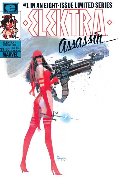
In simplest terms, a “successful” cover is the perfect blend of artistry, advertising, marketing and sales. It’s a piece that intrigues a potential reader enough to select the book, magazine or comic from a store display (in this case, a brick-and-mortar store) hold it in their hands, leaf through it and ultimately, purchase it.
That’s the corporate, economic goal.
Additionally, for me, the most iconic covers have a wonderful mix of the new and unusual and a certain timelessness, making the resulting image almost an inevitability in terms of a cultural language.
Being asked to choose one of my own covers that I consider “successful”, perhaps the one that caused the biggest degree of controversy (controversy equals attention equals publicity equals curiosity equals potential for increased sales) was the cover to Elektra: Assassin #1
At the time, (and I stress this fact: at the TIME) it was a very unusual decision to do this cover the way and for the reasons I did. First, and foremost, it was a twist on all the tropes of the debut issue of any character. I wanted to let readers know exactly what they were going to get. I fully intended it to be mix of usual heroic badassery and over the top satire.
Here was a female character, tall, lanky, relatively slight with a runner’s physique instead of that of a zaftig or buxom weightlifter effortlessly holding a machine gun that weighs at least 75% of her soaking wet, (AND a sai in the other hand because overkill) looking nonchalantly at the reader, doing all of this while standing in improbably high heels.
It was and remains a quite ridiculous image. It’s also -by today’s over the top steroidal standards an almost quaint, restrained, and adorably understated piece of nostalgia.
At the time, it upset people. Newspapers (Google them) reviewed the series, using the cover’s Elektra figure enlarged over four times from the printed comic’s size, along with the admonition to parents, “We must protect our children from this. “
We don’t get publicity or advertising gifts like this all that often. So of course, we absolutely ran with it. In short, all of what accompanied the series debut was a perfect storm of timing, brilliant writing by Frank, narrative chance taking, societal and religious infighting, politics, cultural change, wild exploration of the medium, etc.
Now as to whether I’ve answered the question if what really makes a successful cover, I don’t know. The example I offer is more the exception, not the norm.
Dakota Alexander
Publication Image: The Hunter 1
Publication Date: Halloween 2025
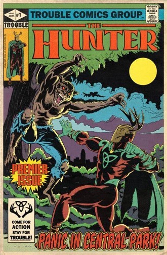
I think it all comes down to the essential, albeit diplomatic, question: What kind of comic are you making?
Bronze Age Superhero: I think Marvel had the best approach which was to give the potential buyer a peek into the story by presenting the Hero vs the main antagonist, also with the hero in a position of danger. This, to me, immediately suggests tension and suspense- inspiring the question of How the heck is the hero gonna get out of THIS?” Furthermore, these covers were so rooted in layout and composition because you had to provide the conflict, the setting, and often times make space for a few words balloons and text blurbs. You learn about the story without having to open the book, but it also compels you to open the book to learn more.
80’s Superhero: Basically, Mike Zeck is the model of how to do this. Zeck gives you kinetic action, metaphor, tremendous detail, and beyond anything else, intensity. Covers were less about giving narrative insight and more an encapsulation of the story in a more poster-type layout. Any one of Zeck’s covers at this point could be posters in your room. They are all THAT good.
80’s non superhero: really the sky is the limit. You can approach it metaphorically, ironically, literally. Tank Girl had amazing covers for their shear sense of comedic composition. Brian Bolland was similar in many of the same respects though his usually had a much darker layer underneath. Love and Rockets had covers that ranged from ironic takes on layout you’d see in Romance comics, to an almost photographic representation of a punk show. So, it’s very much concept and execution and tone. But it’s gotta be good.
From the 90’s on it can go however you like because the flood gates were opened by this point. And while superhero books were “extreming” themselves to death trying to fit the Image comics model, we have all the new guard of Dark Horse and Vertigo giving us works of Fabry, McKean, Miller and Mignola just to name a few. Books are no longer simple episodic pulp action tales, but longer, more thought-out pieces that took the medium to a more sophisticated level. So, a cover at this point can be relevant or just art. As long as it’s good and has some passion.
AS FOR MY WORK. I have only done a few covers in my career prior to making my own creator owned book, The Hunter. Which is my official pick!
I made a lot of mock covers and my absolute favourite of those was my mock cover for an imaginary Bronze Age Batman Halloween story. To me, it ticks all the boxes of a compelling bronze age superhero cover. Plus, it’s Halloween. I loved it so much I actually homaged it for a fake Hunter Halloween comic as well.

Andrew Sawyers
Publication Image: Feral 13
Publication Date: November 2025

My favourite cover I’ve created would be right now, the cover for Feral n°13 (my lucky number and due out this November)
Quite simply this began life as a commission, and it now resides in New Zealand!!! I wanted to do my own take on Frankenstein, and once I’d got the idea down painted this with the theme in mind, that it’d be along the lines of the old Creepy and Eerie covers!
I pretty much drew from the heart on this one, so I’m proud it functions as now intended and look forward to seeing it grace the shelves of newsstands across Europe. Serendipity would have it, as I’d centralised the main figure – and utilised the top fifth of the painting to get in a dramatic skyline it worked perfectly accommodating the cover furniture. Giving birth to a new strip and character to boot, I created a brand-new strip to accompany the cover – Detective Frank Stein!!!
Favourite covers, too many – but I’d list Alan Davis’ Uncanny X-Men No. 213, Brian Bolland’s Eagle Comics Judge Dredd No.4 and the stunning Love & Rockets No.24.
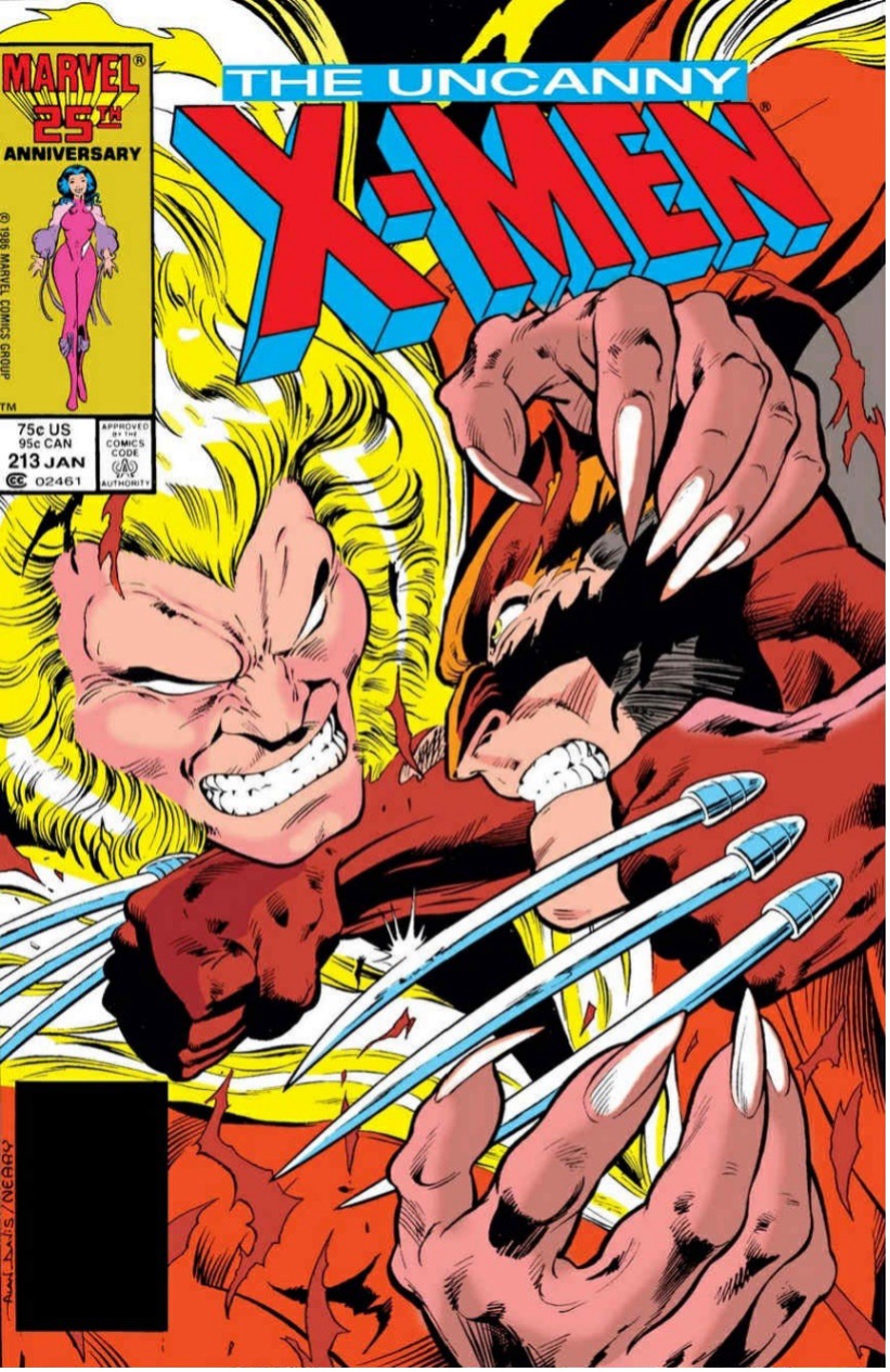
I could go on – there’s hundreds of covers I love, Gibbon’s Watchmen, Sienkiewicz’s Elektra, anything by Bisley or Jock!
Ultimately something that is eye catching, has strong design and thematically alludes to the story inside – much like any good film poster or album cover.
Here’s part one
Ten Comic Creators Explain What Makes A Really Good Comic Cover Part One
Tripwire assures you that Paul Neal is far from done, and Part Three of his ongoing series of articles on the subject of what makes a truly eye-catching comic cover will be well worth the wait.






You must be logged in to post a comment.