

Comics News
Tripwire Asks Ten More Comic Creators What Makes A Truly Eye-Catching Comic Cover Part Four

Selling The Insides?
As promised after well-received Parts One, Two and Three, Tripwire’s contributing writer Paul Neal continues to ask ten more of our friends in the comic industry a deceivingly simple question.
“As a comic book professional, you have been in the position to help create or influence the creation of numerous covers for a variety of comics, would you be able to pick a favourite comic cover you have helped create? Also, in a few words perhaps would you be kind enough to explain your choice, and what you think goes into making a successful and eye-catching cover”
Links to previous instalments of this series of articles are provided at the end. We began by sharing Joe Pruett’s thoughts on the subject…
Joe Pruett
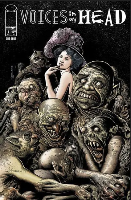
Cover image: Voices in My Head (Image Comics.)
Publication Date: 2024.
When I’m asked, “what makes a great cover,” there are several things I can point at to tell you what works for me.
One: If I’m standing 10 feet around from a wall of comics on the shelf, where dozens of new comics are displayed each week in your local comic book store, does it “pop” out to me? Easily, the best way to assure that your cover stands out from the crowd is by colour scheme. If you try this little test and do exactly as I describe above (standing 10 feet away), the first thing you’ll notice is that 80% of the comics on the wall have a dark cover, usually a dark blue background. By choosing a brighter colour (white, yellow, orange, etc.), your cover will “pop” off the stands, separating itself from the horde of darker covers on the same row.
Two: What does your cover say about the comic and the story within? Does it make you want to pick that particular comic up and open it up to see what the story is within? If it doesn’t, then your cover doesn’t work. The cover should be designed to entice you to want to read the comic. If it’s just headshot or something non-dramatic, odds are the casual reader would not be inclined to “thump through” the comic, let alone purchase it.
A perfect example for me comes from my all-time favourite artist, Brian Bolland. I could easily pick from dozens of examples from his work, as he is a master in creating iconic, eye-catching moments in time that make you pause to admire as you glance through the week’s new offerings in the comic shop., but I’m going to choose Wonder Woman #72 (DC Comics, 1993) and my own comic Voices in My Head (Image Comics, 2024).
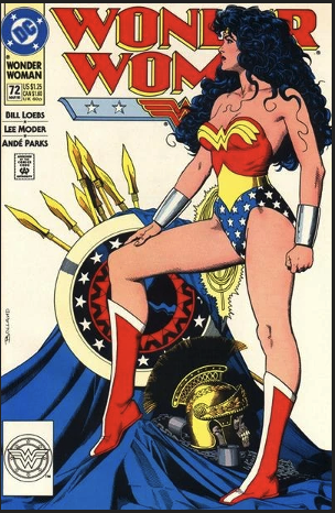
You look at this cover from Wonder Woman #72 and, even if you are a new reader to comics and are the one person in the world who does not know who Wonder Woman is, you will feel you know the character after looking at this cover. From the pose, you know she is heroic and proud, From the items drawn into the background, you know she’s a warrior. She has a majestic aura about her. And the white background will assure that you see it from 10 feet away standing out in an ocean of black and blues.
The cover Brian drew for my Voices In My Head #1 comic is just so effective. It creates a conversation in my mind. One can’t help but look at it and wonder why is this beautiful, sophisticated woman sitting among these grotesque, terrifying creatures. The contrast is just so offsetting that the viewer can’t help but stare and study the drawing. When Brian sent this image to me, it just spoke to me that it inspired me to write a shot story about it, which I included in this comic. A cover that inspires a story to be written around it is a story that works,
***
Simon Fraser
Cover Image: Richard Matheson’s Hell House 1 (IDW Publishing)
Publication Date: December 2004
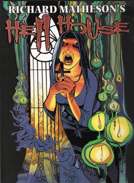
That’s a difficult question to answer at this stage. I suppose it’s the first cover for the Hell House adaption that Ian Edginton & I did for IDW. It’s a total ripoff of the work of Friedensreich Hundertwasser, who was my favourite artists at the time. I thought it came out really well and I still do decades later.
I learned to colour from Hundertwasser. He was really good at putting really bold colours together. So, a lot of my early colour work was me just ripping off his colour choices. Then I got the chance to rip off his visual tropes too. Which I really enjoyed.
It’s heavily rooted in the Viennese Art Nouveau movement, which was a big influence as I had lived in Vienna for 3 years at that time.
A good cover has to engage. On a crowded shelf it has to stand alone and be uniquely compelling. It has to explain the contents of the book, but it’s allowed to exaggerate, even lie a bit. The trick is to make a composition of the elements of the book that is dramatic, exciting and clear. The more elements you choose, the harder it is to balance them out.
Often the strongest element is a face. We are attracted to faces. So, the temptation is to use an attractive face, but then the danger is we arrive at a generic image. Movie posters are very good at this. The stars are front and centre, because these are already people we know or care about. A comic cover can’t rely on star power, so we lean into graphic power. Colour and composition giving both simplicity and implied complexity and depth.
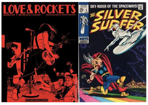
The Love & Rockets cover because it breaks all the rules but guides the eye around the image brilliantly and it’s graphically superb.
The Buscema Thor/Surfer one because it does exactly what it says on the tin. It’s just about to explode in your face.
***
Roger Langridge
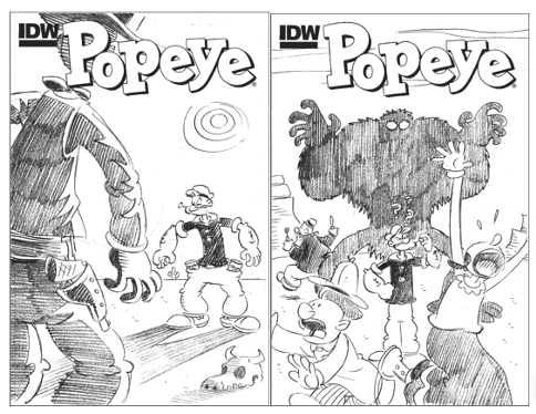
Cover Image: Popeye 7 (IDW Publishing)
Publication Date: November 2012.
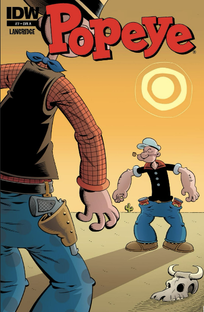
Here’s a cover I drew which I was very happy with, for IDW’s Popeye #7 (November 2012). I like it for a few reasons: the composition is simple and direct, so it reads clearly from a distance; the colour is bright enough to draw the eye, but still harmonious; there’s a half-decent gag in there (Popeye has cans of spinach where his enemy has guns) which isn’t necessarily obvious at first glance, so it rewards closer examination, and yet it’s not so well-hidden that it could be considered obscure. Also, I think it’s one of my better renditions of Popeye himself.
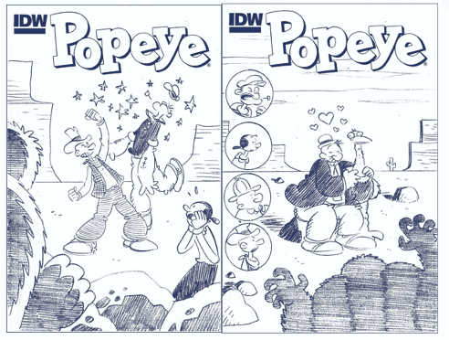
Generally, I compose a cover by first drawing tiny thumbnail sketches in blue pencil, trying out different ideas. I draw these quite small, maybe a quarter of the size of the printed cover. This forces me to think in terms of shapes and light and shade more than fine details, which aids me in composing something that will read well from a distance on a shelf and will hopefully be more impactful. After I’ve drawn as many of these doodles as I can think of, I’ll pick the three or four I think work the best and work those up into more detailed roughs – still very small at this stage, just to nail down the concept and a few of the bigger decisions about lighting and body language. What I’m looking for is something that would grab me as a reader, ideally involving the title character. I don’t really have any rules or principles guiding me beyond that; the only way I’ve found to reliably come up with a good cover design is by drawing a lot of ‘em and weeding out the weaklings! At this stage either the editor (if I’m working for a publisher) or I (if it’s a personal project) will pick one to take to final art.
***
Mike Perkins
Cover Image: Lois Lane 3 (DC Comics)
Publication Date: 4th September 2019.
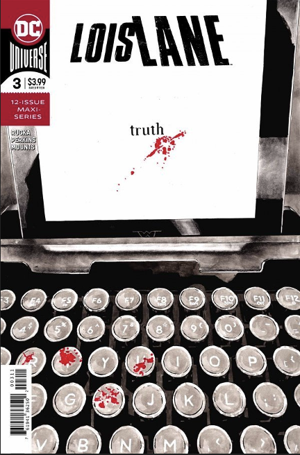
I think my favourite run of covers are always those where the design of the cover becomes an important part of it. If you look at Dave Johnson’s covers, as a prime example, you can always see that design element shining through.
With that in mind, I truly enjoyed the Lois Lane covers I produced and, in particular, the cover to issue 3. Here we just concentrate on Lois’ retro I-pad keyboard – spelling out the word “truth” – the used letters on the keyboard covered in blood signifying the blood, sweat and tears Lois puts into her work…particularly in this series where Greg Rucka and I concentrated on what it means to be a journalist in today’s world where the leader of your country is saying that it’s all “fake news”. The blood splatter on the screen is also a subtle nod to the Daily Planet logo.
***
David Hitchcock
Cover Image: 2000AD Prog 2134 (Rebellion).
Publication Date: 4th June 2019.
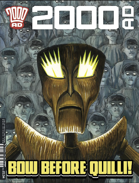
I have produced many comic covers over the years, for various publishers both in the UK and the US. Also, many for my own self-publishing efforts beginning way back in the 8Os with Spirit of the Highwayman and many other indie publishers titles. A cover image needs to grab the viewer, so I always do a variety of sketches, from different angles with a number of different design elements and then work up the best one.
It’s pretty difficult to pick a favourite, because they all serve the purpose individually. If my arm was brutally twisted to pick one it might be my first 2000AD cover, as I coloured that one too. It featured Qulli, a scary wooden puppet type created by Laura Bailey. I illustrated a grand sum of three Terror Tales and two covers featuring the character, two of the stories were favourably reprinted in the Best Of Terror Tales compendium from a few years back.
I’ve done three covers for Dark Horse, Frankenstein: New World, Grendel and a Young Hellboy which I was very lucky to get. I’ve got my fingers crossed for more, but the American market is very difficult to get into, or rather, getting work on a regular basis is very hard in my experience. Obviously publishers initially rely on the popularity of the artist to visually sell comics. But if you don’t get regular work readers won’t recognise you.

I love many artists work, too numerous to mention, from various eras of comics in general, but if I had to single out just one it would have to be the King of Comics, Jack Kirby. As a child you could instantly recognise his powerful poses and dynamic action it literally leapt off the page at me. A case in point would be the UK Avengers reprint, that premiered on the 22nd of September 1973— how can I remember that to such detail you ask? It’s my birthday! I was ten years old shopping with my mum in the town centre and BAM, these super characters leapt out at me from a blank white cover—- Cap, Thor, Iron Man and others, I just had to get my hands on that comic.
At the time I didn’t realise it was a kind of an amalgam of the covers to issues of four of the American series. It just goes to show that even if you cut up and rearrange a Jack Kirby cover it still has the power to knock you for six. I love Kirby’s Thor run, again the powerful godlike covers of any issue would totally grab you and that is what a great cover should do. There’s a reason he was crowned THE KING.
***
David Millgate
Cover Image: 2000AD Prog 2129 (Rebellion Publishing)
Publication Date: 30th April 2019.
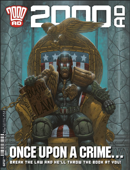
Well, after giving it some thought…I would have to pick the Judge Dredd cover I did for 2000AD as my personal favourite. Partly because of how that one came about.
I remember I had the tagline ‘Once upon a Crime!’ and the idea that Dredd would be sitting on a throne holding The Book of Law in my head before I even picked up my pencil.
The other fortunate thing was the big heavy lookin’ book he’s holding, which gave Matt Smith the opportunity to add ‘Break the Law and he’ll throw the book at you!’ It all just fell into place and came together really easily.
Dredd’s so iconic that he even looks cool when he’s sitting down!
With comic book covers, an idea might be inspired by the script and story you’re working on (?) or a snapshot of a moment or action. There are no rules…or if there are they are there to be bent or broken!!
I’ve heard artists saying “Oh, You should never have a character with their back to the audience!”, but that’s not always the case. I’ve seen some really great covers of Batman, Dredd and various others all with their backs to the viewer that were brilliant, moody and iconic!
Sometimes a cover can be really powerful when you show a character that is usually depicted in a kick-ass action pose doing nothing except being calm and more enigmatic.
One of my favourite covers of all time is ‘The Death Dealer’ by Frank Frazetta. The character’s not even moving, he’s just sitting on a horse holding his axe, but it’s such a cool and striking image. The only slight movement is the horse’s tail, as a few scavenging vultures circle above.
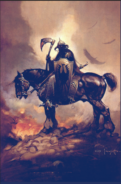
The finishing touch is Death Dealer’s eyes glowing red, that suggests this dark figure has some kind of supernatural power!
I never get bored looking at that painting…it’s a stone cold, fantasy cover classic! Basically, if the cover art is great and it jumps right off the page at the viewer then it’s done its job!
***
David Finch
Cover Image: X-Men 200 (Vol 2). (Marvel Comics)
Publication Date: June 2007.
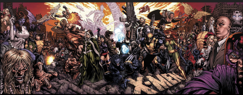
My favourite cover of all time is my cover for X-Men issue 200. It’s a four-page spread cover featuring every character that had appeared in the X-Men up to that point. I think that it was 2007, or maybe 2008. John Byrne and Chris Claremont made me a lifelong comic book fan, so X-Men is very special to me.
The cover took weeks and a lot of back and forth to make sure that we were as thorough as possible, but when it was previewed, fans found missing characters and other errors, so I went back in and made changes to make it right. It’s so rare for me to have the chance to get feedback from fans and implement changes like that. Generally, I do the work and then find out where I’ve made mistakes after it’s too late to fix it! Just knowing that we were able to include fans that love X-Men as much as I do was very, very special to me.
There are lots of different things that go into making a successful cover. For me, I know that there are easy tricks that I can rely on to get the best cover possible, and then there are other tricks that I find much more difficult.
In the easy department, it really comes down to understanding that a large appeal of the greatest characters in comics is the fantasy of imagining ourselves in that role. I try to capture characters with that in mind. Whether it’s power, or mystery, or regal bearing, that comes first, and each decision is in support of that theme. I want to showcase the character, front and centre, with a pose that tells us something about who they are.
Much more difficult is finding interesting compositions that catch the eye from a design standpoint, and I could mention artists that are masters at this, like Dave Johnson, but I rely on it less because it’s not my strong suit. When I luck onto something interesting and inventive, and couple it with my first priority, those tend to work the best. But it’s an art, and not a science, so hitting that mark is rare.
***
Jim Calafiore
Cover Image: Gotham Underground 1-9 (DC Comics)
Publication Date: December 2007- August 2008.
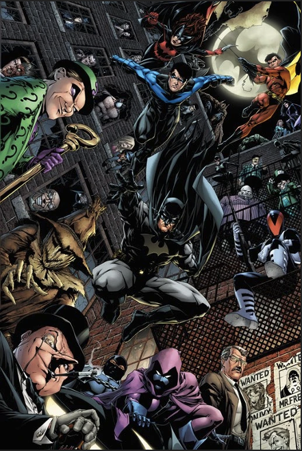
My favourite, and I think my best cover work, was for the Gotham Underground, nine issue miniseries, where all the covers went together to make one giant image.
NOTE: Tripwire tries to show below how the nine covers came together to form the single image above:
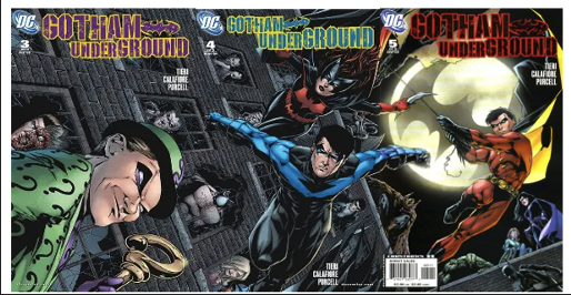
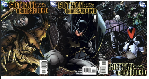
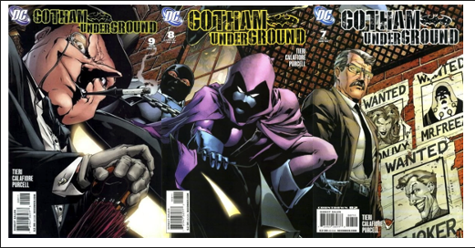
Each one was done on a full-sized board; the size of the actual art was 30 x 50 inches I think. I had to work on it in three, three-page spreads. It wouldn’t all fit on my table. It took a lot of work, laying out the perspective. And the colourist did a great job on it. It also has just about every Batman character I could squeeze in. So, if I had to pick one that was it, not only for the challenge, but for the final results.
A great cover makes you want to open the book. It’s that simple. You see it on the stands, and you have to grab it. That’s what you shoot for when you’re doing a cover. You’re not always successful.
***
Phil Elliott
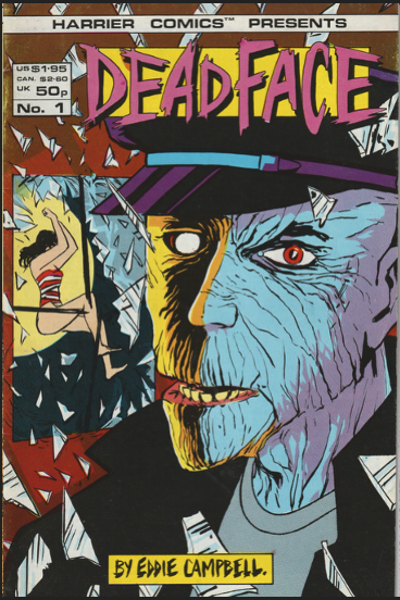
Cover Image: Deadface 1 (Harrier Comics.)
Publication Date: April 1987.
I have drawn covers for a number of my own comics and helped on numerous others. I don’t know how you make a good cover and you should probably best ask Brian Bolland, Sienkiewicz, Mignola and others more experienced than me, but here are my reminiscences of working on the covers of Eddie Campbell’s Deadface series for Harrier Comics.
Eddie already had acclaim for his autobiographical Alec, Ace Rock ‘n’ Roll club and comics for Escape, Knockabout and elsewhere but I think he was seeking great er exposure…and some more money.
Like me.
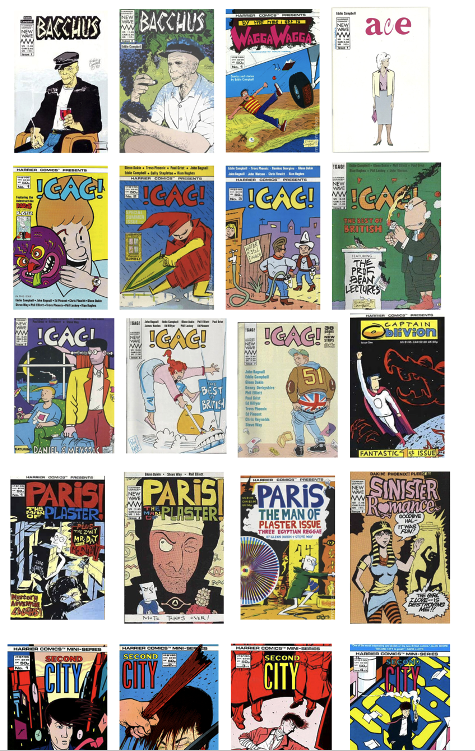
So, Eddie and I latched onto Martin Lock’s Harrier Comics. We both knew Martin from way back, when he was editing the fanzines Bemusing and Fantasy Advertiser and where he actively promoted the small press, photocopied comix that Eddie and I were creating, so it felt a natural step to ask him to publish our comics. This was the boom of the independent publishing market, and we would see our work distributed across the globe, particularly the USA. I got in first with Second City, a 4-issue mini-series written by Paul Duncan and then Eddie created Deadface.
I’d already coloured the cover of mine and Paul Duncan’s Second City for Harrier and Eddie asked if I could colour the cover the first issue of his Deadface. When I say “coloured”, this was before Photoshop, when covers were hand separated (colouring nerd alert!) so the cyan, magenta and yellow were on separated acetates, with the black a photocopy or sometimes original artwork base, using red film for solids and letratone for halftones.
Eddie’s Deadface was far removed from his previous works and his cover of issue 1 is a prime example of this, like an EC horror comic, with a scary-looking character staring at the reader. A half-naked woman jumping through a window does no harm either! Add a distinctive logo by Woodrow Phoenix and I think this is a classic cover. I pushed my boat out with the colours, using a lot of letratone, not knowing how it would eventually look because there wouldn’t be any proofs.
I guess Eddie was pleased, apart from not liking Bacchus’s red eye and I was asked to colour issue 2’s cover. Eddie and I corresponded very regularly at this time, 3 or 4 letters a week, discussing our aspirations, malaise and personal lives. I’d send him my new work and he did the same. I saw a lot of Deadface before anybody else.
I worked from photocopies of Eddie’s covers, mailed from Australia where he was living at the time. In one of his missives Eddie realised that the Eyeball Kid on the front cover of issue 2 he’d sent had fewer eyes than the character inside and could I add a couple extra? I can’t remember which eyes I added but I hoped they blended in well. The lines on the Kid’s suit on the cover were added on the magenta layer.
I don’t think Deadface issue 3’s cover is one of my best colouring jobs, but Eddie was happy and it’s a dynamic image.
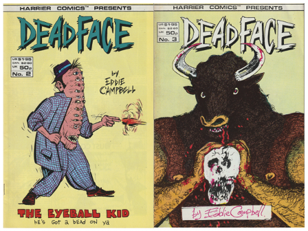
Eddie’s Deadface issue 4’s cover is an odd one, after what had come before. A mash-up of the Deadface’s legacy, the TV series Dynasty and Eddie’s personal life, but that’s Eddie’s talent…expect the unexpected. I enjoyed colouring this cover and using letratone to create some subtle and bold colours.
By the time we came to issue 5 of Deadface I was in my element, becoming more familiar with using the scope of over-layering letratone to create moire effects…an artistic technique already used by Eddie in his comic strips which I used to create colours and textures on the Kid’s suit and gun. I think Eddie was trusting me to “come up with the goods” and left Eyeball’s hair blank, for me to add whatever colour I thought appropriate, in this case a mixture of cyan and magenta.
I’ve just noticed that there’s a bad moire effect to the left of the Kid’s ear! As I said earlier, I had no way of proofing the cover so just went with a wing and a prayer.
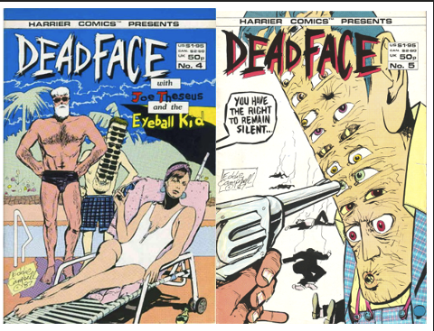
I like that I left the background bland on this cover, with the stark black and white bodies, which I think makes for a very striking cover.
That period with Harrier, working with Eddie and other creators was a very productive and enjoyable time for me so if you don’t mind me indulging myself, here are some other covers I helped on…
***
Colin Wilson
Cover Image: Nevada Book 5: Viva Las Vegas (Delcourt)
Publication Date: January 2024.
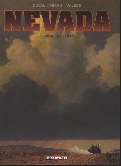
Covers have always been a huge problem for me, and to be honest I’ve never really been very happy with ANY that I have produced, and I imagine that most of the editors I’ve worked with would say the same thing!
The core of the problem is that, in my experience, an editor’s idea of what makes a “good” cover is almost always the complete opposite of what I want to see on the cover of my books. I can understand that, but usually the inevitable compromise results in a cover that no-one is happy with. This has arisen so often in the past that it no longer bothers me… I understand the process: my editor will ask to see some rough ideas, I supply 4 or 5 (or more) pencil sketches, enough to show that I’m playing the game. There will be a couple that I am happy with, two or three that I think the editor might run with, and several wild alternatives that I know will have absolutely no chance of being chosen. I can usually guess which one the editor will select, and in the end it’s their call, and try to stay sanguine with their decision.
A couple of years ago I was surprised when one of my preferred alternatives got the nod. It wasn’t my first choice from the 7 or 8 that I initially supplied (but to be honest I knew that the editor was never going to go with my preferred design), but with some wonderful work by our colourist on the series – Jean-Paul Fernandez – who did some terrific work translating my pencil sketch into a beautiful painting, I think we finished the series with a really strong cover.
Nevada Book 5: Viva Las Vegas
That’s all I ask of a cover. A strong image that catches the eye, contains some elements from the story within, and an image that is faithfully to the overall feel of the whole series.
***
As promised here are the links to the previous three (and a little bit extra) parts of this article.
Plus, The Special Simon Bisley Covers Article: https://tripwiremagazine.co.uk/headlines/simon-bisley-talks-about-his-favourite-comic-covers/









You must be logged in to post a comment.