

Comics News
Tripwire Asks Another Ten Comic Creators What Makes Truly Remarkable Comic Book Covers! Part Three

Beckoning The Reader In
Tripwire’s contributing writer Paul N Neal welcomes you to Part Three of his series of articles that simply asks ten talented comic book professionals at a time about what makes a genuinely effective and eye-catching comic book cover. Here is the question everyone involved was asked:
“As a comic book professional, you have been in the position to help create or influence the creation of numerous covers for a variety of comics, would you be able to pick a favourite comic cover you have helped create? Also, in a few words perhaps would you be kind enough to explain your choice, and what you think goes into making a successful and eye-catching cover”…
Online links to Parts One and Two can be found at the bottom of this article.
Jerry Ordway
Cover image: Superman 38
Publication Date: December 1989.

It is difficult for me to choose my “favourite” cover. Narrowing anything down to one is hard, though I find that the covers I like best are usually those that go from concept to finish without a lot of second guessing. Sometimes I will draw a couple of rough cover ideas for the same assignment and the editor will choose which one they want me to finish. I will usually draw one that I think is best, and the editor will choose the composition I didn’t care much about. I still work hard, maybe harder to bring this idea to life, but it will never be my favourite!
Another aspect of a favourite cover is that the drawing flows smoothly, without me second-guessing anything. As in the earlier example, where the editor chooses the layout or idea I didn’t prefer, I usually struggle because I likely did not work out the proportions of the figures or the foreshortening, action or background fully in the sketch phase, because I did not want the editor to choose that idea. So, struggling to make it better is usually not good.
The cover I am choosing, is what I would call a “technique” cover. The layout is clear, the figures are dynamic but the rendering is what makes it better. I used a brush, a pen, some “china marker” which is like a black crayon, to get a grainy effect in the torrential rain. I then used the side of a razor blade to scrape ink and paper in the same direction as the lines, to give the drawing a sense of raindrops and wind. Finally, I created a watercolor guide for color, which was used by the colour separator to achieve the final, printed cover. I can still remember how much fun this was to do.
Brad Walker.
Cover Image: Detective Comics 1023.
Publication Date: July 2020.

The short answer is, there is no one single answer to what makes a good cover, because different readers have completely different things they respond to, and the style of cover people and publishers seem to want changes over time. The example I provided is probably the cover of mine that’s achieved the most attention, but it’s not even the type I like as a reader.
These days, people seem to respond to splashy pinups of famous characters they love. So much so that editors ask for that specifically. With the craze for variants, editors commission several per issue every month, and often, they won’t even have characters featured in the issue on the cover (a Thor movie comes out, so Marvel does a whole month of Thor variants, across all titles, etc).
What it boils down to is, what is the cover selling? They used to be selling the story the customer is buying, now they’re selling the intellectual properties. As comic creators, it’s pretty unfortunate because it undermines the work we’re doing inside the cover. It works in the best interest of the parent company of the publisher, but it certainly takes the focus off stories, comic creators, and comic books, in general.
In my cover example, the cover has very little to do with what’s inside the book. It’s just a cool image of Batman and Joker together. But people already love Batman and Joker. If this was two unknown characters, I doubt I would’ve heard about it from anyone, and when you read the story, it probably just makes the cover confusing.
A lot of times, the covers have to be produced before the issue is even written. So the editor is just grasping for info from a writer about what they might come up with in a few weeks to pass along to the artist. Then the artist has to come up with three or four ideas from that, going on very little. With this all to be finished with, and it all to start the issue (supposing they’re doing interiors too) when the script or plot pages are ready.
Unfortunately, I don’t think we’re in any position to fix that. It would have to come from readers, demanding they want something different. As long as variants sell as well as they do, retailers request more and more, and it’s a vicious cycle, much like the craze of “new #1” issues.
When I was young, getting into comics, some of the first ones I responded to were GI Joe covers by Mike Zeck and Michael Golden. They were practically panels, pulled straight from the issue, redramatised, and beautifully rendered by two of comics’ best artists. They sent my little imagination into a frenzy and I bought the issues because I had to know what was going to happen.
But today, for various reasons, it seems like readers don’t respond the same way to that. Maybe the typical audience being older has something to do with it. Maybe it’s has to do with a larger, more expansive rack of new books, so smaller figures doing more complex things get lost in favour of simple, splashy figures or the fact that detailed, digital colouring is making smaller details darker and harder to make out at a glance might factor in. Brighter, flat colours let the image itself stand out.
Whatever the reason, a good cover is more what a reader tells you than what a creator tells you. They’re the ones that make them successful. I try to go with what people seem to be responding to, even if it’s not entirely what I prefer. And it’s likely why I’m never very satisfied with my cover work. Once in a while I’ll have one I’m pleased with, but it’s usually some bit of drawing that myself or my inking partner, Drew Hennessy did. Maybe the next one will be a winner. That’s all you can really hope for, as an artist! Ha!
José Villarrubia.
Cover Image: Fantastic Four 1234 #1.
Publication Date: July 2001.
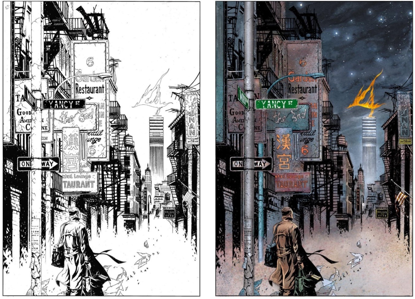
Jae Lee asked me to colour his work because he knew I was a painter and that I understood comics. We had already worked together on Hellshock when he returned to Marvel. Jae didn’t want the slick digital colours that were trendy at the time. We both admired Bill Sienkiewicz, Dave McKean, Kent Williams and Lynn Varley. Initially, Marvel was not interested in painted colours and they had Jae’s series Inhumans coloured by a digital studio. But by the time he did his second one, The Sentry, I was involved. The third series, Fantastic Four 1234 (2001), was my favourite. I was very excited to work with Grant Morrison and Jae on these classic characters. The series had a melancholic tone and the cover for issue one set that mood.
Ben stands in human form on Yancy Street, looking at the fire “4” that Johnny created atop the Baxter Building. Jae gave me free rein to do what I thought was best, and the rest is history. The book was extremely well-received. I was nominated for my first Eisner for best colourist, and the art was exhibited at the Society of Illustrators. To this day, I am very proud of it, since I believe it is not simply eye-catching, but it actually communicates a particular feeling.
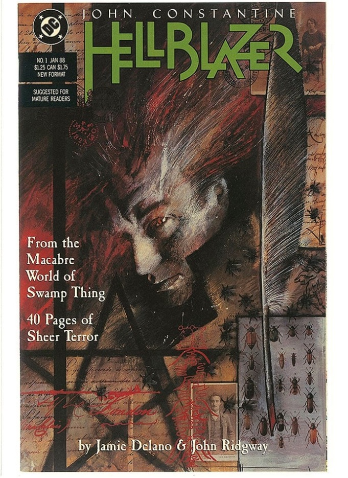
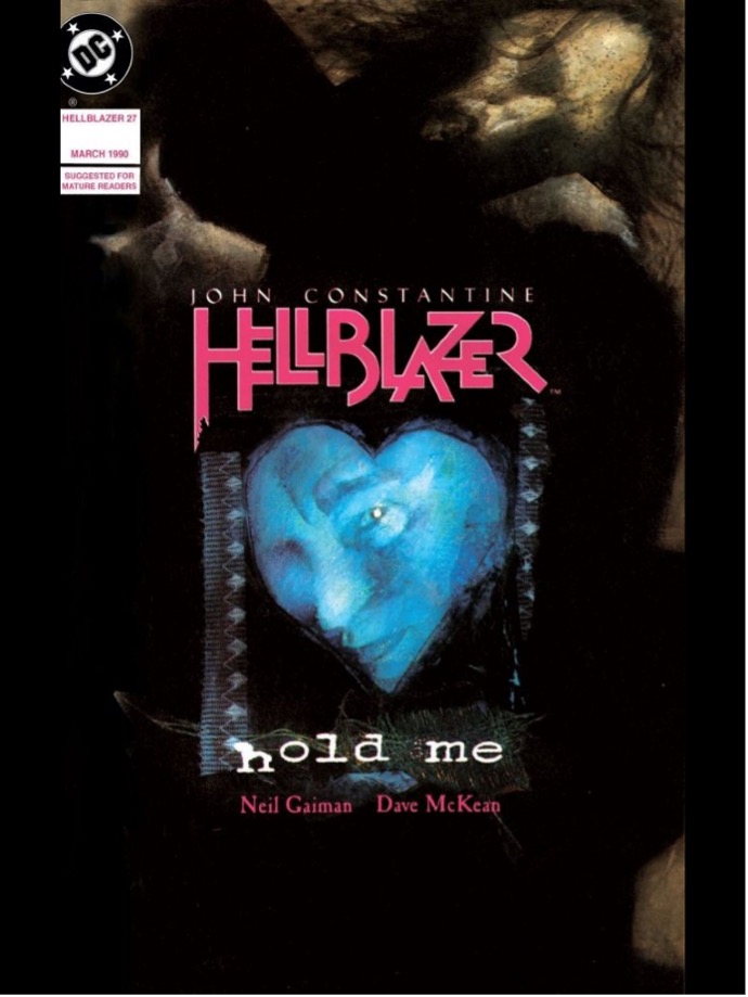
I was 26 years old when the cover of Hellblazer #1 was released. It had a profound impact on me. I was excited by it in the best possible way: the textured, realistic painting combined with expressive strokes, the use of collage and the overall composition. It was all amazing! I had only seen such a combination in Bill Sienkiewicz’s New Mutants poster from four years earlier, which I cherished. But this was different; it was so… goth (even though nobody used that term back then). And it wasn’t credited. I kept staring at it and wondering, did John Ridgway, who did the interior art, paint it? He had a strong, realistic style, so maybe? But I wasn’t convinced. It wasn’t until months later, when The Sandman #1 was published, that I found out it was created by someone named Dave McKean. Needless to say, I became an instant fan. Even the iconic Hellblazer logo was by him. Eventually, he reused the same face reference for the cover of my favourite issue, 27, for the story “Hold Me”.
Alex Ronald.
Cover Image: Lady Death: Diabolical Harvest #1 Alex Ronald Edition.
Publication Date: 2023.
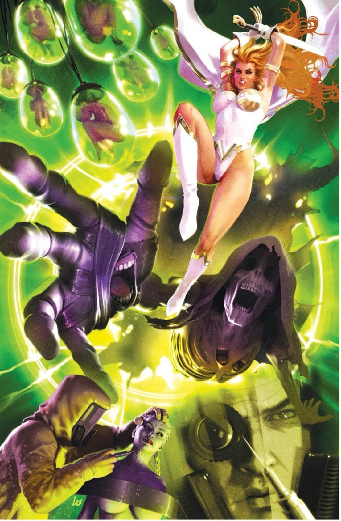
Tripwire Note: Alex Ronald very politely asked Tripwire to observe the fact that the copyright for the image above remains with Coffin Comics and it is shared with our gratitude.
One of the covers I look back on with a degree of pride is a Lady Death cover I painted in 2021. It is not the most iconic depiction of the American horror character, and in this case it is even a clone of her, but it remains one of the rare montage covers where everything simply worked. Montage covers are usually my least favourite type to tackle. Balancing several scenes, characters and story beats in a single composition can feel like spinning plates and keeping it cohesive is always a challenge. With this one, the image seemed to find its own rhythm and the final result burst with an energy that still makes me smile.
I had been a fan of Lady Death long before I ever had the chance to draw her, so she has always been a character I genuinely enjoy painting. Her look is bold, theatrical and dramatic, and the contrast she brings to a darker environment can be incredibly rewarding visually. That contrast became essential for this cover. I knew from the start that the background and supporting elements needed to sit in a toxic mix of horror greens and sickly yellows. Against that poisonous palette, her deep white costume allowed her to punch through the scene and sit proudly at the centre. The white becomes almost a spotlight in itself. It gives the viewer’s eye an immediate point of focus while everything else swirls, glows and mutates around her.
The reaching hand of the villain became one of the main anchors of the cover. I pushed it so far forward in the composition that it feels as if it is thrusting out toward the viewer, almost trying to grasp whoever picks up the comic. With the screaming mouth embedded in the palm, it adds a three-dimensional pull that breaks the illusion of the page and brings a sense of menace that works with Lady Death’s dramatic downward leap.
The framing came together more easily than I expected. Her descending pose creates a strong diagonal line from upper right to lower left. The villain’s reaching hand pushes upward on the opposite angle. Those two forces meet in the centre and create a natural visual collision. Once those anchors were set, the surrounding elements settled into place. The cloning tanks hang at the edges like eerie lanterns. The masked scientists and their experiments occupy the lower corners, which gives the viewer a sense of falling deeper into a twisted laboratory as the eye moves around the composition. Everything sits around the central action without crowding it.
One thing I also enjoyed was the small layer of symbolism that found its way into the piece. The contrast between Lady Death’s clean whites and the polluted green laboratory hints at purity invading corruption, or individuality cutting through manufactured artifice. Even the villain’s grasping hand can be read as a symbol of control and manipulation reaching out from a world built on forced creation. Lady Death’s downward charge becomes a rejection of that environment, a moment where defiance literally slices into a space designed to contain and replicate her.
There is also a thematic contrast that I enjoyed exploring. Lady Death is a supernatural figure who feels larger than life, while the setting around her is cold, clinical and filled with artificial horrors. The metal restraints, the green chemical glow and the distorted experiments all reinforce that divide. Her bright whites and warm skin tones cut into that world like a blade, making her presence feel both heroic and disruptive.
Despite my usual dislike for montage covers, and despite the fact that I seem to end up doing quite a few each year, this one still stands out for me. Every element clicked, the composition cooperated and the final image carried a sense of depth and energy that I do not always get from montage work. I can still look back on this piece with genuine satisfaction that it all came together so well.
Greg Staples.
Cover image: 2000AD Prog 1900.
Publication Date: September 2014.
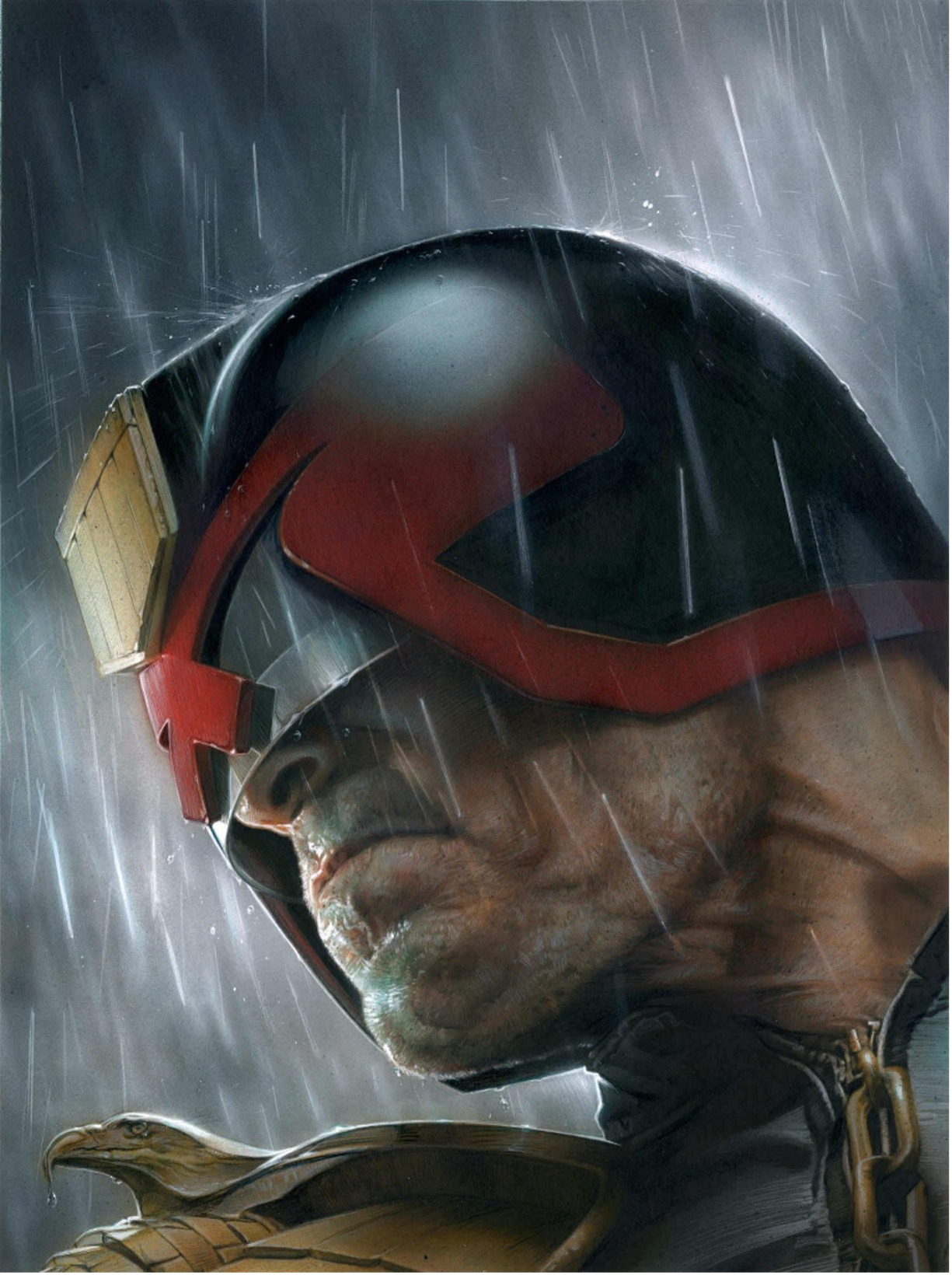
It’s difficult to choose a favourite cover I did but I think it would probably be the side profile of Dredd in the rain. I’d had that imagine in my mind for a few years, so it was nice to get it out of my head and onto the paper. It’s not the most bright or reader-grabbing picture I’ve done, but it brought Dredd right into the real world and told a story in your mind’s eye without seeing what was ‘off camera’. I think it’s also my most mature cover up to that point and showed my growth as an illustrator. I’ve done other pieces for other companies that that were probably more technical, but this is simple, to the point and effective. I’m not one to shout about my work too much, preferring the art to speak for itself, hopefully this one does that.’

Grayham Puttock.
Cover Image: The Ape That Built The World.
Publication Date: 2025.
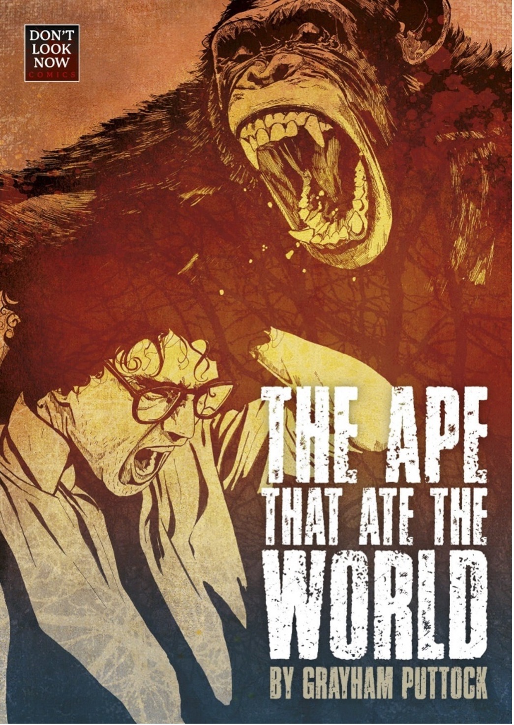
I always find covers difficult and exhausting (same with logos), trying to decide on just the right image to attract the eye and convey something of the tale contained therein. I think I’ve come closest (or, in any case, the cover I’m most pleased with) on The Ape That Ate The World, with a good deal of assistance from design guru and artist Andy Bloor.
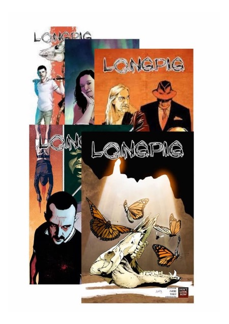
The covers for our ongoing series Longpig are all designed and illustrated by co-creator Adam Jakes, and I think they are wonderful pieces of storytelling. Beautifully coloured by Aljoša Tomić.
As for comic covers I love by other creators, there are far too many to list. I love Mike Mignola’s covers, each and every one of them. Glenn Fabry’s Preacher covers are phenomenal.
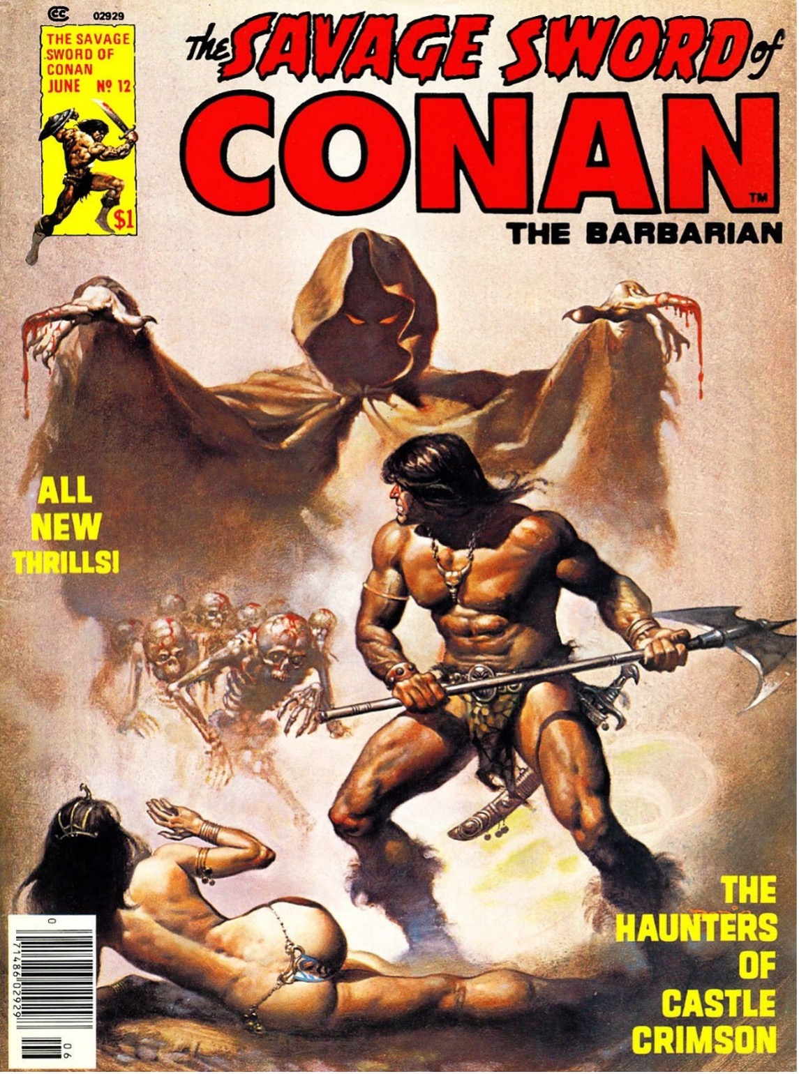
Probably, though, if push comes to shove, I will have to say my favourite cover is Savage Sword of Conan 12, which also happens to be my favourite Savage Sword of Conan tale ‘The Haunters of Castle Crimson’ by my favourite Savage Sword of Conan art pairing, Buscema and Alcala.
Shaky Kane.
Cover Images: The Skin Police 1-4. (Oni Press)
Publication Date: October and onwards 2024
One cover in particular?
A little while back, Oni asked me if I would come up with a run of cover illustrations for Jordan Thomas’ Skin Police comic book series.
The task was to draw each one as if set in various ‘ages’ of comic book history. Golden, Silver, Bronze age and what would pass as Mid-nineties and Modern.

I set aside an afternoon to draw up the ideas for the covers, as they sprang to mind, often referring to actual covers from the past.
Although, at this stage the brief was to submit rough sketches, I can never pin down an idea until I’ve fully realised it, so I probably put more into the sketches than was necessary. Looking back, which cover did I get the most from? I’d say the Silver Age cover.
I was very pleased with the way the Oni art team had aped the look of early to mid-sixties DC comic art, particularly Curt Swan’s frozen tableau cover art, complete with obligatory exposition word balloons.

Patrick Olliffe.
Cover Image: The Tormented # 3.
Publication Date: May 2024.
I think what makes a successful cover is one that grabs the reader’s attention quickly and creates the feeling that they have to find out what happens inside the issue. Strong graphics, a compelling image, a little shock value doesn’t hurt, all contribute to getting a reader engaged.
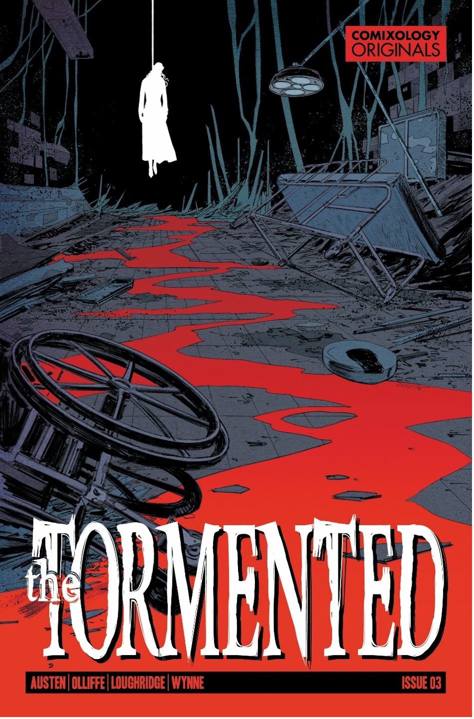
I was happy with this cover that I did for issue 3 of The Tormented, my creator-owned book I did with Chuck Austen for Comixology Originals. The Tormented is a horror/supernatural themed book so I wanted the cover image to not only reflect what was going on in the story but also have some of that aforementioned shock value to hopefully grab a reader’s interest. We were fortunate to be given freedom to create what we wanted for the most part, so I don’t remember having to go through much of an approval process for this cover.
Once I hit on this idea at the layout stage, I sent it over to Chuck to see what he thought. He liked it, so I was good to go. The high contrast of the stark white figure of the hanging ghost against the black background I think is pretty compelling and having her in the upper left quarter of the cover helps as well since most folks read left to right/top to bottom so that high contrast image would be the first they see.
My idea was also to hopefully lead the reader’s eye from that top left image down through the rest of the cover by following the blood trail, eventually landing on the book’s title block. Lee Loughridge’s colours were perfect in helping this cover work overall. There are some covers I’ve done that feel like they work instantly when I lay them out, this was one of them.
Unfortunately, that’s a pretty rare occurrence, more often than not I’m pulling out what’s left of my hair trying to get a good design.
Fabian Nicieza.
Cover Image: Wonder Man 10.
Publication Date: April 1992.
A lot of thinking goes into a cover from an editorial standpoint — is the layout eye-catching? Is it conveying the story or themes properly?
Is the logo prominently visible? Is the colour scheme conflicting with the previous month’s issue (to ensure differentiation on the rack for a casual reader)?
Wonder Man #10 was the first issue after the major Operation: Galactic Storm storyline that had run across all the Avengers Family of titles the previous three months.
The previous issue (also one of my favourites), had two small figures of Wonder Man and Vision and the GIANT words NEGA-BOMB in a gradient range of orange to white as the main focal point of the image.

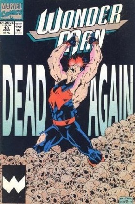
My assistant, Evan Skolnick, and I debated a second “large copy” cover in a row but also knew we were going to have a large main figure of Wondy (to offset last issue’s smaller figures). We decided that thematically, the large DEAD AGAIN played well to the previous issue, allowing type size and font to actually say something thematically about the content of the issue.
I’m pretty sure I did the layout and Jeff tweaked it, making the figure work dramatic, and the sea of skulls creating a very graphically disturbing image.
I’m pretty sure Joe Rosas, our regular colourist, did the cover colours (though it might have been staff colourists Paul Becton or George Roussos).
I thought the cover ended up working in all the ways a cover needs to, telling a story while selling a book.
Marc Deering.
Cover Image: Miranda Mercury #298 pencils by Lee Ferguson
Publication Date: Late 2008/ Early 2009.
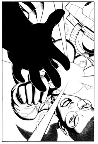

This was a very, very long time ago. If my records are right this is circa late 2008, early 2009. But also, one of my favourite covers I did back then. By the time this cover came around, Lee and I were cooking pretty good with our art styles and what we could each accomplish.
This was about the 4th cover we did after a bunch of full comics too. I was told not long ago by Kelley Jones that a penciler/inker team really start coming into their own after about 4 issues together and I have to say, he is absolutely right. This is very dynamic and bold cover. The implied action is cool and the mystery as to who’s hand that is helps.
See, with the Miranda Mercury covers what we were going for was that each cover served as an almost virtual first page of the inside story. Comics used to do this, mainly by just having the covers tell a sort of story. If you look closely at the texture of her hair, well, that was not easily done. And it’s all my fault. It’s a texture I came up with early on with her to show that she had little to no vanity about her so her hair was just pulled back so she could get to doing whatever she had in front of her.
This cover was done with a .25 Radiograph pen, some hunt #102 quill and a lot of brush, most likely a Scharff 3000 #3.
Fast-forward a few thousand years (it feels that way sometimes, but 2023) and in comes a bucket list cover that I get to do for Marvel’s Predator comic book franchise.
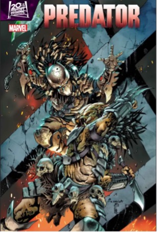
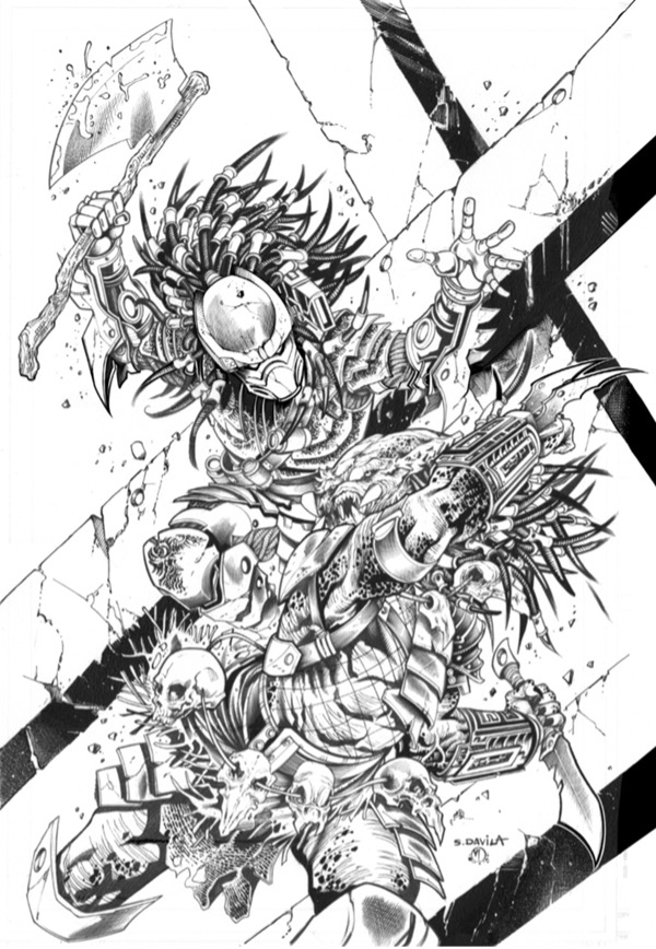
Tripwire Note: Predator pencils by Sergio DaVilla.
I love the Predator movies. I had worked with Sergio before a little bit, but this was a nice big one. His pencils are nice and detailed, which I love because it gives the eye a bunch to look at and enjoy. It also gives me a lot to do. It’s tons of fun. It gives me the chance to go in and add textures all over the place.
The thing is the Predator was not designed to be a comic book. The design is extremely complicated and not as easy to do repeatedly. It was designed for movies which is much different. Still, this was a ton of fun with a great action pose and a question of why are they fighting? Which intrigues a reader into picking it up.
This one was done with tech pens, markers, a #3 Raphael brush and a little Hunt #102 quill.
Tripwire Note: As promised here are links to Parts One and Two of his series of articles on this subject.
And
Tripwire genuinely thank all the creator for taking part in all three part of these articles.
Finally, he has assured Tripwire that in the early weeks of 2026 there will be a Part Four to Paul’s series of articles.









You must be logged in to post a comment.