

Comics News
Artist John Orlando Talks To Tripwire About What Makes Some Classic Comic Covers Truly Eye-Catching


Drawing Readers Into The Issue
In the past, Tripwire’s contributing writer Paul Neal has spoken to a number of artists about what makes an eye-catching comic book cover. His series of articles will continue. However he recently spoke to comic artist John Orlando. His inspired and detailed perspective on the subject seemed worthy of an individual article.
Here are the results in the artist’s own words…
***
There was often a cover that jumped out at me on the comic stand of the old fountain shop I haunted as a kid. What was it that distinguished such covers in the vast sea of images on this well-stocked wall rack of 1973? I didn’t ponder such technical aspects until I was older, and the immediacy of getting my new acquisition to the counter to pay the two-dime tribute necessary for its egress from the store to my bedroom left little time in my excited reverie to bother.
As a comics pro many years later, I found myself on the other side of the comics stand and faced with the task of enticing the shopper/fan (with my cover swimming in that aforementioned sea of images) into giving a new title a try. On debuting titles from smaller publishers, the way to a fan’s stomach is through the cover, to dent a metaphor, and I had to put myself in the consumer’s place.
Composition: In my humble opinion, composition is the first thing to be considered. As a kid, I passed up on books with cover images which, for some reason, “felt wrong” to me, only realizing some decades later upon seeing them again that the subjects were “smooshed” toward a corner or an edge, usually with some awkward negative space gap which could draw the eye toward it rather than onto the subject.
Storytelling: Another passed-over cover may have had a little trouble presenting a clear depiction of what’s going on. There’s a good way to lead a prospective reader to wonder, and there’s a bad. “Good” is causing them to wonder what happens next, and “bad” is having them wonder what is happening at all. Storytelling is as important to single frame illustrations as it is to sequential panels. Confusion will only make the consumer’s eye drift away toward the other books. A clear challenge, threat, conflict, funny scenario or personal interaction are attention magnets and will cultivate intrigue.
Atmosphere: Does your cover illustration “feel” like what it’s supposed to be? Does your horror cover feel eerie? Does your drama cover convey suspense? Does your adventure/super cover present action and cause? As obvious as these points seem in the setting of an academic discussion, the obvious point is often overlooked when tasked with the many considerations needed in facing the blank board with the intention of creating an effective cover.
Display: Is the most important character (or characters) in the story on clear display? Not just “on there,” but dominant to the image and visible in the middle third of the cover? Very often, the bottom third is overlapped in a rack display and points of vital interest should be seen in the region beneath the masthead.
I’d like to cite a few examples of existing book covers. I’ll begin with one of my own.
Doc Behemoth #1 (Chanting Monks Studios, formerly CFD Productions, formerly Cry For Dawn, 1998): Roy Thomas and I were co-creating a “Big Monster” genre one-shot. Roy’s plot had our large aggressor following in King Kong’s footsteps by climbing The Empire State Building and fighting off aircraft with a human female hostage nearby. We both agreed that this peak moment in the story should be the cover image, giving us our atmosphere of adventure and a good sense of what things are coming to on the inside.
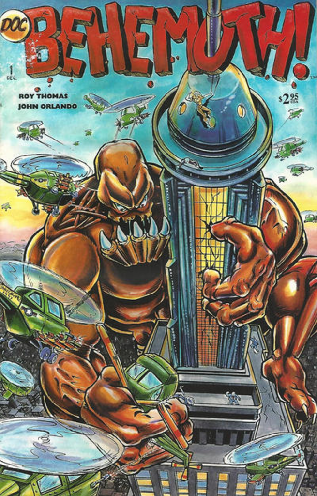
This was settled quickly and decisively, but I was then presented with additional problems to solve. Looking up at the conflict on the building was out of the question. A worm’s eye view would exclude too much of what this premiere image of a new character looks like, except maybe the bottoms of his feet and some other unflattering angles. It would also render any normal-sized supporting cast members too small and in the wrong perspective for us to see.
An elevated view, straight on at the lofty conflict, seemed the way to go until I started thumbnailing it. This angle showed everything clearly but had about as much visual impact as a frame from a videotape showing a play on a stage and presented me with some other hitches. To have our big monster standing on the top of the building at that angle would either have left him too small or forced me to show so little of the edifice that it would lose the dramatic impact of the height and size. To show him hanging onto one side would also force the camera back a bit, and we would lose the massive feeling of both the famously large building and monster alike. I also wanted to exploit the dizzying height a bit, and this would not cut it.
I finally decided on a bird’s-eye view, perhaps from the POV of one of the attacking chopper pilots. I also had our menace emerging from below and behind the building, implying movement upward toward the camera/viewer, and disallowing the dirigible tower portion of the building (to which he is grasping) to obscure any essential visual elements of the beast, while still showing maximum recognition points of the building. In other words, neither the monster nor building interfered with each other.
This would give me my height-driven, vertigo-inducing danger element. It also afforded an angle which allowed clear views of the situation-at-hand – our big, ugly, menacing monster and what he looks like, an enhanced sense of drama, the famous location’s identifying features, and even allowed our relatively tiny and scurrying supporting cast to be seen. All I needed was to find some photographic reference of a bird’s-eye view of The Empire State Building at my local 1998 library….
As some of you may have inferred by the ominous ellipsis ending the previous paragraph, the idea of finding said image in the library stacks or microfiche (the DOS computers were strictly for card catalog purposes) turned out to be as much of a fantasy as what Roy and I were spinning.
In the spirit of forging onward, I photocopied as many pictures of The Empire State Building as I could and drove home with much more determination than certainty.
My next task was to observe whatever perspectives I had available of the building in question and pretty much extrapolate what each element would look like from that height, looking down. I subtly chose an advantageous angle for exposing Doc Behemoth’s image in the composition and wrapped him around the back, peering around the dirigible tower, swarms of heavily armed choppers swirling all around. I began to have the idea that a photo of a past aerial photog’s choosing may have offered me less flexibility in that sense. The end result was a sort of circular, “whirlpool” effect to the composition, with our main character and his dubious situation at the centre.
Upon my own satisfaction with the finished product, I mailed a colour copy to Roy and received an enthusiastic response via fax. All points covered, now on to the pages!
***
Fantastic Four #159, for its effect on me as my eyes fell upon it on that crowded stand in 1975, is a cover I would be remiss in my failure to mention.
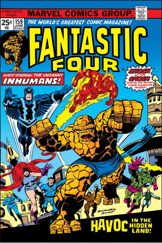
A couple of decades before I met and was mentored by Rich Buckler, I began learning from him on a fundamental level just by looking at that book. Once it was spotted, I stopped looking further in that day’s selection.
We’re presented with an alien urban landscape with every major hero in the book (The Fantastic Four and all five of the Inhumans) in full form are placed at different depths back toward the distressingly tilted horizon, all in a state of great and furious urgency as if, as they say so often, “the fate of worlds hangs in the balance.” They’re running toward the camera, not at us, but rather toward some unknown menace behind us that absolutely must be dealt with, and dealt with NOW, provoking an anticipation of the unknown. “What IS it? Here’s my quarter.” Complete absence of sales resistance on my part.
They didn’t seem to credit cover colourists, but I’d like to applaud the choices of the colourist on this one. A fine example of what good contrasts and a balanced palette can do.
***
Gil Kane’s Undersea Agent #5 (Tower Comics, 1966) drew my attention not on the stands but propped up at the back of a short box at a back issue shop just this year, prompting from me a spontaneous “Ooo, look at that” comment to my wife Jill.
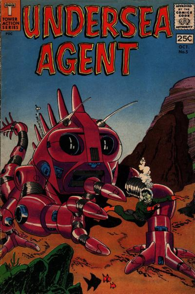
A looming, alien (yet familiar in the Jack Kirby Big Monster tradition) danger, in the form of a massive robotic underwater creature, is in hot pursuit, with menacing intent, toward our comparatively dwarfed, badly outmatched hero. His facial expression is fully revealing his own sense of jeopardy. We’re presented with high urgency, as in the Fantastic Four example, but from another slant – the aggressor is clear and present, and is being fled FROM, rather than rushed toward. Our titular character seems as good as caught with less-than-marginal chances of escaping. What’s next? Crushed in this leviathan’s digits? Popped into its mouth and chewed? Probably not, but the very idea brings the 1966 viewer closer to stage two of comics purchase consideration – the quick reach and discreet leaf-through.
I had mentioned Kirby monsters earlier, but I don’t intend to accuse Kane of derivation therefrom. The composition is very different from what we usually see from Jack. Rather than the pleasingly overwhelming, front-and-centre staging, or the coming right at you, bum’s rush danger of a Kirby monster piece, we are voyeuristically viewing, as though we were spectators on the side of a highway in witness of an unexpected police pursuit or a spontaneous burst of sport.
The action is coming from back-left of our perspective to right-front, heading off past us and somewhat behind, giving the sense that we would have to rotate a bit to our right to see what ultimately will have happened. The scene is balanced counter-diagonally by rock formations from behind and in front, lending further depth. It is a potent cover, and it did lead me to purchase. The one thing that almost prevented me from doing so was my mistaken reading of a hand-written price sticker. It said $12.50, but I thought it said $125.00, so I’m pleased that I took a second look.
***
X-Men #11 by Jack Kirby, 1965 is among the covers I would assess as being frameable.

We find ourselves in a decidedly common setting – an urban scene at dusk – our point of view as being a passerby. However, Kirby managed to convey a broken rhythm in the backdrop crowd. An interruption of their pedestrian journey, in which we are included from our side of the street, as an oddly distinguished, oversized man in a lab coat is treading on the very air itself, stalking toward the heroes, placed before us, as they flee this unknown stranger, heading toward the reassurances of their mentor.
We feel an associative sympathy toward the onlookers, as if we’re all stopped in the tracks of our everyday tasks to witness this surreal spectacle, along with some anxiety for what perils our confused heroes are about to face. The three-layer (from back) composition of setting, threat, and sympathetic characters lends a great deal of structural integrity to the scenario.
Once more to the cover colourist’s credit, the contrast between the drab, urban gray and brown tones of a waning city day and the colourful situation at hand enhance the scene greatly, aiding the artwork in bringing fantasy into an ordinary, realistic world.
***
My last example is a simple one, requiring less verbosity, and one that works best during a period wherein it is not being overused in general. Jim Starlin’s 1973 cover to Captain Marvel #29 employs a minimalistic poster or pinup approach, simply by depicting our character being himself and flying through a cosmically exaggerated backdrop of outer space.

No clear antagonistic presence or situation is shown – just a tribute-like characterisation of our main character exuding a sense of mission, movement, and power. Only previous followers of the title will notice his new blond, rather than silver hair, hinting at a change or shift within our hero. Any newcomer to the title would very likely be attracted into choosing this potently presented issue.
As always, it’s been my pleasure to discuss the subject of comics with you, and I hope I learned a bit more about my own craft in order to continue to improve, in the hopes of producing more of the sorts of covers which bring pleasure to the reading public.
***
As always Tripwire welcomes comments and feedback.
As mentioned previously here are the appropriate links to the previous instalments in this series of articles. Each one features a suitably eclectic mix of incredibly talented creators from within the comic industry.
Part Four.
Part Three.
Part Two.
Part One.
Plus, The Special Simon Bisley Covers Article.
https://tripwiremagazine.co.uk/headlines/simon-bisley-talks-about-his-favourite-comic-covers/













You must be logged in to post a comment.