

Comics News
Ten Comic Creators Explain What Makes A Really Good Comic Cover Part One


Just What’s A Great Comic Cover?
Tripwire’s contributing writer Paul N Neal recently asked a handful of our friends from within the comic industry a deceiving straightforward question? He hoped to find out what genuinely makes a really good comic cover. He asked simply this:
“As a comic book professional you have been in the position to help create or influence the creation of numerous covers for a variety of comics, would you be able to pick a favourite comic cover you have helped create? Also, in a few words perhaps would you be kind enough to explain your choice, and what you think goes into making a successful and eye-catching cover”…
He hoped for the best and decided to let the replies speak for themselves. They are presented here in no particular order at all, except to say he began with one of the very best cover artists in the business.
Glenn Fabry
Cover image: 2000AD. Prog 448.
Publication Date: 14th December 1985.
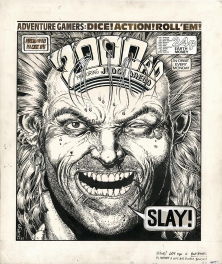
When I first started working in comics, way back before the invention of electricity, I used to go to comic book shops and look at all the books on the shelves and try and see the things that immediately caught my eye. Obviously I’d prefer one of my images to be amongst the most striking. This is when I was working for 2000 AD. I’d go in, and ten feet away from the shelves it all looked like wallpaper. I decided to try a very simple approach. My first proper go a that was the big headshot of Slaine where his forelocks went through the logo. That stuck out, it sold well, result. It’s not the best drawing I ever did, but I invented the headshot for comic book covers! Bragging there but what the fuck💋 It was 1985 or something – Glenn.
Ty Templeton
Cover image: Marvel Ultimate Spiderman 16.
Publication Date: 2013.
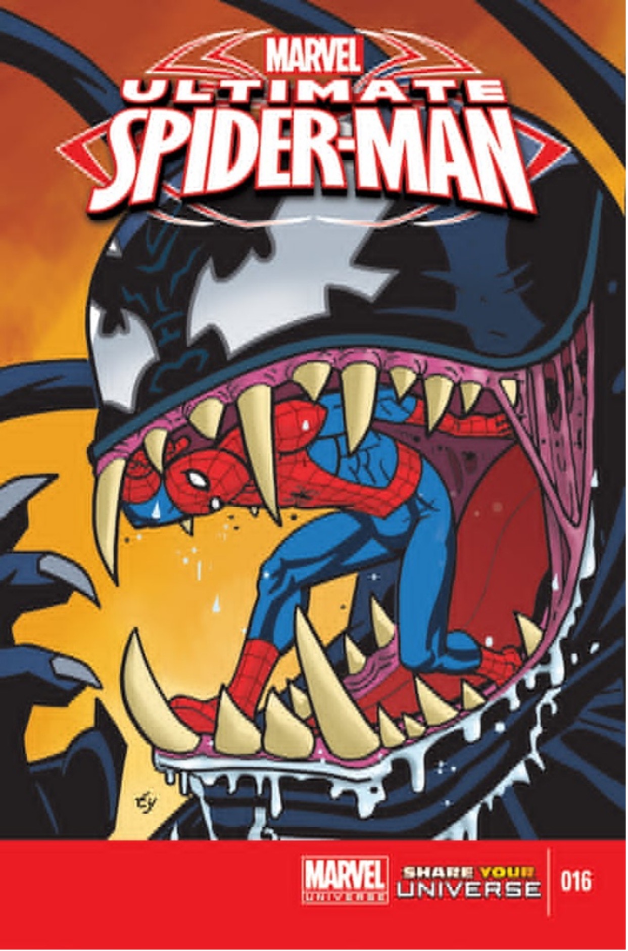
What makes a good cover? I used to teach a course on how to create an effective cover with a series of twelve, one-hour lectures with assignments. There’s no possible way to condense that usefully into a short article, but here goes: A cover is an advertisement for the story within. It should do what all ads do, which is make you feel like you’re missing out if you don’t get the product. What happens? Who’s in danger? Who’s that guy? What’s he doing? Unanswered questions are a good way to create purchase anxiety. Older readers want a vibe more than a purchase anxiety. For a more sophisticated reader, a “poster” style ad, giving away part of the treats and goodies like a free sample.
John Charles.
Cover image: In theory. Transmetropolitan Issue 8.
Publication Date: By the artist’s own admission. Unpublished.

So, what makes a strong cover? Difficult to answer – there are many ways to go… Sometimes symmetry works and sometimes asymmetry is better. In general, I prefer angularity to straight up and down or straight across lines. There are montage solutions, pictorial solutions. Old comic covers often had speech balloons on them and that can be great. One thing I’ve learned as a colourist is that white can be your friend on a colour cover. It is incredibly attractive to the eye when contrasted with colour and blacks.
Perspective can also lead the eye into the focal point of a piece – usually a face, and the focal point should often have the most dramatic contrast of colours in the piece. Some of my favourite covers were Travis Charest’s works for Wildstorm – especially his Wildcats covers.
They were works of genius, full of brilliant drawing, composition, colour and the clever use of white space. I think the influence on my Transmetropolitan sample is very evident.
Beyond those, I’d suggest looking at J.C. Leyendecker’s magazine covers for The Saturday Evening Post. Brilliantly composed and executed and often with cool and whimsical ideas /concepts behind them. In general, covers aren’t just drawings, they are ideas, and that’s what can make them very cool. Oh, and let’s not forget my hero growing up: Neal Adams. Check out his Superboy cover where Superboy is sitting on the moon, exiled from Earth. (Superboy #160) It rocks, as do so many of Adams’s covers.
Incidentally, although my ‘cover’ for Transmetropolitan, which I created around 1999 was never used, it did garner a good reaction from the then editor of 2000AD, David Bishop, who gave me a go on a Sinister Dexter cover after seeing it. As the Rolling Stones will tell you: “You can’t always get what you want, but if you try sometimes you’ll find, you’ll get what you need.”
Mike Carlin
Cover image: Superman Vol 2 Issue 23.
Publication Date: November 1988.

I have been involved in creating hundreds of covers in my 40+ years at Marvel & DC… I have a couple actually framed in my home office.
SUPERMAN #23
When John Byrne left the SUPERMAN titles I suddenly needed to plug in an inventory story. Mike Mignola and I were living in the same Brooklyn neighbourhood at the time, and I doodled a cover idea on our Subway ride home. Simple idea: Superman and Silver Banshee in a tug of war over Jimmy Olsen’s soul. Mike drew the cover overnight and the results were great.

A great cover to me relates to the story inside and makes a dramatic impact: which raises a question, making the viewer NEED to find out what’s gonna happen next. Or what happened to cause THIS to happen. (Better than just a cool pin-up type shot… though those work sometimes, just not all the time.)
Just as important is making the image graphically compelling with a clear composition and focal point.
And, personally, my favourite part of working up a cover was coming up with some clever cover copy to help sell the drama/humour of what the viewer is looking at.
Basically, the cover should sell the book like a movie poster sells a movie. And like anything… I’ve done covers that I like… and covers that are not my favourites. Just as there are good and bad movie posters.
Probably the best/most famous cover I ever did a sketch for was Captain America Annual#8, beautifully realised by Mike Zeck:

TRIPWIRE NOTE: Paul asked if the original sketch that Mike Zeck’s astonishing cover was based upon could be shared online but sadly it was unavailable.
Brian Bolland
Cover Image: Animal Man 25.
Publication Date: May 1990.

I couldn’t provide a definitive favourite cover of mine. I have covers that I’m especially pleased with because they serve a particular purpose or because the drawing pleases me.
Maybe I’ll put forward my cover for Animal Man number 25. It pleased me because there are references in it that the reader might pick up on. For instance – the quote by someone that, if you had an infinite number of monkeys, one of them might type out the complete works of Shakespeare. In this case the monkey is typing the actual script by Grant Morrison to the story inside. Is it therefore comparing Grant’s work to that of Shakespeare or is it suggesting that it was written by a monkey? Part of the conceit of the cover is that the title hero himself is not on the cover. I like the balance between the “action” and the white space around it. Whether it’s a good cover and whether it induced people to buy it is neither here nor there. In Googling it I notice it doesn’t appear in the 20 best Animal Man cover list.
I’m going now to backtrack in time. In my very early teens in the early 60s my family would take the occasional weekend trip to the seaside town of Skegness. (Skeggy.) At one point our car would round a corner on our way to the carpark. On that corner was a store selling seaside stuff, postcards etc. Out front, though, were a couple of spinners containing DC comics. (Marvel hadn’t been reinvented yet.) In those fleeting moments from the back seat of our Rover 90 I could see my first glimpse of the latest Flash comic. Number 127. March 1962. With its elegant Carmine Infantino cover. Green Lantern number 11 from the same month with its equally no-frills cover by Gil Kane.
In my professional career, in my attempt to do as little work as possible and still get paid for it, I use the example of those covers to produce covers with simple images that are eye catching and easy to understand as if viewed from a distance in a moving car. Occasionally I look at cover artwork by contemporaries and I’m impressed by the technical skill and the scope of their imagination, but it takes a while to clock all the goings-on, and I have to look away.
Nowadays, with the advent of “variant covers”, I’m required to come up with an image without any script or any knowledge of who or what is in the story. I’m not one for drawing generic “action shots”. I find them annoyingly (almost comically) macho. Lacking in humour or irony. Both traits plentifully present in the Judge Dredd stuff I was drawing in the 80s. In most cases the characters I draw nowadays are inactive but, hopefully, with enough character and message to make them interesting and eye catching.
Looking back almost 50 years at some of my body of work I notice it doesn’t always comply with the formula I’ve just postulated – so, Reader, kindly disregard this message.
Gregory Wright
Cover Image: Nick Fury Vs Shield Book / issue 2.
Publication Date: September 1988.
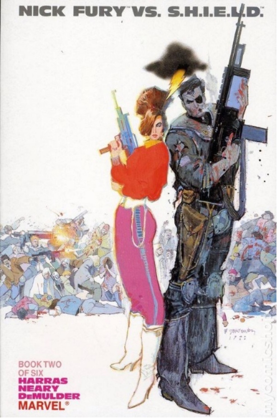
Comic book covers are meant to catch the attention of the reader and make them pick up the comic to check it out and hopefully purchase it. I always thought of them as movie posters. The covers that I did rough sketches for or discussed with creators followed that style frequently. The first set of covers I was responsible for were the covers for Nick Fury VS. S.H.I.E.L.D. Jim Steranko did the first movie poster style cover, as well as the logo. The logo he designed was really small, so the covers HAD to really grab you. Naturally his cover did, but he was only able to do the first issue. I had to get 5 more covers done immediately.
My favourite cover that I had significant input on the design was for issue #2. I managed to hire Bill Sienkiewicz to paint it. Half the job was done. Bill’s covers were always eye catching. I provided a simple “sketch”. The image was Nick Fury and Val standing full figure back-to-back with a horizontal line of SHIELD agents engaged in a battle. No background, just white. Simple. Bill turned in a far better cover than I described and the simplicity of his figures, his use of colour and the attitude of Nick and Val totally sold the cover. That’s how it’s done.
Andrew J. Lewis
Cover Image: Zarjaz Vol 3. Issue 3.
Publication Date: Summer 2025.

Zarjaz #3
Artist: Brett Burbridge
When you have a well-known character like Judge Dredd, you obviously have the fact that the viewer has expectations of what the character is like, so putting them in an unusual or perilous position can be especially effective.
For me a successful or eye-catching cover is usually one that poses a question. It makes the viewer want to read the comic itself to find out more, so it’s not just a cool image of the central character (although they can be successful in their own right, like that incredible McMahon cover for the 1980 Sci-Fi Special or the iconic ‘You’re next punk!’ cover).
The most commonplace question will be ‘How is s/he going to get out of that one?’ and I would point to some of those incredible DC covers with Batman, Superman or Wonder Woman in terrible predicaments that were such a mainstay of comics in the early 70s, or ‘What on earth is going on?’ where the main character is in some kind of bizarre situation like Superman witnessing Lois marrying the Devil!
So, the cover of ZARJAZ Prog 3 is very much influenced by that thinking and the viewer is encouraged both to think ‘How will Dredd get out of that?’ and ‘What on earth is going on? Why are those kids eating him?’
When I posted the image online a lot of responses were that it reminded people of early 2000ad covers, which was obviously the intention!
Chris Weston
Cover Image: Six Gun Gorilla. (Boom! Studios.)
Publication Date: 2014.


I find it very hard to put into words my thoughts on what makes a good cover. There’s so many different kinds of good covers. I think the basic requirement is to be as eye-catching as possible. Simple compositions lend themselves to that.
That doesn’t mean the art has to be minimalist. You can have a simple design to the image, but the rendering can still be detailed. It’s when you get a complicated composition that you start getting into trouble. My own personal favourite cover artist is Jean “Moebius” Giraud who seemed to be endlessly inventive in his choice of cover designs. Brian Bolland’s run of Judge Dredd covers on the Eagle reprints are also mind-blowingly good. Both of those artists are known for doing detailed art, but they knew how to keep their compositions simple. Brian, in particular, was great at telling a story in his covers.
I think that comes from his love of Silver Age DC Comic covers where they basically summed up the whole story in one image. I’m not a fan of the traditional Marvel-style cover which basically feature characters standing around in heroic poses. I want the cover to be a snapshot of the events in the story. That’s what I tried to achieve with my Six Gun Gorilla cover. It’s a basic Frank Frazetta-style composition that uses a pyramid structure.
The lead character is in a traditional triumphant pose, but I’ve also hinted at other things going on: the sadness in the eye of the murdered tortoise and the embarrassment of the guy trapped by the fallen creature. My one regret is not raising the image up an inch so we can see more of the ground. That would have been more pleasing on the eye. But every picture is part of a learning process; it never ends until the day they put you in a box.
John McCrea
Cover Image: Dark Souls issue 3. (Titan Comics.)
Publication Date: 2024.

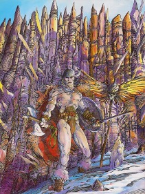
This is one of my favourite covers, done for Titan comics’ Dark Souls. Apparently a computer game. I don’t play computer games. However, I think things just clicked with this one and it tells an interesting story in a dynamic way. Mike Spicer did a bang-up job on the colours. I sent him this pic by BWS as how I saw those colours looking. Let’s face it, if you are making a sword and sorcery pic it’s not a bad idea to look to Mr Smith!
TW: Amazing. Thank you John. What did BWS think of your cover?
JM: I have no idea. It’s not like he would talk to me😅I imagine he’s never even heard of me or seen the cover.
Nick Percival
Cover Image: 2000ad Prog 2421
Publication Date: February 26th 2025
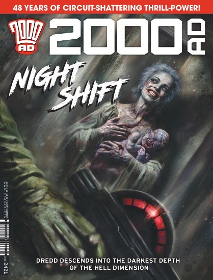
I’ve painted well over a hundred covers for various publishers and ninety per cent of the time I have been left to come up with the idea myself for the cover image. Sometimes, this can be based on a particular event or scene from the story inside the comic or more often than not, it can be a strong, punchy image of the main character or characters from the strip.
When I’m painting a cover for a story that I’m also illustrating, I like the cover to at least hint at what’s going to be happening in the story, rather than just a generic pin-up type piece.
I usually do a rough sketch or two for the editor, just so they know how I’m thinking and what the idea is and then take it from there.
A recent cover I did for 2000AD was a horror-themed one for a Judge Dredd series I was working on. I used a specific moment from the story and created a new version of it for the cover, since I liked the scene so much.
Cover art has to be (or should be) eye catching as it’s sometimes your one chance to sell the comic and to try and make it stand out from other titles on the stands. You need a clear image that works from a distance with a strong focus point and composition to draw the attention of the customer – obviously a really cool image doesn’t hurt! Finally, don’t forget to leave enough ‘dead’ space for logos, barcodes and any other cover copy – you’d be surprised at how many artists forget that simple task.
Personally, I do miss the style of many superhero comic covers from the 50 & 60’s that were so melodramatic with a lot of word balloon dialogue shouting at the reader and telling you the main beats of the story – they were also very misleading as to what actually happened inside the comic and could be quite different, but they were great fun with some fantastic art.
Finally, Some extra thoughts from Mike Carlin.
With decades of experience of writing and illustrating and editing comics for DC and Marvel Comics the gentleman decided to flip our question and explain what makes a BAD cover. In his own words:
“Here is a cover I wasn’t involved in, but it is noteworthy for being STUPID— Daredevil #29. Daredevil is being unmasked by thugs— AND HE’S WEARING HIS BLIND GUY GLASSES UNDER HIS MASK!
Cover Image: Daredevil 29.
Publication Date: June 1967.

TRIPWIRE assures you that this is only Part One of what will be a multi part article. Return to our website for Part Two in a matter of weeks. Paul N Neal assures you that you will NOT be disappointed. There are more surprises to come.
As ever the whole Tripwire team and the creators involved welcome polite comments and engagement on social media wherever this article is shared.







You must be logged in to post a comment.