

Comics News
Artists Talk About The Right Way To Draw Batman


Depicting The Dark Knight
Tripwire recently asked a number of 2000AD artists to talk about the best way to illustrate Tharg’s flagship character Judge Dredd. A link to that article titled, Artists On The Right Way To Draw Dredd’s Helmet is provided just below:
https://tripwiremagazine.co.uk/headlines/artists-on-the-right-way-to-draw-judge-dredds-helmet/
That article inspired Tripwire’s contributing writer Paul N Neal to ask some of the same (and several more) artists and creators about the best way to illustrate one of DC Comics flagship characters. On this occasion the subject was Batman! Given the fact 2024 is Batman’s 85th Birthday Paul tried to get 85 comments to a simple question.
The question was simple enough: “Is it difficult to get Batman’s head, ears, cowl and cape right? What is the best approach to illustrating the batman and who in your opinion is the best Batman artist??”
Many artists, and indeed even a couple of writers offered their thoughts on the matter.
In no particular order we begin with artist Bo Hampton…
Bo Hampton
Artist, Batman Castle of the Bat, Batman Legends of the Dark Knight, Saga of Swamp Thing.
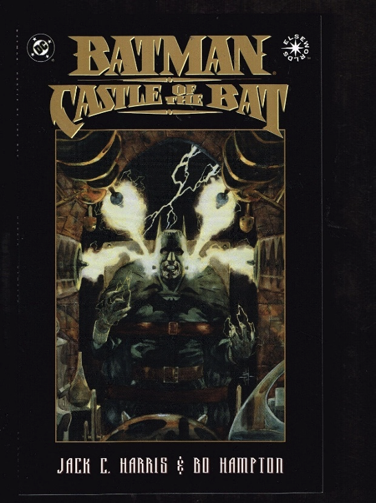
Bo: My preference for The Batman’s cowl and ears is the way Mike Kaluta did it. I believe the ears were inverted for the first time at that point. As far as the actual head it’s a toss-up between Mike and Bernie Wrightson. I fall squarely into the white eyes and protected thick neck Neal Adams used. My painting approach was watercolour and purely my own take on it.
Denys Cowan
Artist, The Question, Detective Comics
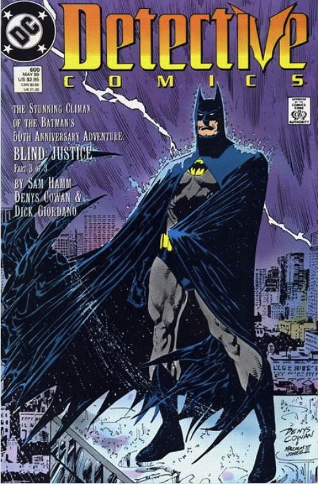 DC: There are times when I draw Batman’s “face” when i’m thinking about it as a whole unit..not a mask on a guy. Other times, It’s bruce Wayne in a mask which is different.
DC: Batman is a nighttime hero, he should always operate in the shadows!
Scott Hampton
Artist, Batman Night Cries GN, Batman Gotham County Line, American Gods.
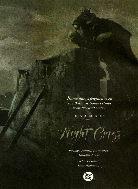
Scott: As far as I’m concerned, the bat ears should be long but not too long. I absolutely love John Bolton’s demonic bat ears in a book he did in the early to mid-90s. I can’t remember the name of it. As to the Cape, I think Bernie Wrightson pretty much said the last word on that. In a general sense, Neal Adams is and always will be the Batman artist as far as I’m concerned.
TRIPWIRE NOTE: It is Tripwire’s belief Scott is referencing the three issue DC Elseworlds miniseries titled Manbat written by Jamie Delano with fully painted art by John Bolton that was released in 1995.
Richard Pace
Artist: Batman: The Doom That Came To Gotham, Imaginary Friends (DC Comics, Vertigo)

I think Sienkiewicz’s Batman is the model I follow closest in terms of ears and cowl, as well as making an effort to have the character feel a part of the environment.
There should be a sense of Batman being a part of the darkness he’s operating within. I guess the operating aesthetic is every bit of shadow and darkness you leave on the page should be an extension of the Bat.
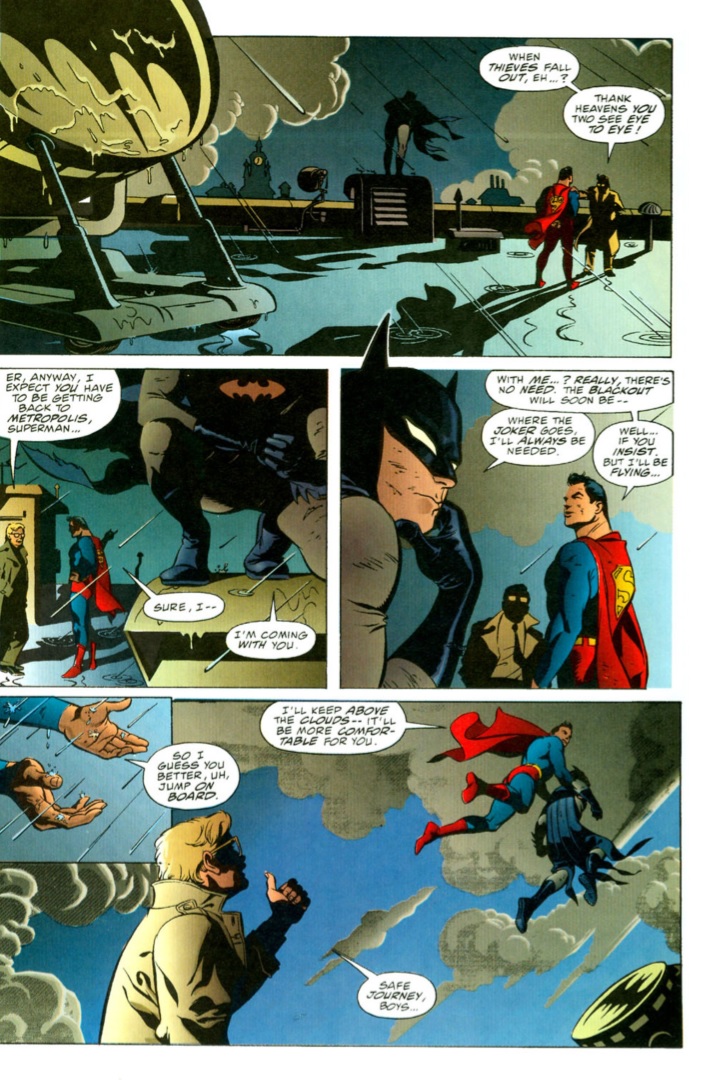
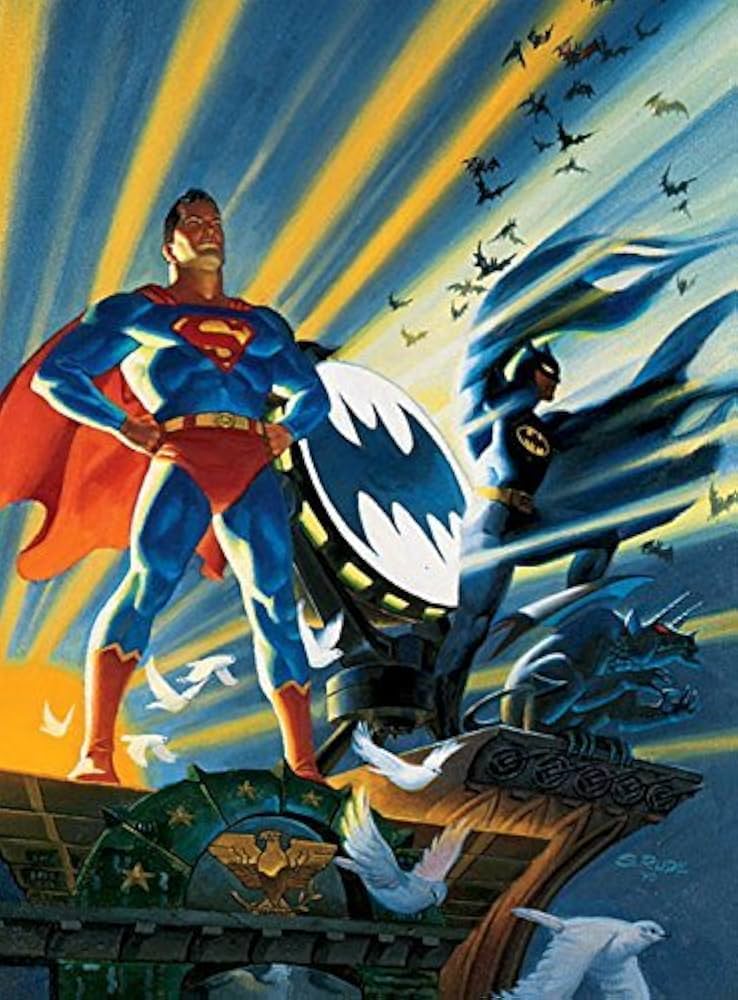
Steve Rude
Artist: Nexus, World’s Finest, Captain America
Eduardo Risso
Artist, Batman, Bark Knight: A True Batman Story GN, 100 Bullets
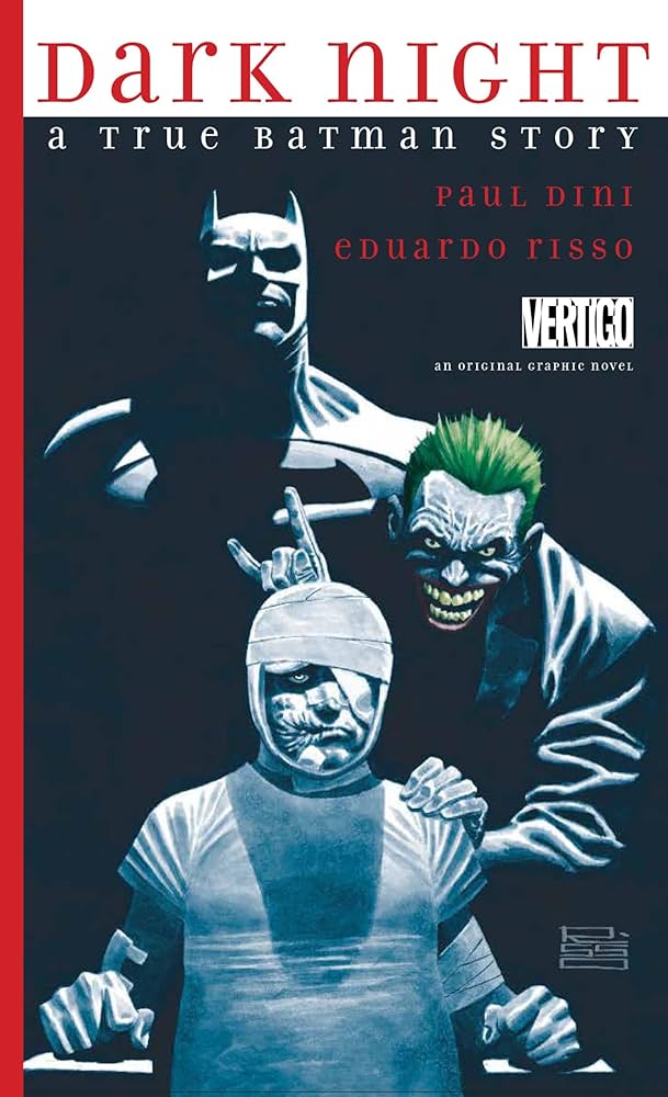
Well, I can tell you for sure there are as many best approaches to illustrate Batman as there are illustrators.
There’s not only the matter of one’s own style and criteria, but there’s also context, editorial requirements, design continuity, and so on and so forth. For instance, for The Last Halloween I was asked to match the aesthetic of the late (and great) Tim Sale.
The tone of the story will also dictate what kind of approach the character demands, it is one thing for Batman to solve a murder mystery, and another one entirely to embark on a multi-dimensional trip to defeat Darkseid.
For my part, I’ve always felt that since he’s a human with no superpowers he should be really physically imposing, and for some reason I think that my design goes better with the short ears and thick cape. The script will draw you into making a more realistic or haunting version of the character. Since I’ve always been more prone to get the detective side of Batman, I’m more inclined to portray him as a regular person using a realistic fabric-made suit, susceptible to knives and bullets.
To my personal liking, Jim Lee and Frank Miller took the character to its highest form.
Glenn Fabry
Artist, Judge Dredd v Batman: Die Laughing Part Two, many Batman covers, Slaine and Preacher.
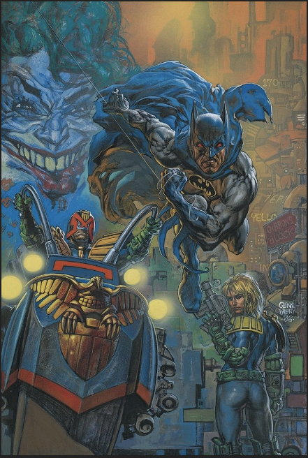
Glenn had some typically brief but interesting words to share.
Glenn: Batman and his head? Simon did big bunny ears. I went more Adam West. Stubby cat ear version!
TRIPWIRE NOTE: We did check, and Glenn was indeed referring to Simon Bisley’s approach to the character.
Dan Brereton
Artist, Batman Thrillkiller, Batman Legends of the Dark Knight, Nocturnals.
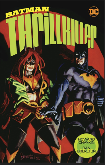
Dan: Over the years, illustrating any Batman story has been a privilege and a pleasure. I find myself much more interested in illustrating him in the context of story rather than pin-ups. The concept of Batman begs for a story to be told. He’s one of the most well designed and conceived superhero characters out there. He is ultra-solid and well-established, as long as you keep to his core, you can draw him any number of ways with incremental adjustments, and he remains Batman.
Dan: There is no right way to draw him (though there are plenty of wrong ways) but I tend to keep his ears on the shorter side and the same way with the nose on his cowl. This gives his suit a more utilitarian feel. He’ll always be the pulp inspired, obsessed detective feared by criminals, a creature of action and shadows.
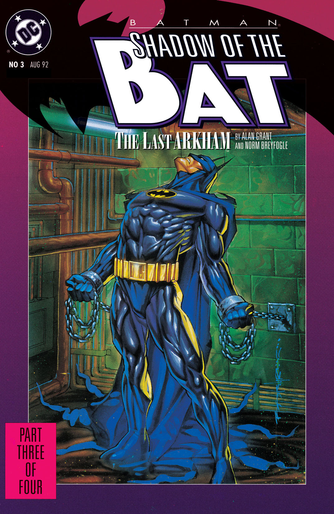
Brian Stelfreeze
Artist, Black Panther, Shadow Of The Bat
John Van Fleet.
Cover artist, Batman, Typhoid Mary, X-files.
Artist, Batman Chalice, Batman/Poison Ivy: Cast Shadows.
When approaching Batman, for me, there is never enough black ink at the art store. I see him as a part of the shadows that Gotham casts. I’m open to a lot of interpretations but I always want part of him touching the dark. Bruce gets to walk around in the light, but I never wanted to draw the Bat in a brightly lit setting. Detaching him from the shadows felt like zapping him of his only superpower.
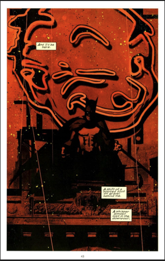
Note: Above splash page from Batman Chalice that John said illustrated his point.
Scott Koblish
Artist, Final Crisis: Legion of Three Worlds, Batman And The Outsiders
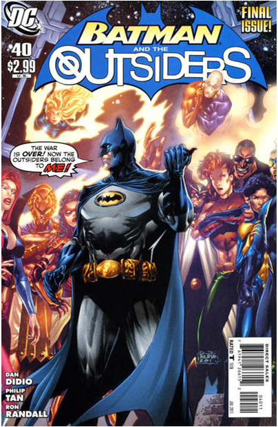
When I consider drawing Batman, the first thing I do is to figure out what the story demands for the character. Batman has a wide array of moods within his stories, from ridiculous to horribly tragic, and it’s important to figure out what the plot demands before settling on a style or approach. Having said that, I tend to focus on the darker aspects of the character when drawing him and I enjoy working most with the cape and cowl, as they identify the character of Batman the most. The shine on the boots and gloves and the billowing of his cape can be accentuated in a drawing by laying in the shadows around him, connecting and merging the dark areas in the environment to the black areas on the figure. That helps to create mystery and mood.
Nick Percival
Artist, Judge Dredd, Slaine
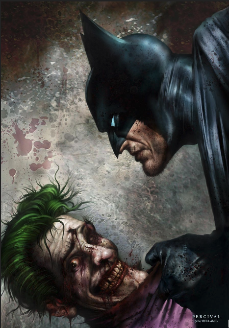
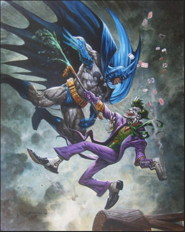
Nick: This was done a long time ago as private commission for a painted version of the classic Bolland Batman/Joker cover. The brief was to keep it exactly like the Bolland piece (although this image is a flipped angle of it), so I stuck with that and just created a more painterly version of it. It also ended up as a print. It was interesting to paint – not how I would probably approach the characters in my own style but still good fun. (At a later date, I did a version that replaced Batman with Dredd.)
TW: How would you approach Batman now?
NP: Much darker and more expressionist, I think. I love what Bill Sienkiewicz does with the character.
TRIPWIRE: as luck would have it Bill Sienkiewicz was available and kindly offered his thoughts.
Bill Sienkiewicz
Artist and inker, Batman, Batman Dark Knight Dynasty GN, Stray Toasters, Elektra Assassin
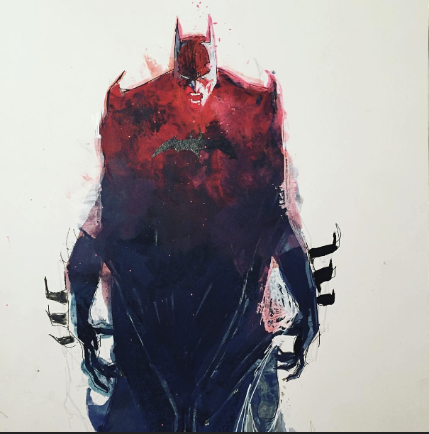
Bill: I approach Batman’s ears, cowl and cape more as living things; how they feel, not necessarily how they look.
TW: Could you elaborate on that thought a little?
BS: The look should be dark or distressed, graphic, scary, like his cape is made of living bats– not Kevlar and armour and carbon fibre- he’s more classic, like Nosferatu and the Karloff Frankenstein rather than the padded versions we see in a lot of films.
John Higgins
Colourist, Batman The Killing Joke
Artist, Batman Legends of the Dark Knight
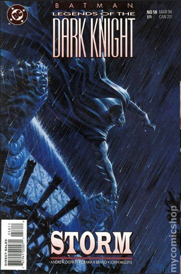
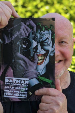
John: Many artists have depicted Batman, and they might influence you, but you come to your own interpretation the same way you would balance the depiction of any part of an illustration. It then becomes yours. In the early days of working for DC or Marvel, you might get an artists’ guide from an editor on a particular character, to show how the costume should work, such as Mickey Mouse’s ears, which stay in exactly the same position no matter which way his head turns. Now we are allowed to do our own style (except on Mickey Mouse:) My depiction of Batman is more spiky ears at the back of the cowl. To his nose covering I give a slight hook, to give the sense of a raptor, his cape is a full expression of his movement, probably more so than his body, billowing or streamlined, it gives shape and form to the action.
Liam Sharp
Artist The Brave and Brave and The Bold, Batman: Reptilian.
Writer and Artist Starhenge.
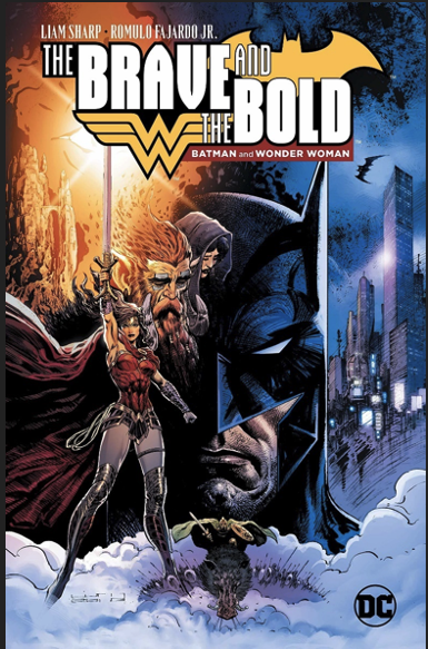
Liam: Good grief! That cowl! That cape! It looks so simple and yet… it really isn’t! How those shapes fit together, triangulated points on the top of a domed mask… there’s a kind of alchemy to it! I’m a fan of the highly stylized approach taken by people like Bill Sienkiewicz, with very long ears. I touched on that in Batman: Reptilian, which also nodded at Dave McKean’s Arkham Asylum work. For The Brave and The Bold it was more a nod towards Neal Adams, who always made it seem effortless. I wouldn’t say there’s a right or wrong way though. Different stories suggest different approaches. Gothic horror (long ears) or detective/crime (less flashy, more practical.)
LS: As Frank Miller showed in DK, probably tiny ears are best for brutal fisticuffs! As for the cape… don’t even get me started down that rabbit hole! 🙂
Matt Wagner
Artist, Writer Batman / Grendel Vols 1 and 2, Batman Legends of the Dark Knight, Mage, Grendel.
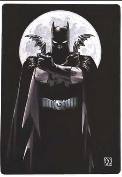
Matt: Batman has got such a strong design as a character that he’s incredibly open to interpretation. Almost every artist brings their own particular flair to his depiction. But one of the biggest aspects of that design is that he’s a figure that’s ornamented with triangles from the points of his ears to the points on his cape, to the points on his gauntlets to the points on the insignia on his chest.
MW: All those triangles make for a very dynamic figure. My most usual take on the character is that he’s a real guy in a real costume…everything has to look functional, the cape most especially. The influence of the visuals from the Adam West tv show are always in my version of Batman to some degree.
Chris Weston
Artist Batman Legends of the Dark Knight, Judge Dredd, The Twelve for Marvel comics.
Concept artist, designing Michael Keaton’s Batman costumes for The Flash Movie (2023.)

Chris: Much like Judge Dredd, Batman’s costume can withstand a surprising amount of artistic variation. His look can be adapted to suit the tone of the story he’s in. Frank Miller’s stocky, musclebound Batman perfectly suits the more brutal tales he’s in, and he’d look silly with long, elegant ears. On the other hand, Bernie Wrightson’s Batman slim, aquiline Batman perfectly suits a more gothic take on the material. I don’t think I’ve really nailed my own Batman yet; I haven’t drawn him enough or found out what I want to say about the character. The only preference I have is for the yellow, oval chest emblem. This was the first thing I requested when I was tasked with coming up with new bat-costumes for Michael Keaton (for the recent Flash movie). Luckily, that was already on Warner Brothers wish-list.
Ty Templeton
Artist, Batman Adventures, Batman 66, The Simpsons.
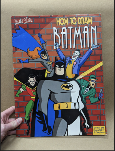
TY: The artists who inspired me were Neal Adams and Dick Sprang. Neal was the new young hotshot when I was a lad, and Dick was the classic artist of the golden age, each with his own notable style, but when I first drew Batman, I leaned heavily towards the Neal Adams interpretation.
TT: HOWEVER: The majority of my association with the character came through the series of comics based on Batman: The Animated Series, a look and style established from a TV series in the 90s. Those designs and styles were created by Bruce Timm and co. over at Warner Brothers animation at that time. My series aesthetic was carved in stone by that design team, and that’s the rules I follow. In fact, I codified those rules in a book called “How To Draw Batman” that came out a couple of decades ago, the definitive style guide for how to do it!
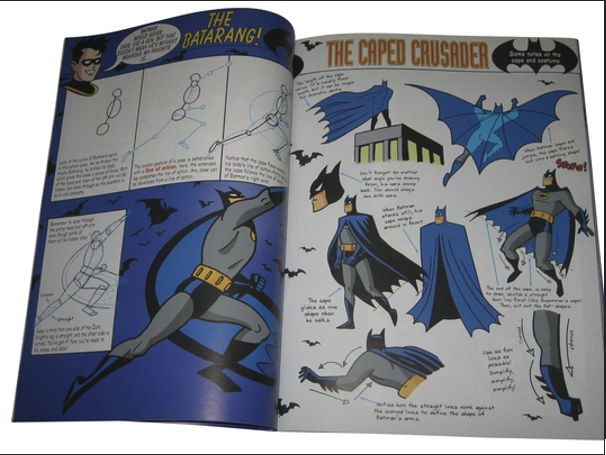
TW: That sounds like an essential book for any Batman fan. In a few words could you say what it advises about Batman ears and cape for example?
TT: Here’s the answers to those exact questions from one single page of the book!
Dale Eaglesham
Artist, Batman, Detective Comics, Batman: Shadow of the Bat, Fantastic Four.

Dale: When drawing Batman, any character really, you need to delve deep into who this person is. In the case of Batman, his parents were murdered by a mugger in front of his youthful eyes. Bruce, wealthy and brilliant, grows up with a longing for justice in the world but also with a hidden rage.
Dale: That rage seeps out into the open when he dons the guise of Batman. Visually, you want him to be able to melt into the shadows, so the less detail the better. However, you also want him to emerge into the light like shattering black glass, terrify and ferocious. Batman shouldn’t look heroic, he should terrify.
Kelley Jones
Artist, Batman, Batman / Dracula Red Rain GN, Batman Bloodstorm GN, Batman Crimson Mist GN.
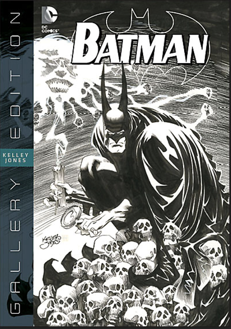
Kelley: When drawing Batman I don’t think of him as a man in a costume, I think of him as the shape of a reckoning. A shadow that can’t been stopped. Batman is the name of fear to those that shadow engulfs.
KJ: His cape and cowl create a silhouette his prey see in those intense moments in a dark alley, or room, or wherever, before he confronts them. I always thought not how I’d be if I was Batman but how frightening it would be to know he’s looking at me. Is he human some will wonder as they go unconscious. The point being criminals give up crime or flee Gotham… And all they’d be able to describe is the cape and cowl and how it must have come from hell, for nothing human could look like that.
Mark Chiarello
Artist, Batman / Houdini The Devil’s Workshop GN.
Editor, creator of the Batman Black and White series.
Art and Design Director for DC Comics for 27 years until 2019.
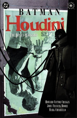
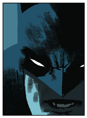
Mark: I don’t think there’s any ‘best’ way to draw Batman, that’s the great thing about the character, he’s completely malleable. That’s why he’s such a favourite of artists, you can draw him in any style you wish. My favourite interpretation of Batman is by master artist Jose Luis Garcia Lopez.
TW: Could you elaborate on how you have approached the character in the past?
MC: Even though I grew up worshipping Adam West as Batman, I try to draw him a bit darker and more mysterious than the 1960’s TV look.
Wayne Faucher
Inker, Batman Shadow of the Bat, Detective Comics, The Spectacular Spiderman.
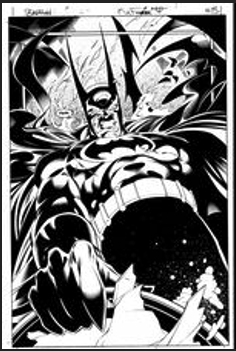
Wayne: The Batman concept is so strong that he can be interpreted in a myriad of ways. This is the beauty of the character (my favourite superhero). Neal Adams and Jim Aparo made the primary (modern) shift to darkness which still continues to this day. Kelley Jones applied a stylistic impression which cannot be denied and drove the character in a new visual direction. Mazucchelli had a simple beauty which (to my eye at least) evoked Toth while Miller’s work was more character driven as opposed to affecting the look.
TRIPWIRE NOTE: This is Wayne inking over Mark Buckingham. He might comment later.
WF: That is, his Batman visuals were more about his style than shifting the character’s look as a means to an end. I’m sure there are many artists who had their effect on Batman. I’ve inked runs on Detective, Shadow of the Bat, and Batman and Robin Eternal. I’ve been lucky enough to work on Batman with Mark Buckingham, Don Kramer, Scot Eaton, Sal Buscema and countless others. Every penciler brings something of their own. It is sustained because again, it’s such a strong character. In the end, his look is just a matter of taste.
Dan Panosian
Artist, Batman: Arkham Knight computer game on PlayStation 4, Windows, and Xbox One. Uncanny X- Men, Web of Spiderman for Marvel Comics.
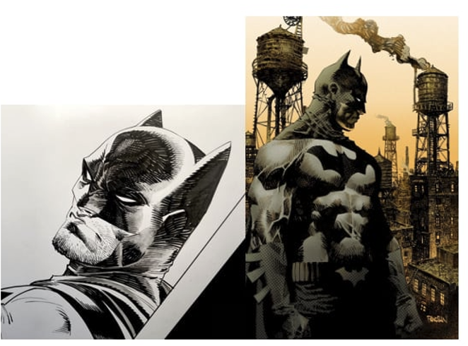
Dan: When I’m drawing Batman it’s a battle between Neal Adams’ version and Frank Miller’s. It’s a very tough decision to make because they’re two very different approaches. Neal Adams gave him a sinewy athletic build and Miller drew him like a block of destruction. So, I wrestle with the dichotomy of those concepts. Oddly enough, I’m working out my own concept of how I want to portray the character, and I keep leaning towards more of a high contrast approach. My reasoning behind it is Batman isn’t terribly stationary when prowling Gotham City unless he’s perched on a nearby gargoyle, but even then, I like the idea of him being something outside of our picture what it is to be human. Something that dances between magic and a nightmare. His costume’s aesthetic function is fear based – so any kind of humanisation works counter actively.
DP: So many artists have done amazing costume variations, but I know there are endless possibilities. It’s quite maddening… But that’s where the fun begins!
Russ Braun
Artist, Batman Legends of the Dark Knight, The Boys.
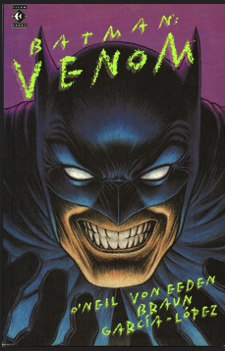
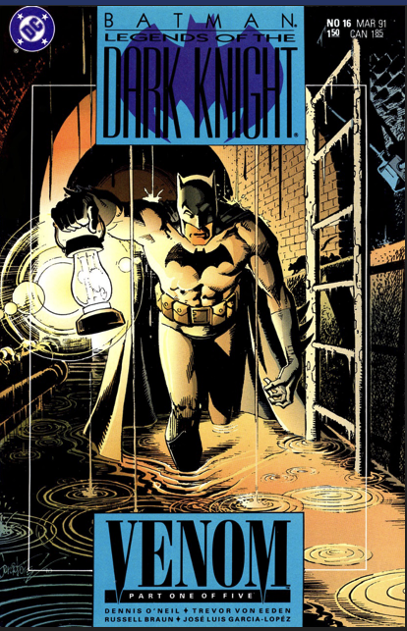
Russ: I had the opportunity to draw Batman LOTDK early in my career. I went for the Year One look with lots of shadows, short ears, trying for realistic leathery texture. I had the amazing good fortune to be inked on that job by the great Jose Luis Garcia Lopez who crafted the cape and cowl and ears to classic Batman perfection, mentoring and teaching me through the process! I think of the cowl and cape as a frame in a way. For me it’s all about the acting. If you can keep an expression on Bats’ face through the cowl you can do almost anything with the lighting, texture and material. He’s dark and grim, but if you can get his humanity to shine through in the expression you can get the reader to identify with him more.
RB: The artists who have influenced me most with their Batman approach are the previously mentioned David Mazzuchelli and Jose Luis Garcia Lopez, but I also love me some Brian Bolland, Bill Sienkiewicz and Alex Ross!
Steve Yeowell
Artist, Batman Legends of the Dark Knight, Zenith for 2000AD
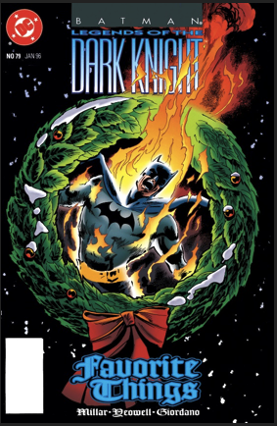
Steve: In my experience, the best way to approach Batman’s ears is to not make them too long! Shadow the cowl with chiaroscuro lighting, three quarters from the rear, then treat the cloak as an independent character in its own right.
SY: My personal favourite Batman artist is Carmine Infantino, although I’d say Neal Adams perfected those three bat elements.
Richard Case
Artist, Batman ’66 and Doom Patrol.
Richard: Both long ears and short have their merits, depending on the attitude and execution!
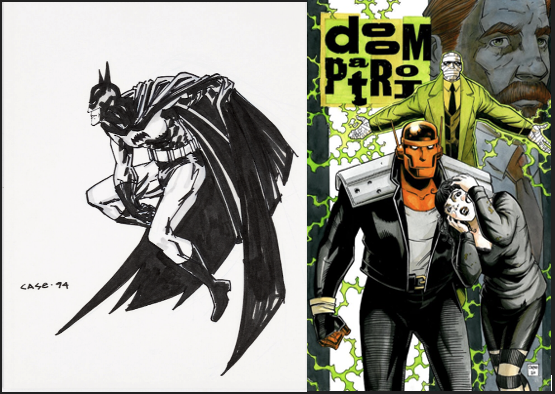
RC: For me, growing up I always preferred seeing Batman in the comics with long ears, there’s something formidable about the silhouette that those long ears created, often accompanied by a long flowing cape. Probably my initial favourite artist that established that look for me was Marshall Rogers on his run of Detective with Steve Englehart and Terry Austin. Followed by discovering Wrightson’s version in Swamp Thing, and Simonson’s, when he met Manhunter in Detective. Ironically, it was Simonson who showed me how cool a short-eared Bats could be, somehow making Bats himself feel more like a tank.
TW: With a bit of luck, we “might” hear from Walt Simonson
RC: Cool!
Dan Jurgens.
Writer, Penciller, Inker, Batman, Batman Beyond, The Brave and the Bold, The Batman: First Knight (2024)
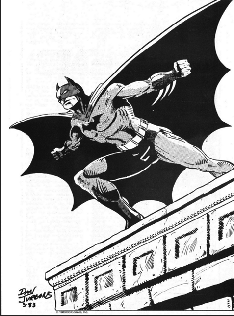
Dan: One of the fun and fascinating aspects of drawing Batman is the ability to blend him into the night and shadows of his environment. Superman, when flying through the sky, for example, still stands out. He’s incredibly visible. Batman, thanks to the unique aspects of his costume, can move through the night largely unseen, blending in as though he’s part of the city. Which, in many ways, he is. He’s quite unique that way.
Mike Perkins
Artist, Batman: The First Knight, The Swamp Thing
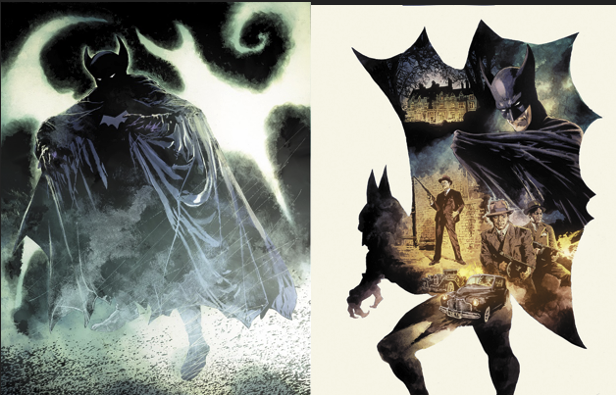
It’s always visually striking to render the cape as a living shadow. A swirling, demonic entity that has a life of its own and can vary in length. That’s not something I’ve been able to play with on The Batman: First Knight, though.
On that series, set in 1939, we wanted to show that this is a costume. A heavy leatherish cloak with ribbing leading to the peaks of the “bat wing”. It can still be utilised to dramatic effect but firmly embedded in a realistic, albeit atmospheric environment.
Frank Quitely
Artist, Batman and Robin, JLA: Earth 2, All Star Superman.
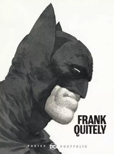
The best way to approach Batman’s ears, cowl, and cape, is to go for whatever suits your personal taste, and whatever suits the story. One of the great things about Batman is that he can be depicted in so many ways.
Dave McKean had an angular, exaggerated Batman in Arkham Asylum, whereas David Mazzucchelli had a more realistic Batman in Year One, and both look great, and suit the style of their respective stories.
Barry Kitson
Artist, Batman: Shadow of the Bat, Batman: Legends of the Dark Knight, Batman/Punisher, Legion of Superheroes.

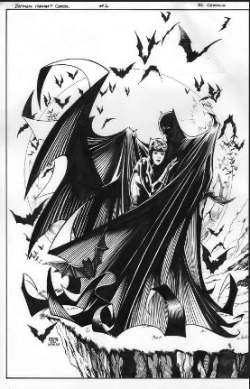
Getting to draw Batman was a childhood dream come true for me and a chance to follow in the footsteps of one of my artistic heroes. For me, Neal Adams totally nailed the way Batman should be depicted in his reimagining of the character.
Before Neal I had always thought Batman looked pretty goofy, but Neal’s take made the character imposing and dynamic – finally a creature of shadows that could strike fear into the hearts of criminals! Despite our stylistic differences it was Neal’s version of the Batman that I always kept in mind when I drew him.
John McCrea
Artist, Hitman, The Boys: Herogasm, Judge Dredd.
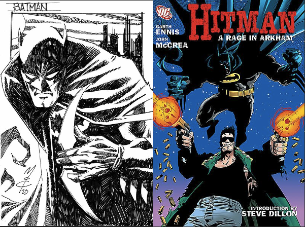
Life is a constant quest to figure out the best way to draw Batman…. Early in my career I used to draw him super muscular but over time I have realized that the less is more approach works best. Cover up most of him with a swirling cape and focus on the important stuff -ears, symbol, batarang, fists etc.
Speaking of ears, that’s another problem- super long ears like Kelley Jones, super short ears like Dave Mazzuchelli, medium-sized like Jim Aparo (who is my very top Bat artist). It can change day to day, job to job. As you can see I am still searching for, and will probably never realise, the perfect Batman.
Erik Larsen
Artist, Teen Titans, Outsiders, Spiderman
Writer, artist and publisher Savage Dragon, Image comics
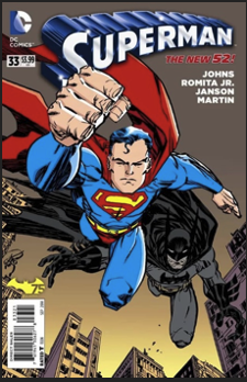
There is no right answer to this question. Batman is an appealing character for a lot of artists because he’s so flexible. You can make his ears crazy long and he’s still Batman or crazy short and he’s still Batman. He can be dressed up or dressed down. Leaning on shadows seems to work better than not and the white eye slits seem to work better than seeing his eyes. My own personal preference is to NOT see the outline of his human ears–four-eared Batman looks silly to me, and we’ve seen from every live action movie that the mask does effectively cover his human ears–but again, that’s a personal preference.
I prefer no armour and no seams or piping, but I would never argue that any one version is the correct one. The beauty of Batman is that they all work. Alex Toth could draw a terrific Batman with six well-chosen lines and Neal Adams could draw him with a thousand lines defining every contour.
Mark Buckingham.
Artist, Batman: Shadow of The Bat, Shade The Changing Man, Miracleman.

There have been so many incarnations of Batman by so many wonderful artists that I must admit picking one who got the character “just right” seems impossible to me. When I drew him I was pulling on so many different threads, trying to weave a Bat that could resonate with all that went before, from early 60’s silliness, to the gothic of Neal Adams, to Bolland, The Dark Knight, and so much more.
Mine mostly started with a fairly detailed and textural style, dragging stylistic elements from my collaborations with Chris Bachalo on Death and Generation X, with a hint of Will Eisner’s design influence, a mix of Batman Animated, a pinch of Neal Adams, and an awful lot of Kelley Jones who was my favourite current Batman artist when I started on the Bat books. I took delight in seeing which of us, Kelley or I, could give Batman the longest ears. I think Kelly won.
As my time on Batman progressed I found my overall approach to the art became increasingly simplified and more cartoony. The human aspects of Batman himself became submerged beneath a swirling mass of cape curls, a living thing of shadow, where only his cowl and ears remained visible, and a pair of white eyes peering out from deep inside, to give any sense of him existing within it. A dark unfathomable form.
If I were to tackle him again today I know I would try something completely different, to reflect where I am right now. That is the beauty of Batman. A concept so simple, so striking, it is open to infinite reinterpretation and reinvention.
Jimmy Broxton.
Artist, Knight and Squire, 2000AD, Barbarella, Fully Loaded

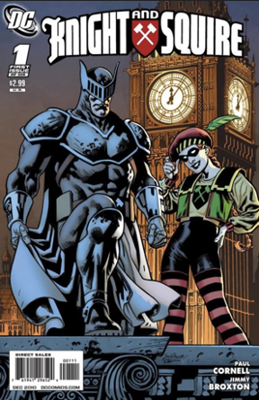
The first thing you have to decide is whether you are going for a man in a bat suit (Mazzucchelli for example), or a humanoid, bat-like creature (Kelley Jones springs to mind). There are valid arguments for both approaches, both thematically and visually. Personally, I’m a man in a bat suit kind of guy, so that’s where I lean.
The second thing you have to decide, is the length of the ears and the size of the cape. To a degree, if you are already favouring the man in a suit idea, then practical limitations apply, so you can’t go too crazy, or it starts to look ridiculous (assuming we don’t think a man in a bat suit isn’t intrinsically ridiculous to begin with). I tend to drift on the ears, sometimes I’ll go long, sometimes short (not in the same story though). Once you have all that established, the cowl takes care of itself, and can be rendered in accordance with the locale and lighting conditions. As for artists who have perfected this tricky balancing act, I’d put Dick Sprang, Marshall Rogers and Frank Miller at the top of my list.
Wayne Nichols
Artist, Detective Comics variant covers, Star Wars Unleashed, Bill and Ted Roll The Dice, Afterburn (now a Dave Bautista and Samuel L Jackson movie.)
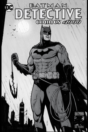
The best way to illustrate Batman’s uniform is to start out with the outlines – placing the triangle shaped eye holes first, then build up the outline of the top of his head with short triangle pointed bat ears either side.
From there you can draw in the opening where his mouth will be but leaving a solid moulded covering over his nose area. His cowl connects to his cape at the back, and from the front it comes together at a point in the top centre point of his chest, just above the iconic chest Bat symbol. And its Batman, so don’t forget to add plenty of shadows!
I try to give my version of Batman a good amount of bulk and size to cut a tall, strong and imposing figure. At the same time I try to give him a sense of grace, balance and agility to his body language and movement.
You asked in my opinion which artist, if any, has perfected Batman? It’s hard to pin it down to just one artist, but Neal Adams really nailed Batman’s look in the 1970s and his version still holds up and looks just as fantastic today.
Chuck Dixon.
Writer, Batman, Batman Chronicles, Batman LODK, Detective Comics, Nightwing, Robin (Approximately 400 Batman related comics.)
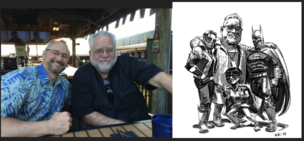
Batman’s costume and look is so elegant that it allows itself to be modified or interrupted and still remain recognizable. He’s one of the rare pop culture figures who is readily recognizable in silhouette.
That means he’s malleable, able to be adapted to any given artist’s style from Dick Sprang to Berni Wrightson to Graham Nolan. For my tastes, and my more procedural mystery approach to the Dark Knight, Graham’s style always worked best.
Photo: Chuck Dixon with Graham Nolan. Art by: Kevin Kobasiac.
Graham Nolan
Artist, Batman, Batman: Bane of the Demon, The Batman Chronicles, Batman Vengeance of Bane 1 and 2 (1993 and 1995.) Detective Comics (Over 150 issues) The Joker: Devil’s Advocate
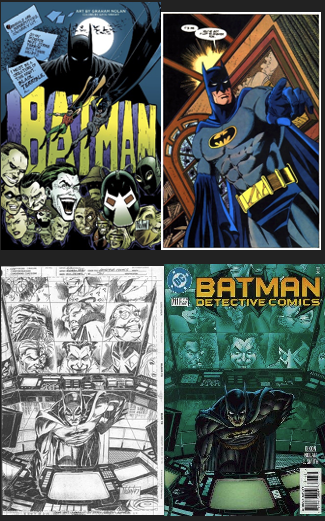
The Batman has that perfect look, a blend of cartoon and realism. Jerry Robinson, Dick Sprang, Neal Adams, Jim Aparo and Don Newton captured the heroic and mysterious look of the character that made me fall in love with him. It’s what I tried to achieve during my tenure with the caped crusader.
All great characters can be identified by their silhouette. There is no mistaking The Batman. The ears and the cape are wonderful tools for the artist to play with. You can go for realistic or even German expressionism to achieve the look and mood you are trying to convey. That is a wonderful sandbox for an artist to play in. I consider myself truly blessed to have had the opportunity to add my own touch and flair to this wonderful character. To The Batman I say, “Thanks, old chum”!
Rick Burchett
Artist, The Batman and Robin Adventures, Batman: The Gotham Adventures, Batman: The Brave and the Bold, Batman Mask of The Phantasm.
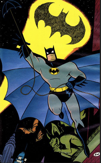
Denny O’Neil always said, “There are many ways to do Batman and they’re all correct.”
Given the choice, I think he should be just a darker part of the dark; never fully seen, just glimpsed. A shadow that moves. I always thought that to be truly scary he should be as frightening to the reader as he is to the criminal. What we don’t see is always scarier. It lets our imagination work and that is always more effective. I have a lot of favourites. Dick Sprang, Neal Adams, Marshall Rogers, Jim Aparo, Bruce Timm, Darwyn Cooke, Alex Ross, Berni Wrightson, the list goes on and on.
Chris Burnham
Artist, Batman Incorporated, Batman and Robin, Nameless.
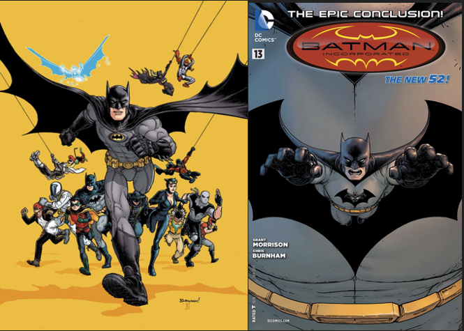
The genius of Batman’s design is that he works in every style. The pointy ears, the ridged gloves, the belt, the bat-symbol, are so instantly recognizable that they work no matter who is drawing it. David Mazzuchelli’s simplified realism is perfect. Frank Miller & Klaus Janson’s chunky stylization is perfect. Kelley Jones’ long ears and infinite ribs, Mike Mignola’s heavy shadows, Seth Fisher’s open line, Jim Lee’s crosshatching, Frank Quitely’s detailed wrinkles and seams, Norm Breyfogle’s expressionism… they’re ALL perfect!
Flint Henry’s Batman from Detective 622-624 is my favourite. I couldn’t come up with a clever three-word description of it, and none of your readers will have heard of him, but his Batman is even more perfect!
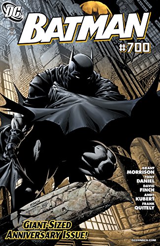
David Finch
Artist, Batman 700, Batman The Dark Knight, Batman The Return, Darkness / Batman.
Version 1.0.0
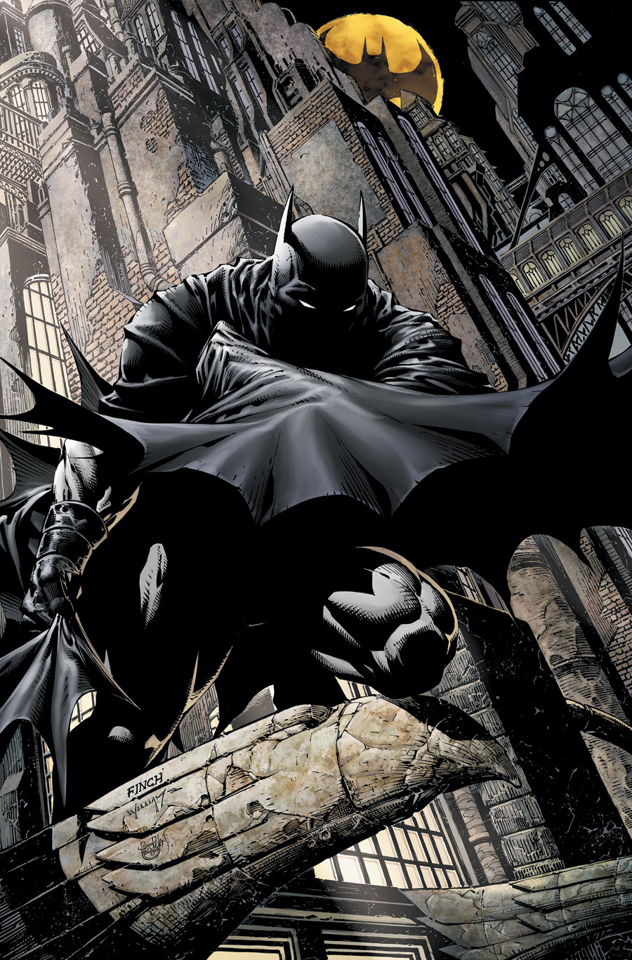
Batman is a character who works well under so many different treatments, so I don’t think I can give a definitive answer to the question of what works best. But I certainly can tell you what my favourite version is! I like short ears. They just seem more functional. And a powerful, almost brutish physique, but still athletic enough to be acrobatic when he needs to be. His cowl works best for me as a second skin that I can wrinkle and stretch with his expressions. That’s an advantage of comic illustration! It just doesn’t work for live action. And his cape should be fairly heavy and structured.
I like to be able to draw Batman in a realistic way, and I think as the hero, he needs that depth, but I do love using shadow and mystery with him. Personally, I think both are necessary to really capture him. If he’s just a spectre, he’s not relatable, and if he’s just grounded and real, he’s nowhere near as cool! There are so many artists that I love on Batman, but I think Neal Adams was the artist who made Batman who he is today. He understood all of those things, and while I have versions I kind of like better, like Greg Capullo’s Batman, he created the modern template that we all use.
Aaron Lopresti
Artist, Detective Comics, Robin, Wraith of God.
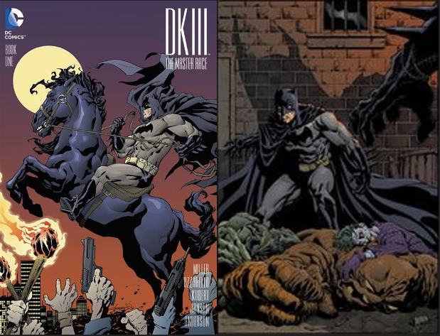
Understanding the character of Batman is key to getting the right look. Making him more stylized and spectre-like rather than realistic man-in-a-suit, is a better and more effective and visually interesting approach. You want to separate him from other heroes. He is supposed to be mysterious and frightening, definitely a creature of the night. Neal Adams was the first artist to really make him cool for me, but I have come to prefer the rougher short-eared Frank Miller version.
Dave Taylor
Artist, Batman and Superman: World Finest, Batman: Riddler -The Riddle Factory, Batman: Shadow of the Bat, Batman Death by Design.
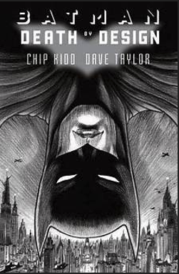
I’d say the best approach to illustrating Batman is to consider the story. He’s the perfect character for sculpting to fit the mood of the tale being told. So, if it’s a super dark, phycological thriller, you can draw him to be a grotesque of the character, a terrifying presence, barely seen, only hinted at in shadows. And then, if it’s something more mainstream, something less gloomy, then you can go the more classic bold, in your face route. He’s a highly adaptable character.
I think I change his ear length every time I do a different Batman project. If he needs to be sleek and serious I’d give him little sleek and serious ears. If it was for something dark and moody I’d probably go for the longer, weird ears, following the great Kelley Jones. Can’t say I ever messed around with the cowl much, but the cape is fun to play with. You can do so much with it, if you’re not trying to be too photorealistic. It can add shape and dynamics to an image, if placed well. And it’s great for capturing dynamic movement, which I think was always the reason these folk wear them! I suppose the Batman artist that inspired me the most would have to be Jim Aparo, who I learned a lot from starting off. And obviously Kelley Jones, who was constantly kicking ass when I started at DC.
J H Williams III
Artist, Writer, Batman, Batman LODK, Batwoman, Desolation Jones, The Sandman: Overture, Echolands.
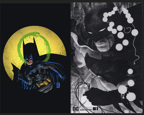
Batman is one of the more unique characters in comics in terms of design. While certain details are consistent from artist to artist, there is something interesting that often takes place, where each artist ends up going for distinct approaches that can have a wide range of impact. And sometimes those differences can be quite dramatic. Some draw long ears, or a shorter cape, some are more realistic while others can be highly exaggerated, or even scary. But no matter what, Batman always is still viewed as Batman, readers seem to easily accept wildly diverse interpretations of the character, and that is what makes him so unique. Very few characters have this attribute. And therefore, there kind of is no right or wrong way to handle his visual.
My own version tends to be a mixture of various things, more realistic, sometimes also wraith-like, but yet I mostly never allow his cape to be stagnant, as if it’s got life to it no matter the scene. I feel that is important to his visual. But even with my own work, in every story I’ve drawn him I tend to draw him differently in some way, consciously or not. Going for what feels right in the moment, or to purposely impact the reader in a particular way. And yet it works every time, and that is what is so wonderful about him.”
Brian Bolland
Artist, Batman: The Killing Joke, Judge Dredd, Camelot 3000.
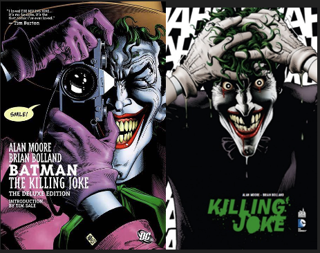
Sometimes the ears are long. Sometimes they’re short. The cape has no real practical use. I’m sure, in reality, he’d plunge to his death. It’s really just a dramatic effect. Batman is a shadow on a wall, two-dimensional, not really there. A scary thought in the minds of the more interesting all-colourful villains.
I came to Batman and DC Comics as a child. I experienced Batman through the Sheldon Moldoff period. The character was made slicker thanks to Carmine Infantino’s elegant drawing style. (Let’s disregard the camp TV show.) He became the “Dark Knight” in the hands of Neal Adams and later Frank Miller. I LOVED DC Comics. I had a vast collection of complete runs of DC’s titles. I sold the entire collection several years ago. I loved them the way I might have loved a beautiful girl. I later married her. We lived happily together for many years. I no longer think about her very much and when I do it pains me to think how much I once loved her but now – nothing. So, when I’m asked to talk about her (Batman. This is a metaphor!) I’m reluctant to. I’ve moved on.
Roger Langridge
Artist, Batman Legends of the Dark Knight, The Straitjacket Fits, The Muppet Show.

“My” Batman – which is to say the one I’m most interested in reading, as well as the one I like to draw – isn’t particularly realistic at all. Batman grew out of a combination of other influences, including The Shadow, Zorro and the Scarlet Pimpernel, but one of the biggest, and to my mind the most significant, was Chester Gould’s Dick Tracy. You can see this in the freakish villains, the exaggerated shadows and shapes that make up Gotham City. My favourite visual interpretation of Batman and his world remains that of Dick Sprang, whose Gould influence mixed with his own sensibilities to create something startlingly original.
More generally, my taste in comics tends towards the heavily stylised, the kind of thing that declares from the rooftops that it’s a medium with its own aesthetics and boundaries rather than a poor cousin to film. As a cartoonist, I feel that the more one leans into realistic art, the less opportunity one has to stamp a unique sensibility on a comic.
So, to address the original question about how one ought to approach drawing Batman’s cape, cowl and bat-ears, I think one ought to go for whatever makes the greatest visual impact on the page. Approach it, at least in part, as a graphic design challenge. Batman’s visual world, to me, encompasses a spectrum between heightened, exaggerated realism at one end and expressionistic cartooning at the other.
Michael T Gilbert
Artist, Batman LODK issue 94, Elric, Walt Disney’s Comics and Stories
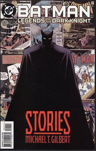
I’m a child of the late fifties, so my preferred Batman is the classic fifties version, written by the great Bill Finger and illustrated by the equally great Dick Sprang. Sprang employed weird, expressive angles, capes flowing a million miles in the air, and a hero that looked like a hero, not a thug. Sprang’s Batman, (and my Batman!), was strong and powerful; a terror to criminals, but a smiling big brother to Robin and other kids. Someone to protect and inspire a child. That’s the same feeling I strive to achieve with my own retro-hero, Mr. Monster.
While I greatly admire the darker, illustrative style Neal Adams brought to the character in the sixties, I also enjoyed the older, meaner Frank Miller version seen in his Dark Knight Returns. One unfortunate side-effect of the Miller version’s popularity is the sneering, hateful hyper-steroid Batman we’ve seen in recent years. A hero in name only, I believe.
However, Sprang’s Batman is the one that really speaks to me. That said, I must confess I also love the very early, cartoony version that Bob Kane employed, (stiff figures and all!). I loved the long bat-like ears he (and assistant Jerry Robinson) drew early on, plus the spooky cape and cowl, hidden by dark shadows. When I finally got a chance to do my own take on the character (in my “Stories” tale in Legends of the Dark Knight #94 in May 1997) I wrote and drew three complete chapters in the style of my idols. For that comic, I did my best to channel Kane, Sprang, and Adams.
The latter was the most difficult to replicate, in that Neal used a more sophisticated, illustrative style than mine. The cartoony Bob Kane version was fun, and the easiest for me. But the Dick Sprang chapter of my story gave me the most satisfaction, with his brilliant mix of cartoony and illustrative styles. It worked with my own approach, and I really was able to nail it. Better yet, when I sent Dick a copy of the printed story, he wrote a long letter back, and was generous in his praise, which made all the work worthwhile!
Anthony Williams
Artist, Batman LODK, Batman Two Faces, Judge Dredd, The Real Ghostbusters
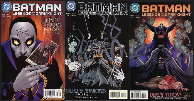
One of the pleasures of drawing Batman is he is open to so many different artistic interpretations and LODK epitomized this with dramatic shifts in tone and style from story to story. Personally, I’m a huge fan of artists who draw a very idiosyncratic Batman that is clearly ‘their’ Batman. The cape, cowl and pointy ears tend to be the signature details.
I think my Batman was beginning to take shape, but I didn’t draw him long enough for me to fully find my look. It was pretty a natural outgrowth of my artistic sensibilities which involves a lot of heavy blacks and use of shadows. My first pages were way too safe and lacked personality and legendary editor Archie Goodwin very firmly told me I could do better, and he was right. Looking back at the issues I drew I can remember how I wanted the cape to be a big dramatic visual statement and framing device. There are only one or two characters I always feel compelled to draw for fun and Batman is definitely one. Visually he is so iconic and unmistakable in silhouette. Okay now I have to go and do a Batman drawing!
Joe Staton
Artist, Batman and Superman Adventures World’s Finest, Batman and Robin Adventures, Batman Gotham Adventures, Batman Chronicles, Batman LODK, Batman Beyond, Batman Shadow of The Bat etc etc.
Newspaper Strip: Dick Tracy 2011-2021 Tribune Media Services (Formally Chicago Tribune.)
Awards: Inkpot Award 1983, Harvey Awards for Dick Tracy 2013, 2014 and 2015.
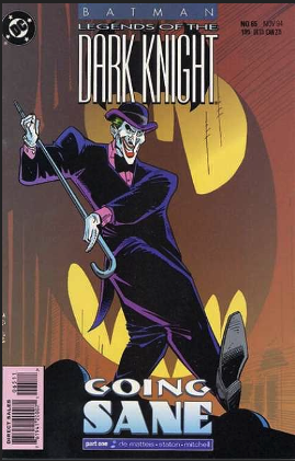
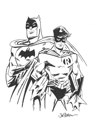
Several years ago, I had an exhibit of my comics’ art in Massachusetts. Included as well were at least eight or nine completely different versions of Batman, from Dick Sprang, to Bob Brown/Joe Giella, through the animated version, up to the Jim Aparo/Dick Giordano take. Also included was a moody version inked by Bill Sienkiewicz. So, I know there are many variations of the basic Batman design because I’ve drawn a lot of them.
When you’re trying to make Batman convincing in a 3-D world, the problem is really the ears. The Bat-ears are one thing and the human ears inside the cowl are another. The clean lines of the mask and cowl should be broken by the lumpy, scrunched ears in there. Generally, they are ignored and handled as straight lines along the edge of the head. Otherwise, there are just a few scratchy lines above the side of the jaw. So, I’ve done all those versions, but the one I really like best is the clean design of the Dick Sprang/Jerry Robinson head.
Ariel Olivetti
Artist, Batman LODK, Superman and Batman verses Aliens and Predators, Lobo.
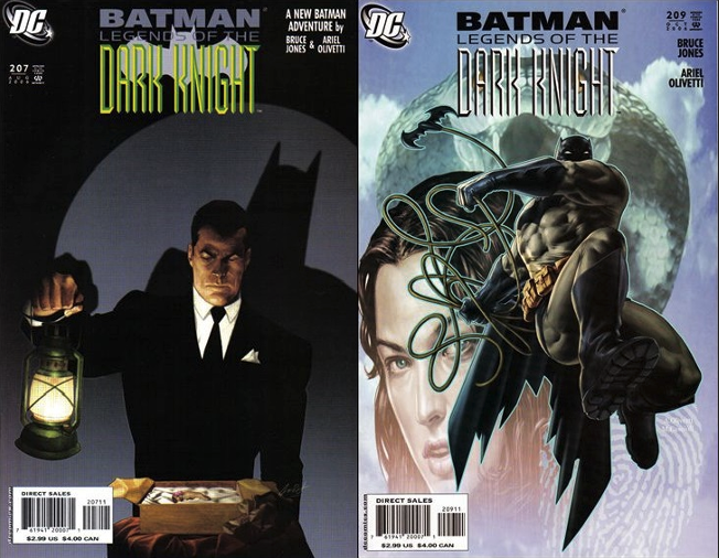
In my humble opinion, one of the most outstanding comics about Batman is “Batman: Year One.” Masterfully illustrated by David Mazzucchelli they are the first steps of the Dark Knight in his fight against crime in Gotham City. What captivates me most visually is the design of Batman with his iconic short ears. Mazzuchelli’s minimalist and sombre aesthetic highlights the duality of Bruce Wayne: the millionaire playboy and the masked vigilante.
In addition, the detective plots add depth to the character. Watching Batman solve mysteries and face villains that cunning must be a delight for any fan.
Mike Zeck
Artist, Batman, Batman LODK, The Punisher, Captain America.
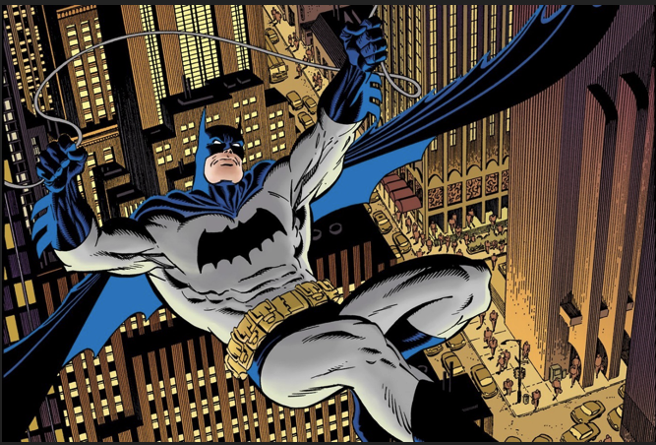
I don’t favour a particular look or feel for Batman. The quality of the writing and visual storytelling matter more to me. I’ve read and enjoyed very realistic interpretations of the character. I’ve seen versions of Batman’s costume that defy all practicality and I have also been 100% behind that interpretation. Just give me a rip snorting, well-written, well-drawn story, and I’m happy.
I DO favour a particular Batman artist. I wonder who among us won’t point to Neal Adams first. He absolutely defined and modernized Batman and just rendered the shit out of every script that came his way. The bar was raised, and the look that would influence all future Batman artists was established. So incredible that the warning siren was heard around the world— “The rest of us schlubs had better get up off our lazy butts and get better or be left behind!”
Val Semeiks
Artist, Batman LODK, Justice League of America, The Demon, Lobo.
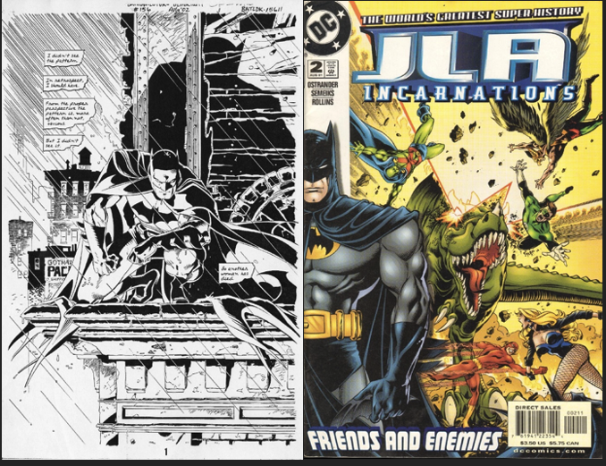
I’ve always preferred a spooky and mysterious Batman over a hyper-realistic one. He does run around in a Bat suit after all. It gets silly if you take it too seriously. So, I liked Tim Burton’s Batman movies much more than Christopher Nolan’s.
I’ve been back and forth on Batman’s ears. I used to like them long, but I’ve been leaning towards shorter now. Not quite Frank Miller short. But somewhere in the middle. I’m pretty old school when it comes to Batman’s look. Though I do like the black bat on his chest more than the yellow oval. Batman’s cape is like a character in and of itself. It has to flow and set a mood. I draw him with square shoulders a lot. I like how that looks. I’ve never been much into heavy Bat armour. That can get goofy real quick. Batman needs to be athletic and nimble.
I’ve drawn Batman in a good number of Justice League of America books and in two story arcs in Batman: Legends of the Dark Knight. The latter are my favourites.
Craig Russell
Artist, Batman LODK, Sandman, American Gods, Fables, Dr Strange GN (1996)
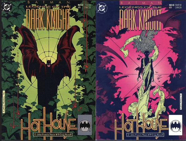
Legends of the Dark Knight #42-43. It seems every artist wants to take a crack at Batman at some point and I was no different. I just wanted to do one for the fun of it. John Moore’s plot synopsis was for a single issue, but I found so much to work with in it that I requested and was granted two full issues.
As to my approach I have to admit I was quite smitten by Berni Wrightson’s silky approach to the character in his appearance in Swamp Thing. I already had a love of long sinuous almost liquid draperies, and I’d used it before in my Doctor Strange stories so any time I could drape him in his creature of the night cloak I did. The character is so adaptable to such a range of artist’s styles and interpretations. I was happy to have had the opportunity make my contribution to the gallery.
Mike Hawthorne
Artist, Batman LODK, Batman (current artist.), Deadpool.
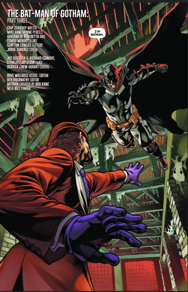
For me, drawing the cape and cowl are two distinct challenges. Drawing the cape takes me back to my art school days and all the hours spent drawing drapery, learning how folds work. You can use the folds to create a mood, be it calm or tense. But you can also use it to imply secondary movement. Things about a person walking with a cape. There’s the primary mover, the person’s steps, then the cape reacts to that movement. You can do a lot with that, adding all kinds of drama to a scene.
The cowl is different in that it’s more static, but also more of an iconic image. It must read with little to no detail, like a logo. It must also allow for expressions of the person under it. So, it can’t be too rigid, you have to allow for brow & mouth movement. It’s a tricky bit of business. When I think of artists that make it work best, my mind goes to Mazzucchelli. He manages to allow the cape to work perfectly while retaining expressiveness. Jones comes to mind for just the pure unique, signature energy he brought to the cape and cowl.
Tim Levins
Artist, Batman Gotham Adventures, Siren for Image Comics.
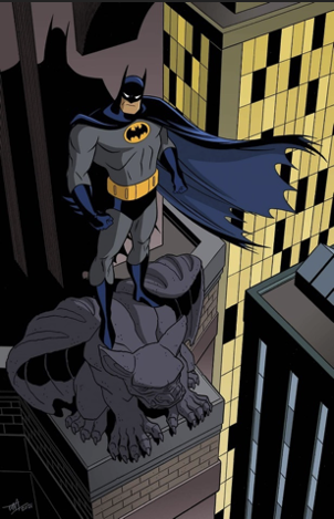
The Batman comic I worked on, Batman: Gotham Adventures, was modelled after The New Batman Adventures TV show, which employed what is likely the most streamlined, basic visual design of Batman in any medium. Despite the simplicity, the art captured the essence of the character: the cape and cowl, the belt, the chest emblem – all the elements that make Batman one of the most recognizable superheroes ever created.
The portrayal of the character, both in the TV series and in the comic book adaptation I worked on with writer Scott Peterson, was also stripped down to the core of who Batman is supposed to be, a compassionate righter of wrongs whose relentless pursuit of justice always comes first, regardless of the toll that crusade takes on him – a true hero. I’m so grateful to have had the opportunity to contribute in a small way to the Batman mythos and I look forward to seeing what the future holds for the Dark Knight!
Bill Reinhold
Artist, Batman LODK,
Inker, Batman, Brave and the Bold, Daredevil.
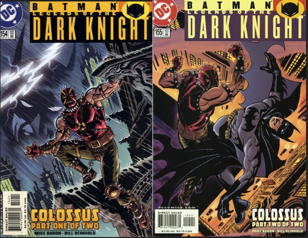
One of the reasons I loved drawing Batman for the Legends of the Dark Knight comic book in 2002 was because, for me, Batman is the epitome of the big city superheroes. I grew up in Chicago, so night-time city dwelling heroes like Batman or Daredevil always appealed to me.
I don’t think there is a best approach to drawing Batman, but I’m more attracted to the old school Batman costume without all of the armour and thick padding often used today. I suppose the first more modern Batman artist who struck me was Neal Adams, for the more realistic darker portrayal. But my very favourite Batman artist is Frank Robbins! Especially the pronounced brow on Batman’s cowl and the great use of blacks. Also influencing me is Bernie Wrightson, for the longer ears and flowing cape on the Dark Knight.
The other huge influence on me was the Gotham City design of Anton Furst for Tim Burton’s 1989 Batman film. A character in itself with a mix of Art Deco, Art Nouveau, and Baroque architecture. That for me, completed the way I drew Batman and his environment.
Al Gordon
Inker, Justice League of America, Detective Comics, Who’s Who in the DC Universe

I was an Inker on those books… not the Illustrator. But I always liked the Batman of the Old Serials where he was so dark and kind of leathery. I really liked him being similar to The Shadow, or Doc Savage. So, I tried to make him as Leathery and Dark as I could. Almost wet.
Greg Staples
Artist, JLA Riddle of the Beast, Judge Dredd, Slaine.
I approach illustrating Batman very much like I approach Judge Dredd, almost non-human but the epitome of what they are and how they are dressed. A good inspiration for me is Clint Eastwood the Man with No Name. He is the costume and the attitude and the cool, not so much a man but a character that people love to see more of. So, in a way, Batman is simply a cool character and design, and the character comes second, for me at least. I guess a bit mythical. Does that make sense?
Alan Quah
Artist, Current Batman cover artist, Deadpool, TMNT, Transformers.
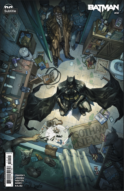
I see Batman as a detective, a crime solver and finally as a crime fighter. I enjoyed portraying him solving murders in the last few covers on Batman #141, #143 and #144. The artist I felt that drew the true batman is Jim Aparo. That is how I aspire drawing my version too, not overly bulky, medium sized ears and slightly square jawed.
Michael Allred
Artist, Batman ’66, Silver Surfer, Madman, Batman: The Dark Age.

I like to go with big more bat-like ears. Classic cape with span for subtle gliding. A practical lurker. David Mazzuchelli’s art on Year One first came to mind with the question. Nick Derington’s recent run with Bendis really lit me up!
I wish Alex Toth had done more, Neal Adams was my fave when I was a kid, and Frank Miller’s take on the old Batman rocks hard! But gotta give Mazz the edge since his Batman is the one I re-visit the most (also have every Year One collection I’ve ever come across, including the new Artist Edition).
Paul Kupperberg
Writer, Batman, Detective Comics, Brave and The Bold.
Editor: DC Comics, Archie Comics.
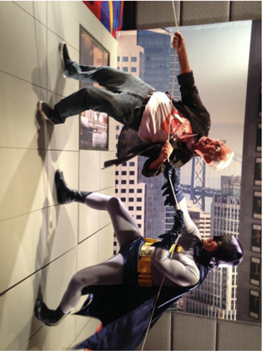
Not being an artist I don’t know what the best way to illustrating Batman’s ears, cowl and cape would be but, as a reader, I’m a diehard fan of the approach taken by Jim Aparo and Neal Adams, my two favourite artists on the character in the 1970s. Both created a unique silhouette for the Dark Knight and Neal in particular had a way of giving the bat-cape a spooky life of its own.
Conclusion
It is clear many artists are passionate about their own particular approach to Batman whilst also agreeing The Caped Crusader is an infinitely versatile character. Tripwire thanks every single artist that has taken part in this article.
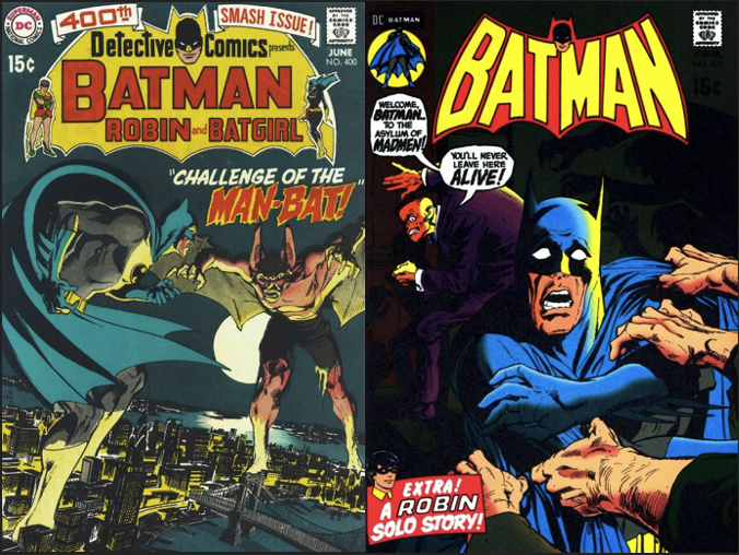
This endeavour has taken some time to put together, but even during the early stages (amongst other names) a clear artists’ favourite as their Batman artist of choice was the late great Neal Adams.
Much has been said about this incredibly talented creator. Adams was born in June of 1941 and sadly passed away in April of 2022. His contribution to DC Comic and the industry is hard to calculate. His best covers are included here.
It is tragic how many legendary Batman artists have passed away. As comic fans, in no order of preference, we have lost Tim Sale, Carmine Infantino, Dick Sprang, Jim Aparo, and Dick Giordano amongst so many others. Batman is a character that has touched so many artists and their careers.
From this journalist’s point of view there was a name that was mentioned only once or twice. That name was of the wonderful artist Norm Breyfogle. His run of comics with writer Alan Grant provided fan with a body of work will stand the test of time with all greats included in this article.
There is a possibility Tripwire may add additional contributions here from other artists and writers at some future date. As it stands, as is always the case, Tripwire is interested in Feedback. Comments are very welcomed indeed.










You must be logged in to post a comment.